In an era where our pockets buzz every few minutes with digital notifications, there is something surprisingly powerful about a physical piece of paper. I see it constantly in my line of work: a business owner pours thousands into social media ads that are scrolled past in a microsecond, yet a well-designed piece of print can stop someone in their tracks. Event Flyers, in particular, create a genuine moment of connection. There is a weight to them—both literal and emotional—that pixels on a screen simply can’t replicate.
However, not all print marketing is created equal. We have all been handed that flimsy, poorly designed scrap of paper that immediately ends up in the nearest trash can. As a service provider who has helped countless businesses navigate their marketing strategies, I know that the difference between trash and treasure usually comes down to intentional design and material choices. A high-quality Event Flyer is more than just an announcement; it is a handshake. It is often the very first physical interaction a prospect has with your brand, and that first impression needs to be impeccable.
Creating a flyer that builds a strong brand impression isn’t about just putting ink on paper. It requires understanding the psychology of touch, the science of color, and the art of visual hierarchy. When you get these elements right, a flyer becomes a portable ambassador for your business, carrying your reputation into coffee shops, community boards, and the hands of your future clients. Let’s dive into how you can transform a simple sheet of paper into a powerful branding tool.
The Psychology of Touch: Why Paper Choice Matters
One of the most common mistakes I see business owners make is finalizing a beautiful design and then trying to save money by choosing the thinnest, cheapest paper stock available. I always gently remind my clients that marketing is a sensory experience. When someone takes your flyer, their fingertips register the quality of the paper before their eyes even focus on the headline. If the paper feels flimsy, the subconscious assumption is that the business is flimsy, too.
Choosing the right substrate is crucial for establishing authority. A thicker, heavier cardstock conveys stability, professionalism, and luxury. It tells the customer, “We invested in this because we believe in our value.” Conversely, a thin sheet that curls at the edges suggests a disposable commodity. This is why we spend so much time discussing must-use paper types and finishes for high-impact event flyers with our clients. The texture whether it is a glossy finish that makes colors pop or a matte finish that feels sophisticated and organic sets the emotional stage for your message.
Beyond just the weight, the finish affects readability and glare. I recall a client who wanted a high-gloss finish for an outdoor event flyer. While it looked great indoors, in the bright sun, the glare made it unreadable. We switched to a satin finish, which offered the best of both worlds: vibrant color saturation without the blinding reflection. These practical, experience-based decisions are what separate amateur prints from professional branding assets.
Precision and Consistency in Digital Printing
Your brand colors are your uniform. If your logo is a specific shade of navy blue, it needs to look like that specific navy blue every single time whether it is on a business card, a banner, or an event flyer. This is where the technology behind the scenes makes a massive difference. In professional Digital Printing, we use calibrated equipment to ensure that the colors you see on your monitor match what comes off the press.
Inconsistent branding confuses customers. If your flyer looks washed out or the red looks more like pink, it degrades trust. It signals a lack of attention to detail. I have worked with real estate agents who printed their open house flyers on office laser printers, only to find that the photos of the homes looked muddy and dark. In a visual industry, that is a dealbreaker. By utilizing professional-grade digital presses, we ensure that images are crisp, text is sharp, and color fills are solid and streak-free.
This level of quality control is essential because your flyer is competing for attention. It might be pinned to a community board surrounded by ten other flyers. To stand out, the production quality needs to be visibly superior. It is not just about conveying information; it is about outshining the competition through sheer visual fidelity.
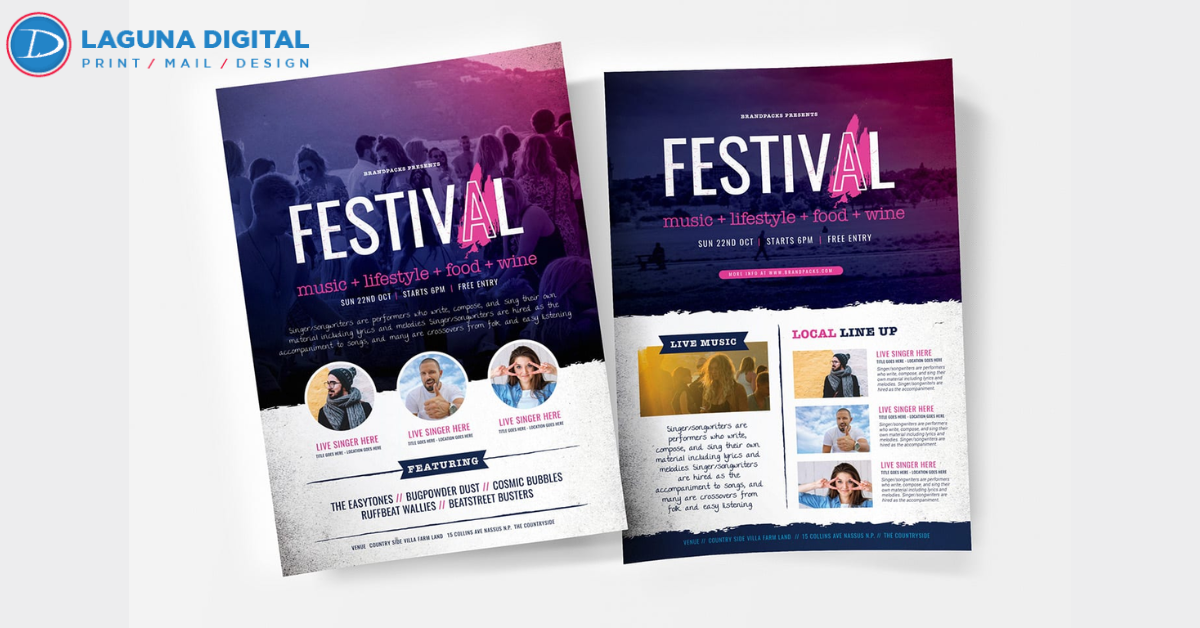
Visual Hierarchy and Imagery
A flyer has about three seconds to do its job. If the reader cannot figure out who you are, what you are offering, and what they should do next within that window, you have lost them. This is where design discipline comes into play. A common trap is horror vacui the fear of empty space. Business owners often try to cram every single detail, price point, and policy onto a 5×7 card. The result is a chaotic mess that the brain instantly rejects.
To create a strong brand impression, you must embrace white space. It allows the design to breathe and guides the eye to the most important elements. Furthermore, the quality of the images you use is non-negotiable. In the same way that we approach high-end Photo Printing, the images on your flyer must be high resolution. Nothing screams amateur louder than a pixelated, low-quality JPEG stretched to fit a layout. If you are selling food, the photo should make the viewer hungry. If you are selling a service, the imagery should evoke the feeling of the solution you provide.
The Subtle Power of Typography
While images grab attention, words close the deal. However, the way those words look is just as important as what they say. Typography is the voice of your brand. A whimsical script font might work for a bakery, but it would look disastrous for a financial seminar. I often see flyers where the designer has used four or five different fonts, creating a disjointed and confusing look.
We always advise clients to stick to two, maybe three fonts maximum: one for the headline and one for the body text. This restraint creates elegance and readability. If you are unsure how font choices impact consumer psychology, I highly recommend looking into the power of typography in creating impactful event flyers. The right font can make your brand feel modern, traditional, urgent, or relaxed without the reader even realizing why they feel that way.
Additionally, size matters. Your headline should be legible from five feet away. If someone sees your flyer lying on a table, they should be able to read the main offer without having to pick it up. This glance value is a critical component of successful event marketing.
Strategy: Getting Your Flyers into the Right Hands
Even the most beautiful flyer in the world is useless if it stays in the box. One of the frustrations I hear from business owners is, I printed 5,000 flyers and didn’t get a call. When we dig deeper, we usually find a distribution problem, not a print problem. Handing them out randomly on a street corner is rarely effective. You need to target locations where your ideal client spends time.
For example, a yoga studio shouldn’t just leave flyers at the grocery store; they should partner with local juice bars, athletic wear shops, and chiropractors. Contextual placement increases the perceived value of the flyer because it feels relevant to the customer’s current mindset. If you are struggling with distribution ideas, there are 5 ways to use flyers for event promotions that can help you think outside the box, from direct mail inserts to strategic partnerships.
Extending the Narrative Beyond the Flyer
Finally, it is important to view the flyer as just one piece of a larger puzzle. A flyer is excellent for a quick, punchy announcement, but sometimes you need to tell a deeper story. For clients who are running major conferences or extensive product launches, we often suggest pairing flyers with more substantial materials.
If you have a complex story to tell or a catalog of products, you might want to consider Book Printing for booklets or programs that can accompany your flyer distribution. The flyer acts as the hook for the hey, look at this and the booklet serves as the closer, providing the detailed information that builds deep credibility. When all your materials from the smallest postcard to the thickest catalog share the same design language and print quality, you create a brand ecosystem that feels professional and trustworthy.
FAQs
Is a glossy or matte finish better for event flyers?
This depends entirely on your design and usage. Glossy finishes are fantastic for flyers with lots of vibrant photographs, as the coating makes colors appear richer and sharper. However, if your flyer has a lot of text or will be read under bright lights, matte is often better because it reduces glare and makes the text easier to read. Matte also has a more modern, organic feel that is popular right now.
How many flyers should I print for a local event?
Start with a realistic estimate of your distribution channels. It is better to print a smaller run of 250 or 500 high-quality flyers that you can strategically place than to print 5,000 cheap ones that end up in the trash. We often recommend a test and scale approach print a smaller batch, gauge the response, and then reprint if the campaign is gaining traction.
Can I design my flyer in Word or PowerPoint?
Technically, yes, but we strongly advise against it for professional printing. These programs are not designed for CMYK color management or high-resolution output, often resulting in margin issues and color shifts. Using professional design software (or hiring a designer) ensures that your bleed lines, crop marks, and image resolutions are correct, preventing expensive printing errors.
Conclusion
In the fast-paced world of marketing, it is easy to get caught up in the latest digital trends, but the tactile power of print remains a cornerstone of building trust. A well-executed event flyer does more than announce a date and time; it communicates your brand’s commitment to quality. By carefully selecting your paper, maintaining consistent colors, and designing with clarity, you turn a simple piece of paper into a compelling brand asset.
Remember, your marketing materials are a reflection of your business. When you hand someone a flyer that feels substantial and looks professional, you are telling them that you run a substantial, professional business. At Laguna Digital, we are passionate about helping you make those lasting impressions, ensuring that every piece of print helps you reach your business goals.