We have all been there. You are at a networking event, the conversation is flowing, and you exchange contact information. You take the card, look at the front to see the name and logo, and then—almost instinctively you flip it over. When the back is blank, it feels like a missed beat, a silence in the conversation that didn’t need to happen. That blank white space is often the most undervalued real estate in marketing.
In my years of working in the printing industry, I have seen thousands of designs pass through our presses. The most successful businesses understand that a business card isn’t just a way to share an email address; it is a tactile representation of your brand. At Laguna Digital, we often advise clients that if you are paying for the paper, you might as well make every square inch work for you. Using the reverse side effectively can turn a simple introduction into a lasting relationship.
The reluctance to print on the back usually stems from a fear of clutter or simply not knowing what to put there. However, a well-designed backside doesn’t have to be chaotic. It can be functional, beautiful, or informative. Whether you are a local contractor, a real estate agent, or a creative freelancer, utilizing that second side creates a perception of higher quality and attention to detail.
Why the “Blank Slate” is Costing You Connections
There is a practical argument for keeping one side clean: it allows the recipient to write notes. While valid, you don’t need the entire back of the card for a quick scribble. Leaving it completely blank suggests a lack of creativity or a tight budget, neither of which are signals you want to send to a prospective high-value client.
When we handle Business Cards, we encourage clients to think of the card as a mini-brochure. It is likely the only physical piece of marketing collateral a prospect will take home with them. If the front answers “Who are you?” and “How do I reach you?”, the back should answer “Why should I care?” or “What do I do next?”
Here are 11 experience-based, creative ways to utilize that space, drawn from real campaigns we have helped bring to life.
1. Turn It Into an Appointment Card
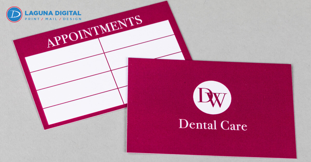
For service-based industries like salons, dental offices, or automotive repair shops, the back of the card has a very specific job: securing the next visit. By printing an appointment grid on the back, you ensure the card goes straight into the client’s wallet rather than the trash.
It serves a dual purpose. It acts as a reminder for the customer, reducing no-shows, and it keeps your contact info close at hand. We often recommend using a matte finish for these specific cards so that writing on them with a ballpoint pen is smudge-free. If you need a layout specifically designed for this, you might look into dedicated Appointment Cards to streamline your booking process.
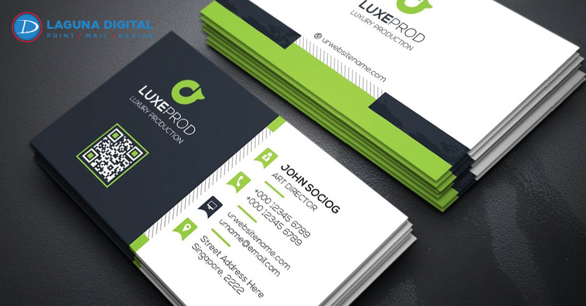
2. The Strategic QR Code
A few years ago, QR codes were considered a fading fad. Today, they are essential. Placing a QR code on the back of your card bridges the gap between physical print and digital presence. But here is the trick: don’t just link it to your homepage.
Link the QR code to something specific and valuable. It could be your Linktree, a direct calendar booking link, a portfolio of your recent work, or a downloadable vCard that instantly saves your details to their phone. This makes the user experience seamless and portrays your business as tech-savvy and modern.
3. Showcase Your Menu of Services
One common mistake I see is business owners assuming people know exactly what they do based on a job title. “Marketing Consultant” could mean anything from SEO technical work to brand design. Use the back of the card to list your core services in a clean, bulleted format.
This clarifies your offering immediately. If you offer a wide range of Marketing Materials, listing them out helps the recipient realize, “Oh, they don’t just do business cards; they can handle my brochures and flyers too.” It creates cross-selling opportunities before you even make a pitch.
4. Feature a Client Testimonial
Trust is the currency of business. You can talk about how great you are all day, but having a client say it carries much more weight. Placing a short, punchy quote from a satisfied customer on the back of your card provides instant social proof.
Choose a testimonial that speaks to a specific pain point. Instead of “Great service,” use a quote like, “They doubled our leads in three months.” This technique works exceptionally well for consultants and real estate agents where personal trust is the deciding factor.
5. Add a Mini Portfolio
If you are a photographer, graphic designer, or interior decorator, telling people you are talented isn’t enough—you have to show them. High-quality Photo Printing technology allows us to print vibrant, sharp images on cardstock.
You can even use “variable data printing” to have different images on the backs of different cards. One card might show a landscape shot, another a portrait. It turns your business cards into a collectible mini-portfolio that sparks conversation.
6. Offer a Coupon or Discount
People love a deal. Turning the back of your card into a coupon such as “10% off your first order” or “Free appetizer with entree”—gives the card immediate monetary value. The recipient is financially incentivized to keep the card.
This strategy essentially turns your standard business card into a piece of direct marketing, similar to Business Flyers, but in a pocket-sized format. Just be sure to include a small expiration date or terms to protect your margins.
7. Provide Valuable Reference Information
One of the smartest plays I have seen involved a real estate agent who printed a list of essential local emergency numbers and utility contacts on the back of her cards. Her clients taped that card to their refrigerators.
If you are in construction, maybe print a conversion chart. If you are a mechanic, print a tire pressure guide. If you provide useful content, your card stops being an advertisement and starts being a tool. This aligns well with other Business Essentials that prioritize utility alongside branding.
8. Referral Card Layout
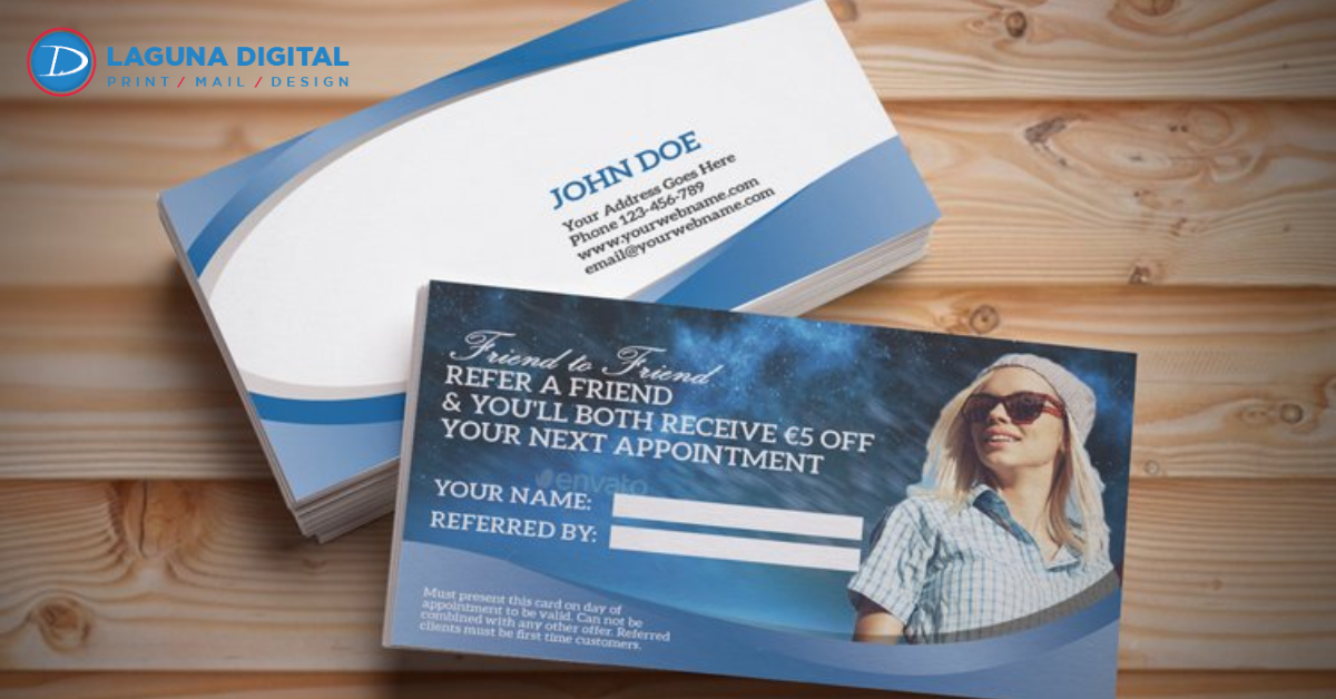
Word of mouth is powerful, but sometimes it needs a nudge. Design the back of your card with two lines: “Referred by” and “Referred to.” You hand these to your loyal clients and tell them, “If you give this to a friend, you both get a discount on your next service.”
This turns your existing customer base into an active sales force. It’s a tangible way to track where your new leads are coming from, which is often difficult for small local businesses to do accurately.
9. Map and Location Details
While everyone has GPS on their phone, a visual map can still be incredibly helpful, especially if your business is located in a large complex or a confusing part of town. It reinforces your local presence.
This works best for businesses that rely on foot traffic, like cafes or retail stores. It can also complement your larger Banners, Posters, and Signs by visually familiarizing the customer with your storefront’s location relative to major landmarks.
10. Brand Values or Mission Statement
Sometimes, the goal isn’t to sell a service but to sell a feeling. For non-profits or lifestyle brands, using the back of the card to state your mission or core values can create an emotional connection.
Keep it brief. A tagline like “Sustainably sourced, ethically made” tells a story that a logo alone cannot. This approach helps attract customers who align with your worldview, filtering for the right type of clientele.
11. The “Branded” Note Section
If you simply must leave space for writing, don’t leave it stark white. Add your logo as a watermark (faded into the background) or include branded lines.
This compromises between utility and branding. It allows you or the recipient to jot down a cell number or a meeting time, but it still looks intentional and professional. It shows that you thought about the user experience, which is a hallmark of good design.
Technical Considerations for Double-Sided Printing
When you decide to print on both sides, the quality of the paper becomes even more critical. You cannot use thin, flimsy stock because the ink might bleed through, or the text from the other side might show through when held up to the light.
We always recommend a higher GSM (grams per square meter) paper stock for double-sided jobs. Professional Digital Printing ensures that the registration (alignment) is perfect, so your borders don’t look lopsided. Also, consider the coating. If you want people to write on the back, you cannot use a high-gloss UV coating; you will need an uncoated or matte finish.
FAQs
Does printing on the back of the card double the price?
Generally, no. While there is a cost increase for double-sided printing because it uses more ink and setup time, it is rarely double the price. The value gained from the extra marketing space usually far outweighs the marginal cost increase.
Should I put my logo on both sides?
It depends on the design. If the front is text-heavy, a large logo on the back looks great. If the front is logo-centric, use the back for information. Avoid repeating the exact same information on both sides; it is redundant and wastes space.
What is the minimum font size I should use on the back?
Because you are likely fitting more information on the back, there is a temptation to shrink the text. Try not to go smaller than 7pt or 8pt font. If your customers are older, keep it at 10pt or higher. If you have too much to say, consider Book Printing for a brochure instead of cramming it onto a card.
Can I use different designs for the back within the same order?
With modern digital printing, yes. This is often called “variable data” or “multi-matrix” printing. You can have the same front for all employees but different backs promoting different services or products.
Conclusion
Your business card is often the very first impression potential clients have of your brand and sometimes, it is the only thing they have to remember you by. Leaving the back blank is like renting a billboard and only painting one side. Whether you choose to add a QR code, a service menu, or a simple appointment reminder, utilizing that space shows that you are professional, prepared, and detail-oriented.
At Laguna Digital, we believe in making every piece of print count. If you are ready to upgrade your cards or need advice on the right paper stock for a double-sided design, visit our Contact Us page. For more tips on marketing and print design, be sure to check out our Blog. Let’s make your business cards work as hard as you do.