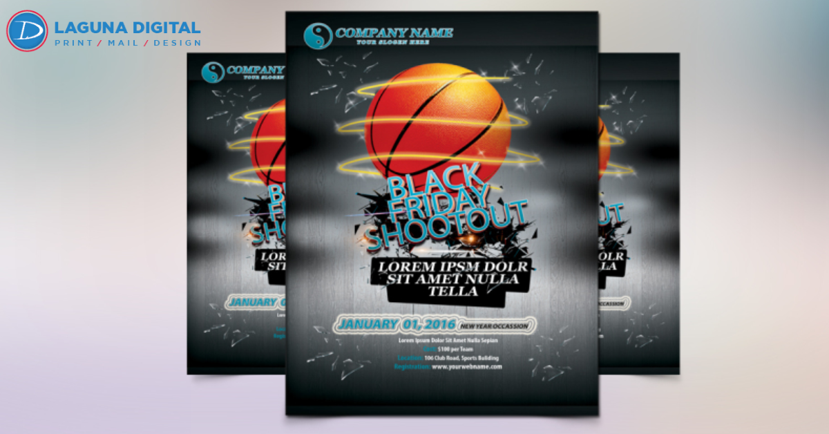
Typography is more than just choosing fonts—it’s a design language that communicates mood, tone, and intention. When creating event flyers, the right typefaces can draw attention, guide the reader’s eye, and emphasize key event details. A well-structured flyer can mean the difference between someone attending or overlooking your event. At Laguna Digital, we believe typography is the foundation of impactful flyer design. By understanding type hierarchy, font pairing, and readability, businesses can create flyers that resonate with audiences. Typography ensures your message is clear, professional, and unforgettable.
Setting the Tone with Typography in Event Flyers
Fonts Reflect Personality
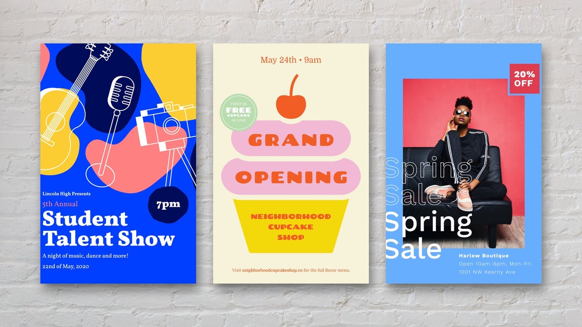
The typography used in event flyers reflects the theme and personality of the event. Bold, modern fonts create energy for concerts or festivals, while elegant serif fonts convey sophistication for galas or fundraisers. Choosing the right style is the first step in capturing attention.
Matching Mood with Message
Typography should align with your event’s mood. For example, a casual comedy night might use playful, quirky fonts, while a corporate seminar requires clean, minimal typography. At Laguna Digital, we guide clients in selecting fonts that mirror the purpose and create immediate connection with the audience.
Hierarchy: Guiding the Reader’s Eye
Importance of Font Sizes
An impactful event flyer must guide the reader from headline to details. A bold headline font grabs attention instantly, followed by mid-sized subheadings, and finally the essential details in smaller type. Proper hierarchy ensures no message gets lost.
Highlighting Key Details
By using typography effectively, you can highlight critical event details like date, venue, and RSVP instructions. This makes it easy for readers to grasp vital information quickly. Laguna Digital specializes in designing flyers where typography builds a visual roadmap, ensuring clarity and retention.
Readability: The Backbone of Event Flyers
Choosing Legible Fonts
Creativity is important, but readability is the backbone of a good flyer. Overly decorative fonts often confuse readers and distract from the main message. Clear, legible type ensures every detail—especially key contact information—remains easy to understand. This helps event flyers achieve their purpose effectively.
Color Contrast for Visibility
Strong color contrast plays a vital role in flyer design. Black on white or bold tones on subtle backgrounds instantly boost visibility. At Laguna Digital, we ensure fonts and colors work together for maximum readability. This makes your event flyers pop both in print and digital formats.
Font Pairing: Balancing Creativity and Simplicity
Combining Fonts Effectively
Font pairing creates balance and keeps flyers visually appealing. The ideal mix is two or three fonts—one for headlines, one for subheadings, and another for details. Too many fonts overwhelm readers and cause confusion. Laguna Digital ensures combinations stay stylish, modern, and easy to follow.
Creating Brand Consistency
Typography should reflect and strengthen brand identity. Fonts chosen carefully not only look attractive but also build recognition across marketing materials. At Laguna Digital, we help brands select typefaces that match their image. This ensures flyers stay consistent, professional, and memorable to every audience.
Typography Trends for Modern Event Flyers
Bold and Oversized Fonts
Oversized fonts are one of the biggest flyer design trends today. They grab attention instantly and make key messages visible even from afar. Perfect for concerts, festivals, or street posters, bold typography adds energy. It also creates an impactful first impression for any event.
Minimalist and Clean Fonts
Minimalist typography offers a sleek, modern approach to flyer design. Clean fonts work well for upscale, professional, or formal events that require elegance. At Laguna Digital, we stay updated with these design movements. Our flyers balance minimalism and clarity, ensuring they appeal to today’s audiences.
How Laguna Digital Elevates Flyer Typography
Custom Typography Solutions
At Laguna Digital, typography isn’t an afterthought—it’s central to flyer design. Our experts carefully select fonts that reflect your brand and event personality. Each design is customized to ensure it communicates effectively. This approach guarantees your flyers stand out and leave a lasting impression.
Professional Printing Quality
Typography shines brightest when paired with flawless printing. Even the best font loses impact if not printed cleanly and sharply. With advanced technology, Laguna Digital ensures every letter is crisp and professional. From paper quality to finishing touches, we make your event flyers look exceptional.
Conclusion
Typography has the power to transform ordinary event flyers into powerful marketing tools. The right fonts create tone, establish hierarchy, and enhance readability, ensuring your event captures attention. By combining typography expertise with modern design trends, you can create flyers that inspire action. Laguna Digital specializes in designing and printing impactful flyers where every word makes a statement. When typography and design work together, your flyer doesn’t just inform—it influences, excites, and converts audiences into attendees.