



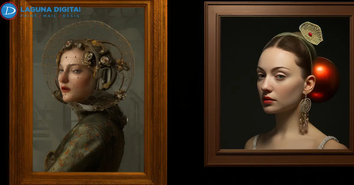
A reproduction can be sharp and detailed yet still feel wrong beside the original. A muted green may shift yellow, a warm gray may turn cool, or dark brushwork can merge into one heavy shadow.
Those problems often build across capture, editing, proofing, media choice, and output. Color calibration gives those stages a dependable reference, helping the final print stay closer to the original color and tonal relationships.
Color Calibration Protects Fine Art Reproduction From Start To Finish
A finished reproduction passes through several devices before it reaches paper or canvas. The artwork may be scanned or photographed, viewed on a monitor, adjusted in software, proofed, and finally printed. Each stage can introduce a shift.
Color calibration keeps those decisions tied to known conditions, especially in neutral backgrounds, skin tones, pale washes, layered reds, and deep glazes.
A professional fine art printing company should explain how these stages are controlled.
Capture Quality Comes First
Good art reproduction begins before editing. Uneven light, glare, clipped highlights, or weak shadow separation in the source file will follow the image through production.
Flat originals may work well with high-resolution scanning. Textured, delicate, or oversized pieces need a method suited to the surface. Artists with larger originals can review large format fine art scanning before deciding how to create the master file.
Reliable art reproduction services should preserve texture, detail, and tonal separation.
Calibration Before Color Correction
Color correction changes the image file. Calibration checks whether the device used to judge that file is behaving predictably.
An overly bright monitor can encourage unnecessary darkening, while a cool display can lead to unwanted warming. Once the screen is stable, color matching decisions become easier to trust.
Print Color Accuracy Depends On The Complete Workflow
Print color accuracy is not created by the printer alone. The source file, display, working profile, output profile, ink, paper, and viewing light all affect the result.
The practical goal is to preserve the relationships that make the original recognizable, including the difference between navy and black or warm and cool neutrals.
Monitor Brightness And White Point
A monitor emits light while paper reflects it. That difference can make an image appear brighter and more open on screen than it will in print.
Regular color calibration helps keep the display within a useful range. Avoid automatic brightness, vivid display modes, and changing room light during critical editing.
Printer Profiles And Media
Paper changes color appearance. Warm cotton rag can soften cool highlights, while matte, gloss, luster, and canvas handle dark tones differently.
That is where printer calibration and paper-specific profiles matter. Color-accurate printing depends on the actual printer, ink, and media combination rather than a generic setting.
For fine art printing, request a proof on the same surface intended for the edition.
Soft Proofing Reduces Expensive Surprises
Soft proofing previews how an image may behave under a selected output profile. It can reveal colors that may fall outside the printable range, shadows that may close up, and neutrals that may move warmer or cooler.
Color calibration makes that preview more useful because the monitor is no longer an unknown variable. The screen still remains a simulation.
Critical Color Checks
Start with the colors that define the piece, such as dusty rose, muted botanical green, or the contrast between charcoal and black.
Focusing on those areas makes color reproduction decisions more precise and avoids unnecessary edits. For photography-based artwork, professional photo printing also helps artists compare how surface and finish influence the final image.
Hard Proof Approval
The physical proof is where custom fine art printing becomes tangible. Ink, paper white, texture, and black density are present together.
Place the proof beside the original under stable light. Check whites and neutrals first, then highlights, midtones, shadow separation, and two or three signature colors. Step back at the end and judge the overall balance.
A proof can match individual colors and still feel too warm, heavy, or flat, so the broader comparison remains essential for dependable color matching.
Paper Choice Shapes The Final Reproduction

Paper affects contrast, perceived sharpness, saturation, black depth, and the warmth or coolness of light areas.
This is especially important in fine art photo printing, watercolor reproductions, line drawings, and paintings with soft tonal transitions.
Artists comparing giclée printing solutions should judge actual samples when possible. The best surface should support the artwork without overpowering it.
Viewing Light And Perception
A print can look balanced near daylight and noticeably warmer under household lighting. The print may not have changed. The light illuminating it has.
For serious proof approval, compare the original and reproduction under the same stable light. A controlled workflow cannot compensate for inconsistent viewing conditions.
This habit improves print color accuracy and prevents unnecessary corrections.
Production Records Protect Future Editions
An approved proof should become a production reference. Save the final file with the media name, profile, printer settings, rendering choice, proof date, and final correction notes.
Those records matter when fine art prints are reordered months later. They are equally useful for museum quality printing, replacement pieces, limited editions, and gallery stock where consistency matters across runs.
Printer calibration should be checked before an older setup is reused because a saved file alone cannot guarantee the same output.
Professional Art Reproduction Needs A Clear Approval Process
A strong workflow covers capture, monitor control, proofing, media selection, output profiling, and final inspection.
When comparing one fine art printing company with another, ask how proofs are reviewed and how approved settings are recorded. Clear process details are more useful than broad promises about perfect color.
Artists who want the master file, proof, and final print managed in a single workflow can explore professional art reproduction services. Keeping these stages connected reduces the risk of decisions being made without the context of earlier production steps.
Reproduction Limits
Fluorescent pigments, metallic paint, reflective materials, and extremely saturated colors can be difficult to reproduce exactly on a standard ink and paper system.
Good color reproduction protects the visual relationships that define the artwork rather than forcing an impossible one-to-one match.
That is a more useful standard for color-accurate printing and archival editions.
Frequently Asked Questions
How Often Should A Monitor Be Calibrated For Fine Art Work?
There is no single schedule for every display. Recheck it regularly and create a new profile when the display changes, measurements show drift, or the editing environment changes. Color calibration works best as routine maintenance rather than a one-time setup.
Why Does A Fine Art Print Look Darker Than The Screen?
A screen produces its own light, while paper depends on reflected light. If the monitor is too bright, the file can appear lighter than the finished print. Controlled brightness and stable viewing light make the comparison more reliable.
Can One ICC Profile Work For Every Fine Art Paper?
No. Papers differ in white point, coating, texture, and ink behavior. A profile should represent the intended output condition, especially with giclée printing solutions offered on several archival papers or canvas options.
Is A Physical Proof Necessary For A Small Edition?
A proof is strongly recommended when appearance matters. It lets the artist judge real ink on the final surface before approving multiple copies. This is valuable for fine art photo printing, custom fine art printing, and high-value fine art prints.
Can Every Original Color Be Reproduced Exactly?
No. Some pigments and surface effects fall outside the printable gamut or change with viewing light. Museum quality printing should focus on controlled output, tonal relationships, and careful proof approval rather than an unrealistic promise of exact duplication.
Bottom Lines
Fine art printing becomes more consistent when every important decision is made from a controlled reference. Strong capture protects the source, a stable display supports better editing, the correct profile predicts media behavior, and a physical proof confirms the result on paper.
Color calibration connects those stages without replacing the artist’s eye. Before approving an edition, compare the proof with the original under stable light and check critical hues, neutrals, highlight detail, shadow separation, and overall balance.
For artists ready to move from original artwork to a finished edition, Laguna Digital can support the process from capture through final output. Bring the original or master file, intended print size, preferred media, and any previous proof so production begins from a clear visual reference.