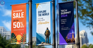
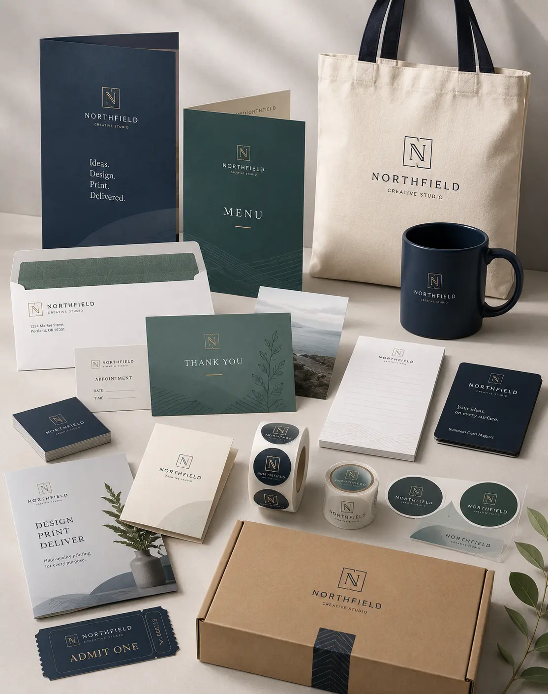
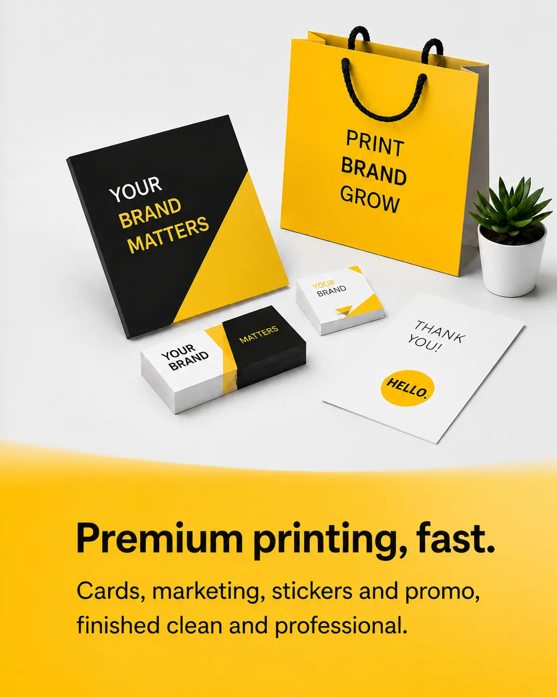
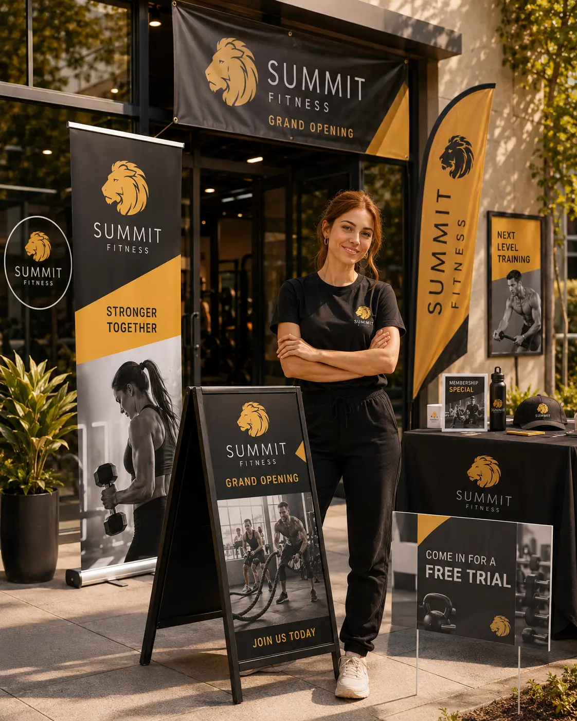
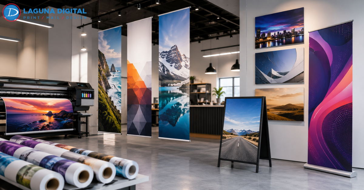
Many business owners feel invisible in a crowded marketplace. They invest in quality products and services, yet potential customers walk right past their storefronts without a second glance. We understand this frustration, as we frequently help local brands overcome the “noise” of modern competition. High-quality Banners, Posters & Signs serve as your 24/7 silent salesforce, capturing attention and guiding customers toward your front door.
We believe that signage should do more than just exist; it should communicate your brand’s personality instantly. A flimsy, poorly designed sign suggests a lack of permanence, while a sharp, professionally printed banner signals stability and authority. We work with clients every day to transform their visual identity into physical assets that actually drive foot traffic and increase revenue.
Design Principles for High-Impact Visibility
Effective signage requires a different mindset than digital or small-print design. We often see business owners make the mistake of including too much text on a large-format banner. When someone drives or walks past your sign, you have roughly three to five seconds to deliver your message. We recommend focusing on a single, clear headline and a strong visual element that people can digest at a glance.
Contrast plays a vital role in readability from a distance. We suggest using dark text on a light background or very bright text on a dark background to ensure clarity. Avoid using complex script fonts that look elegant but remain impossible to read from twenty feet away. Clean, bold sans-serif typefaces usually work best for outdoor signage and promotional posters.
The Importance of High-Resolution Graphics
We frequently encounter files that look great on a smartphone screen but appear blurry when we scale them up to banner size. For large-format printing, your images must have a high DPI (dots per inch) to maintain crisp edges. We encourage our clients to use vector files whenever possible, as these allow us to resize logos indefinitely without losing quality.
Using low-quality images sends the wrong message to your prospective clients. A pixelated sign suggests that you cut corners in other areas of your business as well. We provide file checks for our customers to ensure their graphics meet professional standards before the printing process begins. This attention to detail prevents costly mistakes and ensures your brand looks sharp and professional.
Strategic Uses for Every Business Environment
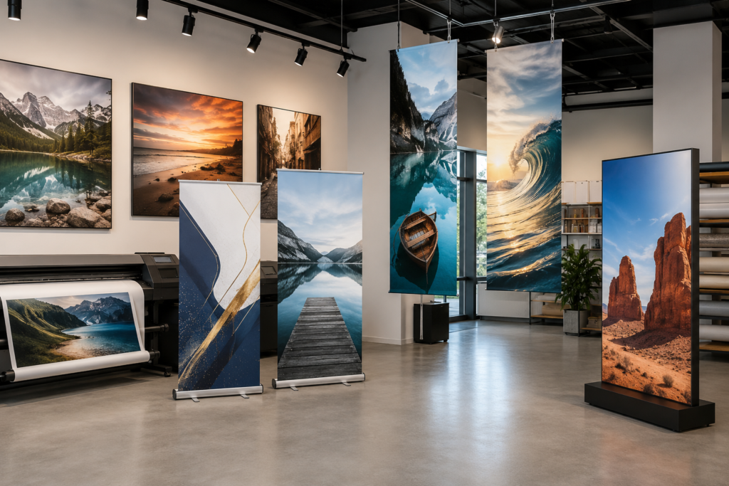
Different environments demand different materials and mounting strategies. For outdoor events, we recommend heavy-duty vinyl banners with grommets and wind slits to prevent the material from tearing. For indoor retail displays, foam core signs or high-gloss posters provide a sleek, polished appearance that encourages impulse buys. We help you choose the right substrate based on where you plan to display your message.
If you plan to attend a professional gathering soon, we offer specialized setup tips for retractable banners to help you stand out. These portable signs work perfectly for lobbyists, trade show vendors, and temporary pop-up shops. They offer a high level of mobility while providing a massive amount of branding real estate.
Maximizing Storefront and Point-of-Purchase Signs
Your storefront acts as your most valuable billboard. We often advise clients to use a mix of permanent signage and temporary promotional banners to keep their look fresh. Window decals and A-frame sidewalk signs effectively draw people inside who might otherwise walk right past. Once they enter, interior posters and signs guide their journey toward a purchase.
Point-of-purchase (POP) signage highlights specific deals or new arrivals right where the transaction happens. We see businesses significantly increase their average order value by placing well-designed signs near the register. These small but powerful tools remind customers of products they might have overlooked during their initial walkthrough.
The Tangible Benefits of Professional Signage
Investing in professional signage provides one of the highest returns on investment for local marketing. Unlike digital ads that disappear the moment you stop paying, a physical sign continues to work for you for years. We use UV-resistant inks that prevent sun-fading, ensuring your investment remains vibrant through several seasons.
Beyond the financial gains, high-quality signs build brand recognition within your local community. When people see your logo on banners and posters consistently, they begin to associate your brand with reliability and presence. This psychological familiarity makes it much easier for them to choose your business over a competitor they don’t recognize.
FAQs
What material works best for outdoor banners?
We recommend 13oz or 15oz vinyl for most outdoor applications. This material resists rain, heat, and cold while providing a smooth surface for vibrant color printing. If you live in a particularly windy area, we suggest mesh banners, which allow air to pass through the material without causing it to act like a sail.
How long do custom signs typically last?
The lifespan depends heavily on exposure to the elements and the materials used. Generally, our outdoor vinyl banners last between three to five years with proper care. Indoor posters and foam board signs can last indefinitely if you keep them out of direct sunlight and high-humidity areas.
What is the “bleed” in a print file?
A “bleed” refers to the extra area around the edge of your design that we trim off after printing. This ensures that your colors or images go all the way to the edge of the sign without leaving a white border. We usually require a 0.125-inch or 0.25-inch bleed depending on the specific product size.
Can I use a photo from my website on a large poster?
Most website images have a low resolution (72 DPI) to help pages load quickly. For a large poster or sign, we generally need at least 150 to 300 DPI at the final print size. If you use a web-quality image, the result will likely look blurry or “blocky” once we enlarge it for print.
Conclusion
A well-placed sign can change the trajectory of your business by capturing the eyes of people who need your services. We take great pride in helping our clients navigate the design and material choices that lead to successful marketing campaigns. By combining strategic design with high-quality materials, you ensure that your brand leaves a lasting impression on everyone who passes by.
Your business deserves to be seen, and we have the tools to make that happen. Don’t let your competition capture the market simply because they have better visibility. Reach out to the professional team at Laguna Digital today to discuss your next project. We look forward to helping you create the banners, posters, and signs that will take your brand to the next level.