

A store window has exactly one job. It has to earn a glance from someone who wasn’t planning to stop.
Nobody earns that glance by cramming in more products, turning up the color, or running three promotions side by side. That combination almost always backfires, and what’s left in the window stops reading as anything in particular. One clear product story, told well enough to land in half a second from the sidewalk, works far better.
Good storefronts pull a passerby’s eye through in stages. Rarely the three neat, equal beats a marketing deck likes to sketch, though. Something grabs the eye first, often before anyone consciously registers why.
A short line of copy gives that pull some meaning. The merchandise closes the loop, handing the person an actual reason to step inside.
Store Window Strategy Starts With One Selling Goal
Before anyone touches the glass, the display needs a sales goal. Not a decorating theme, a goal.
Take “summer.” It creates a feeling, yes. It never shows the team what the customer is really supposed to pay attention to when they pass by. Change that to something like ” travel clothing for weekend trips,” and then the whole thing has a purpose because now it speaks about a real product story instead of just a season.
Define The Reason To Stop
Decide what’s actually supposed to make someone slow down. A new collection. A sharp price. A seasonal item, a one-off event, or maybe a service the business already offers that most people walking by still don’t know about. Any of those can carry the whole campaign.
Whatever gets picked should drive everything downstream of it. The window layout, the photography, which products even get chosen, and the signage on the glass itself.
And when a campaign calls for exterior graphics that actually look professional rather than printed at home, working with sign and banner printing services can carry that message without turning the whole window into one big ad.
Decide What Does Not Belong
A shop might have a dozen products worth showing off. Cram all twelve into the front window, though, and odds are none of them stick in anyone’s memory. Pick whatever actually supports the campaign and let the rest earn its spot inside the store instead.
Stand outside during the hours. Observe the window like a customer would not like staff from 3 ft away. Notice reflected sun, store signs showing through, colored glass, door frames, mullions, light fixtures, anything that would obstruct or distract.
A headline that hits at 9 a.m. can be lost to glare by mid-afternoon. Detecting this prior to artwork being printed in order to prevent a reprint later on is just a short stroll outside. Also check from which angles folks actually view it; not directly straight on, but from different sides where they’ll actually be able to see.
Give Signage One Clear Role
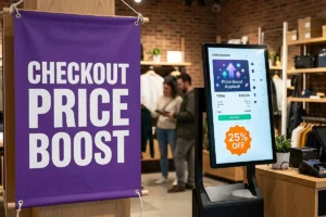
Signage exists to help customers understand what they’re looking at. It shouldn’t compete with the merchandise for attention, and permanent signage really has just one job, identifying the business.
Campaign graphics do something different entirely. A new product, a seasonal offer, a one-time event, or just making a product category easier to recognize at a glance, any of those can be the point.
Keep The Headline Easy To Read
Start with the shortest line that still gets the idea across. Long copy almost never helps a display people are reading from the sidewalk mid-stride. The headline has to land in a glance, full stop. Save the details for text closer to the glass, where someone who’s actually stopped has time to read.
Before signing off on any signage printing, test the headline at roughly the size it will actually print. Looks small on a screen or a printout? It won’t get bigger after installation.
Match Sign Size To Viewing Distance
Signs meant to be read from across the street need bigger type and fewer words. Full stop. Smaller signage can carry the supporting details, store hours, pickup instructions, event info, product specs, whatever else needs saying.
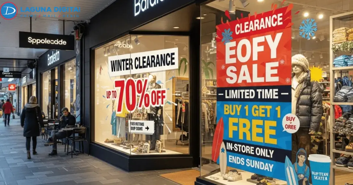
Hierarchy is really the only thing that matters here. One message leads. Everything else just supports it. For a campaign running just a few weeks, custom window clings tend to look a lot cleaner than taped paper, and they come off just as easily when the promotion changes.
Choose Print Materials Around The Campaign
Pick the material to fit the campaign. Not the other way around.
Some signage only needs to survive a single weekend. Other pieces stay up for a full season, sometimes longer. Those are two very different production problems, even if the glass looks the same either way.
Plan For The Installation Surface
Measure the glass. Not the total window opening. Focus on the space you can use. Door handles, framing, security hardware, decals, and any permanent signage in place all take up room. You need to account for every bit of that space because it affects what you can actually do.
Decide early whether graphics go on the inside or the outside of the glass. That choice matters a lot. It changes how the installation is done. It determines how visible the graphic is from the street. Additionally, it affects how the graphic looks against the merchandise behind it. Once you pick, stick with it. Only add a second round of signage when it has a specific job. Filling empty glass isn’t one.
Use Larger Formats With Restraint
A large banner earns its place when a campaign needs to be visible across a bigger stretch of sidewalk or street. Grand openings. Seasonal pushes. Events. Any short message that has to read from a distance.
Going big doesn’t mean writing more. It usually means writing less. When a message genuinely needs that kind of scale, custom printed banners work best, carrying just the main statement, with the rest of the details pushed onto smaller pieces. Skip that, and the banner just turns into one more crowded block of text, which kind of defeats the point of going large.
Connect The Window With What Happens Inside
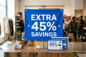
The window’s job doesn’t stop at the door. Once a display actually gets someone to walk in, they should be able to find the thing that pulled them inside without starting the search over from scratch.
Continue The Product Story
Window’s promoting a new skincare line signage. If it doesn’t push the main story forward, it probably doesn’t belong in the front glass.
Build The Display From The Sidewalk In
Staff sees a display from a few feet away, standing inside the store. Customers see something else entirely.
Most people catch the window at an angle. They glance at it through a row of parked cars, or take in maybe two seconds of it mid-stride on their way somewhere else. Design for that outside view first. The view from behind the counter can wait.
Control The First Glance
Every display that actually works has one clear starting point for the eye. A single mannequin, a cluster of three products, one big photograph, a bold price tag, or a piece of merchandise that simply doesn’t look like anything else on the street.
Once that focal point is set, everything else can sit around it without fighting for the same attention. That’s the whole idea behind hierarchy. Nobody should have to hunt for the important part.
That line needs an obvious presence somewhere inside, not buried on a back shelf three aisles over. Outside is all about graduation gifts? Nobody should have to ask a staff member where those actually are.
This is really where window planning turns into the rest of the shopping trip. A custom poster placed right by the featured merchandise can hold the details that would have been too much text for the front glass.
Separate Identity From Promotion
Permanent signage should reinforce the store’s identity, or just help people find their way around. Temporary pieces carry the current campaign. Mix the two with no clear hierarchy and the whole frontage gets harder to read, inside the store too, not only out front.
Identification, promotional graphics, product displays, they should all feel like they belong together. Without saying the exact same thing four separate times.
Refresh The Story When The Retail Moment Changes
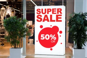
There’s no magic number of days after which a display needs a full rebuild. A better question is simply whether the current message still matters to anyone walking by.
Change The Story Rather Than Everything
New inventory might call for a different focal point. A holiday usually needs new copy. Even a sudden cold snap can make a seasonal product feel a lot more relevant than it did last week.
The fixtures themselves can usually stay put. Some of the best window refreshes come from swapping the product story while reusing the same physical setup.
And the next version of the window doesn’t need to look like a totally different display. It just needs a new reason for the regulars walking by to notice it again.
Measure Customer Response
Every display should have some way to measure whether it actually worked. For one campaign, that might be sales of the featured product. For another, it could be foot traffic through the door, event sign-ups, QR scans, or requests for a specific service.
Whatever gets measured, keep it tied to the original goal. Those results are what should shape the next round of signage, not a guess or whatever a competitor did down the street.
Over time, that feedback loop is what lets a business build window displays around its own customers instead of copying someone else’s storefront.
Frequently Asked Questions
What Makes A Store Window Display Effective?
A store window display works when it gives shoppers one reason to stop and take a closer look. The key is having a focal point that stands out. The products should match the message you want to send. The text must be easy to read from a distance. Good contrast helps the display pop.. There should be enough space around the main idea so it doesn’t get lost in clutter.
How Many Products Should Be In A Window Display?
There’s no number. It depends on the size of the products, the size of the window, how far people are standing, and the story the display is meant to tell. As a rule of thumb, if a product starts stealing attention from the focus, it’s time to take it out. Less is often more when it comes to window displays.
What Type Of Signage Works Best For Storefront Windows?
It depends on the message. How long the display will be up. Standard window signs are great for simple messages. Clings are useful when you want to change graphics. Posters work well in an enclosed space. Banners are best for messages that need to cover more area. The right choice depends on the goal and the amount of time the display will last.
How Often Should Retail Window Displays Be Changed?
The real answer is whenever the product story changes. There’s no need to follow a schedule. New products, seasonal shifts, promotions, holidays, weather changes or local events are all reasons to update the window. A display that stays the same too long can feel outdated. Freshness keeps people interested.
How Can A Small Storefront Look More Professional?
Cut down on competing messages first. One strong focal point, consistent typography, deliberate spacing, and better contrast go a long way. Small windows almost always benefit more from editing down what’s already there than from adding more props or signs.
To Sum Up
A store window basically works like a quiet salesperson, as long as the customer can understand the message without anyone standing there explaining it. The product grabs attention. The headline gives it context. The supporting graphics fill in the offer. And what the shopper sees after walking in should confirm that the window wasn’t overselling anything.
Before signing off on the campaign, go up to the window the way a real customer would. Look at the glass at a few times of day, check the artwork at its actual finished size, and remove anything that is taking attention away from the main message.
Make sure to figure out the glass dimensions that can be used before production begins and think of the signage, the permanent identification, and the promotional graphics as one single frontage instead of separate projects that happen to be in the same window.
When the idea is ready to be printed, Laguna Digital can help make that storefront into a more focused selling surface. Ask for a quote or look through the full list of signage and printing services to start the process.