



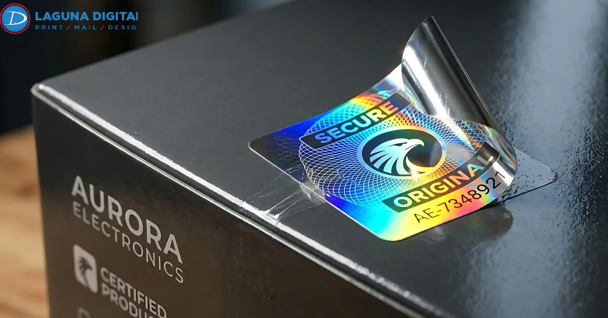
Dark artwork can look neutral on a monitor, then change on a reflective print surface. Black may pick up a steel-like sheen, deep red can feel warmer on gold, and a charcoal background may lose separation from a black logo. They come from the way ink, the metallic layer, and reflected light work together.
Predictable metallic stickers start with one decision. Choose where reflection should remain visible and where color needs an opaque base. That choice affects contrast, small type, brand color, and gradients.
Why Dark Colors Change on Metallic Stickers?
Most process color is judged over a light base. A metallic surface behaves differently because light can return through the printed color from the reflective layer below. The effect can look intentional, but it can also shift dark artwork away from the screen preview.
When planning metallic stickers, decide whether each dark area should look metallic, opaque, or somewhere between the two.
The Reflective Surface Becomes Part of the Color
Without an opaque base, the material influences the ink above it. That is why metallic stickers printing needs a material-first approach rather than a screen-first approach.
Silver stickers printing tends to keep grays, blues, and blacks visually cooler. Gold stickers printing can add warmth to browns, reds, and other dark tones. In sticker printing, the substrate is part of the color system.
White Ink Controls Where the Metal Shows
A white underbase separates selected color from the reflective layer. Color printed over that white area behaves more like color printed on a conventional light surface. Areas without white can keep more of the metallic character.
Use white under logos, barcodes, fine text, pale graphics, or important sticker colors. Leave it out where borders, patterns, or backgrounds should stay reflective.
Adobe summarizes the broader print principle well when it notes that “the combination of ink mixed by the commercial printer and the paper determines the exact appearance of a printed spot color.”
Use the White Underbase to Build Contrast
Covering everything with white can remove much of the metallic effect. Leaving everything unbacked can weaken stable color and separation.
Metallic label printing works best when opacity follows the visual hierarchy. Put white beneath information that must remain clear. Leave it out where the shine serves the design.
Decide Which Areas Need Opacity
A dark blue panel without white can gain a metallic cast. A white-backed version will usually look flatter.
The same thinking helps custom foil stickers. Reflection has more impact when it is reserved for selected details, giving the focal point more room to stand apart from the decorative finish.
Keep the Specialty Layer Easy to Read
The printer may request a mask, spot layer, or separate white separation. Follow that specification rather than guessing at naming or overprint behavior.
In CMYK printing, the process colors and specialty layer must line up with the intended result. If the design also uses transparency, clear stickers provide a useful comparison because white ink and transparent areas also have to be defined deliberately.
Screen Color Cannot Fully Predict Reflective Print
A monitor emits light. Printed color depends on ink, substrate, coating, surrounding light, and viewing angle. A screen can confirm file values, but it cannot reproduce metallic reflection.
Treat CMYK colors as print instructions rather than a guarantee that the screen and finished piece will look identical. The same caution applies to print colors placed over reflective material.
Give Dark Tones Enough Separation
A near-black logo on charcoal may look clear on a bright display because the monitor can show small tonal differences. On a reflective surface, those differences can narrow as the viewing angle changes.
Good sticker design does not make essential information depend on a tiny brightness change. Increase contrast around words, logos, and edges that must remain obvious.
Choose Black for the Intended Effect
Small black text, a broad black background, and a gunmetal effect are different print problems.
For metallic sticker printing, first decide whether black should look neutral or intentionally metallic. A white-backed black reduces the influence of the reflective layer. An unbacked black can keep more of it.
Ask for the preferred black build for the actual press and stock instead of copying a rich-black formula from another job. This matters when fine text or tight registration is involved.
Silver and Gold Shift Dark Artwork Differently
With silver sticker printing, a dark neutral can move toward cool graphite or gunmetal. With gold sticker printing, the same area can feel warmer, especially around reds, browns, and amber tones.
In metallic label printing, this is why print colors should be judged on the intended material when appearance is critical. A color value alone does not describe the finished result.
Custom foil stickers follow a similar principle. If every element competes for shine, hierarchy weakens. A strong sticker design uses opacity and reflection to direct attention.
Prepare Artwork Around the Final Material
Choose the material before the last design round. Moving from white stock to silver or gold late can change contrast, white-ink needs, and dark areas.
The custom stickers page is useful at this stage because it brings white, clear, silver metallic, and other material options into the same product workflow.
Before sending the file, check these points.
- Confirm the exact metallic material and finish.
- Mark the areas that should remain reflective.
- Mark the areas that need an opaque base.
- Review small text, thin rules, and reversed elements.
- Check the final color conversion.
- Compare neighboring dark areas for enough separation.
- Confirm bleed, cut line, and final size.
- Request a material proof when a brand color or subtle dark effect is critical.
This preparation makes metallic label printing more predictable because the intended relationship between color, white ink, reflection, and cut shape is clear.
Know When White Vinyl Is the Better Choice
Metallic stock is not automatically the best choice for every dark design. The same material decision matters across custom stickers. Photography, neutral skin tones, broad areas of controlled color, and artwork with several close tonal values can be easier to manage on an opaque white base.
For those jobs, vinyl sticker printing can be more straightforward. The vinyl stickers page shows a white vinyl format for full-color artwork where metallic reflection is not the goal.
The material should follow the visual objective. Metallic stock works when reflection adds value. White stock works when stable color carries more weight. Make that decision before vinyl sticker printing or specialty production begins.
Send a File That Makes the Result Obvious
A production file should show what is metallic, what is opaque, and what is color-critical. Include final-size artwork, proper bleed, embedded or outlined fonts, print-ready images, and the requested mask or specialty layer.
For metallic label printing, add a marked visual reference when the mask is complex. Do the same for sticker printing files with unusual transparency, dense black backgrounds, or close dark tones.
Frequently Asked Questions
Why Can Black Look Different on Metallic Stickers?
Black can look more reflective, cooler, warmer, or less visually dense when the metallic layer contributes to the finished appearance. A white underbase can reduce that influence when a flatter black is needed.
Do Dark Colors Always Need White Ink?
No. White ink helps when sticker colors need opacity or tighter visual control. Leaving it out can be correct when the metallic cast is part of the intended effect.
Can Metallic Material Match Brand Colors Exactly?
Reflective stock can change perceived color, so critical brand colors should be evaluated on the intended material. White underprinting and a physical proof can improve predictability, but the stock and finish still influence the result.
Should Artwork Be Supplied in RGB or CMYK?
Follow the printer’s file specification. Reviewing CMYK printing files and final CMYK colors before production helps reveal conversion changes and gives prepress a clearer starting point.
Are Metallic Stickers Better Than White Vinyl for Dark Designs?
Not automatically. Metallic stickers suit artwork that benefits from controlled reflection. White vinyl is often easier when neutral color reproduction, photography, or close dark tones matter more than shine.
Conclusion
Dark artwork works best on metallic stickers when the reflective layer is planned as part of the design from the beginning. Decide which areas should show metal, which areas need opacity, and where stronger contrast is necessary before production.
Review the artwork on the intended stock, confirm the white or metallic mask, and proof any color-critical area before committing to quantity. To move from artwork to production, visit Laguna Digital and submit the file with the material, finish, and reflective areas clearly identified.