


Your design looks perfect on screen but when printed it appears darker or flatter. Perhaps its hue feels too purple for its own good or the skin tones look warmer than expected or perhaps your logo that seemed crisp on screen is dull and lifeless on paper – this can be one of the biggest frustrations for businesses, designers, photographers or anyone ordering printed materials.
Screens and printers produce color differently. While a screen emits light, paper reflects it. That difference alone can alter how your eyes read color; when combined with monitor brightness, paper texture, ink limits, file settings or viewing conditions the difference becomes easier to comprehend.
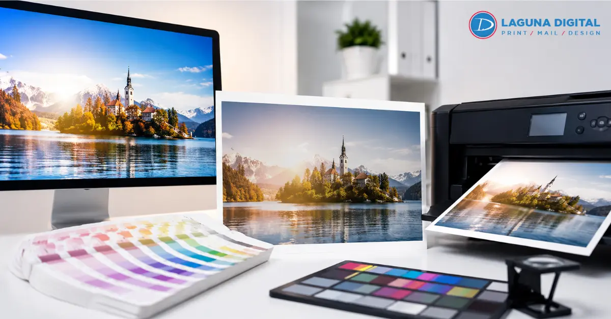
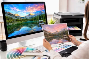
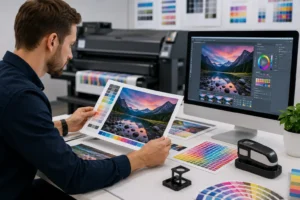
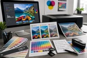
Good print results do not depend on guesswork; rather, they emerge from an orderly process, complete with clear files and reliable proofs, expert production checks and regular production inspection. That is why professional custom color printing services focus beyond simply pressing print: they manage color from its first review through production checks to completion of final pieces.
Why Does Screen Color Look Different in Print?
Screens Glow While Paper Reflects
Your monitor creates color with light. Printed paper shows color by reflecting light from the room around it. A bright screen can make colors look more intense than they will on paper. This is why digital printing colors may look lively on a display but softer once ink meets stock.
RGB Has a Wider Visual Range
The majority of screens utilize RGB, combining red, green, and blue light. Numerous printing processes utilize CMYK printing, which mixes ink on paper. RGB can display extremely bright hues that ink cannot entirely replicate. Vibrant greens, rich blues, and luminous oranges frequently require precise tuning prior to printing.
Monitor Brightness Changes Judgment
A screen set too bright can make files look cleaner and lighter than they really are. When the print arrives, shadows may feel heavy and midtones may look dull. Regular color calibration helps keep your display closer to a reliable viewing point instead of a personal preference.
Paper Stock Affects Color Depth
Glossy paper enhances the sharpness of colors as it bounces back more light. Uncoated paper soaks up more ink, resulting in colors appearing softer and warmer. High-quality digital printing services must always take into account the type of paper used, as the same design can vary when printed on different stocks.
Brand Colors Need Extra Control
Logos and campaign colors need tighter handling than casual photos. For branded printing services, a small shift in red, navy, or green can affect trust and consistency. A print provider should check profiles, proofing needs, and final output conditions before producing large runs.
Better Steps for Reliable Print Color
Start With the Right File Setup
A print file should be built with the final use in mind. Size, resolution, bleed, image quality, and profile settings all matter. Strong corporate printing solutions usually begin with a file review so color problems are caught before the job reaches production.
Use Profiles That Match Output
ICC profiles help translate color between devices, software, printers, inks, and paper. They do not make every color identical, but they guide the conversion. Reliable color management depends on choosing the right profile for the machine and material being used.
Proof Before Large Runs
A proof gives you a realistic preview before full production. It is especially useful for catalogs, signage, menus, packaging inserts, and projects where digital printing colors must stay predictable. Custom color printing services often recommend proofing when color accuracy matters more than speed.
Adjust Images for Print Reality
Photos often need small edits before print. Shadows may need lifting, saturation may need control, and skin tones may need balancing. This is where print color correction services are useful because the goal is a good printed result, not just a good looking screen image.
Keep Brand Files Consistent
Use approved logo files, official color values, and one source of truth for design assets. Branded printing services work better when teams avoid random screenshots, copied images, and mixed file versions. Clean files reduce surprises and help every order look more consistent.
Common Mistakes That Cause Color Problems
Trusting One Screen Too Much
A laptop, phone, and office monitor can all show the same design differently. None of them should be treated as the final authority without checking. Color calibration gives your screen a better baseline, but a physical proof is still the safer choice for important work.
Ignoring Paper Samples
Paper is part of the color result, not just the surface below the ink. A bright white stock can cool the design, while cream or recycled stock can warm it. Premium digital print services can guide you through sample options when the final look needs a specific feel.
Sending Low Quality Images
Images pulled from websites often look fine on screen but fail in print. They may be too small, compressed, or saved with weak color data. Good corporate printing solutions include checking image quality early, especially for brochures, posters, and sales materials.
Letting Software Guess
Automatic conversion can create unexpected shifts if the file uses the wrong settings. A printer may convert RGB to CMYK without knowing your intent. Planned CMYK printing gives the production team more control over rich blacks, neutral grays, and stable brand tones.
Skipping Expert Review
Color problems are easier to fix before printing than after delivery. Experienced print teams can spot risky gradients, oversaturated images, weak contrast, and profile conflicts. That is where print color correction services can save time, waste, and reprint costs.
Frequently Asked Questions
Why does my print look darker than on screen?
Under normal room lighting conditions, screens tend to be brighter than paper; therefore when files are judged against a highly reflective display on an illuminated display device, printed versions often look darker.
Should I design in RGB or CMYK?
That depends entirely upon the project and print provider. Many designers work in RGB for greater creative freedom before switching over carefully when printing. For optimal results, speak to your printer about which setup best meets their machine, paper stock and final product requirements.
Can printed colors ever match those seen on-screen exactly?
An exact match between printed and screen colors is sometimes not possible due to differences between light sources (screen) and paper sources (ink), however achieving an appealing and consistent outcome should always be your goal.
Why does my file print differently on different papers?
Paper brightness, coating thickness and absorbency all have an impactful influence over how ink sits on its surface, glossy sheets may produce crisp and bold images while an uncoated sheet could produce soft ones.
What should I provide my printer in order to obtain optimal color results?
Upload and send over all original design files, linked images, fonts if needed, approved logo files as well as any brand color references as well as final uses/paper selection and any past print samples you want matched up.
Bottom Lines
Screen colors will never match up precisely, but that does not have to be an unpredictable experience. By carefully setting up files and using realistic proofing sessions as well as correct profiles and color management solutions, finished pieces can look more consistent while meeting brand expectations more effectively.
For projects where color matters, work with a print team who reviews files before production and clearly outlines your options and options available to you. When ready, contact us so that we may begin by providing proofs before undertaking full runs of printed items.