


A flyer can look clean on a screen and still print soft, dull, or unclear. That is frustrating when you are promoting a sale, grand opening, menu, service, or local event. The design may look bright on a laptop, but paper tells the truth.
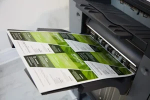
From real print work, the pattern is clear. The machine is often blamed first, but the file is usually the first place to inspect. Most blurry results begin before the file reaches the press.
The printer may be fine, but the artwork may include small images, weak logos, poor export settings, or text placed too close to the trim. Good production comes from design judgment, proper setup, and real print experience.
Why Printed Flyers Lose Sharpness?
Small Images Stretched Too Far
The most common issue is a small image enlarged beyond its limit. Photos taken from websites or social media rarely hold enough detail for retail flyer printing. If the original file is weak, the paper version will show it.
Weak Logo Files
Many businesses only have a small JPG logo saved from an old website. That file may look fine in an email, but it can print with fuzzy edges. A vector logo or large original file protects brand clarity and improves print quality.
Screen Quality Versus Paper Reality
Screens add light and smoothness, while paper shows the real file. A flyer that looks crisp on a phone can still print soft. This is why flyer print resolution must be checked at the final printed size.
Overcompressed Artwork
Files lose detail when they are saved, resized, and downloaded again and again. Edges become muddy, photos lose texture, and color can flatten. Blurry printed flyers often come from artwork passed through too many apps.
Poor Export Settings
A strong layout can fail if it is exported as a low quality file. Missing bleed, compressed images, and flattened text can all reduce sharpness. Before sending artwork to flyers printing services, save a clean print file.
Design Choices That Affect Print Clarity
Crowded Promotional Layouts
When every inch is filled with photos, coupons, icons, and long copy, the eye has nowhere to land. A cleaner layout gives the offer room to breathe and helps shoppers understand the message faster.
Low Contrast Text
Pale gray text on a light background may look stylish online, but it often prints weak. Strong contrast keeps prices, dates, and contact details readable under store lights, sunlight, and mailbox conditions.
Thin Fonts and Tiny Details
Ultra thin fonts, delicate icons, and tiny disclaimers can break down in print. Business flyer printing works best when important text has enough size and weight to stay clear after trimming.
Unclear Product Photos
Product photos should support the sale. If an image is dim, soft, or taken too far away, the promotion feels less convincing. Retail flyers need bright original photos with clean focus and natural color.
Poor Visual Hierarchy
A flyer should guide the eye from headline to offer to action. If every part looks equally important, nothing feels important. Smart flyer design printing uses spacing, size, and contrast to create order.
How to Prepare Flyer Files for Better Print Quality?
Build at the Final Size
Start with the correct width, height, bleed, and margins. Do not design small and enlarge later. A file built at final size gives the printer better information and keeps edges cleaner.
Check Image Resolution Early
A practical target for most flyers is about 300 PPI at final size. It is not magic, but it is a strong baseline. Checking flyer print resolution early prevents rush fixes right before production.
Use Better File Formats
Finished artwork is usually safer as a print ready PDF than as a compressed image. A proper PDF helps preserve layout, fonts, and image detail. Ask your print provider what file type they prefer before uploading.
Add Bleed and Safe Margins
Bleed means the color or background can go beyond the trim edge, and safe margins keep the text away from the blade. Such setup details contribute to the appearance of clean, balanced, and professional finish flyers for marketing.
Review a Proof Carefully
A proof is not just a formality. Zoom in, read every line, inspect the logo, and check the photos. Reliable flyers printing services should help spot obvious file problems before the full order starts.
Common Mistakes That Make Flyers Look Cheap
Using Web Images
Images copied from websites are usually too small for clean production and may create usage concerns. For stronger retail flyer printing, use original photos or properly licensed high quality files.
Ignoring the Real Reader
People usually glance at a flyer for a few seconds. The offer, deadline, location, and next step should be clear fast. A focused layout respects the reader and helps retail flyers earn a better response.
Choosing Price Over Outcome
Low price matters, but poor results can weaken the promotion. The right team should offer material guidance, artwork review, and consistent output. Better decisions protect the business image.
Forgetting Paper Choice
Paper changes how color and detail appear. Smooth coated stock often makes photos feel cleaner, while uncoated stock can look softer. Quality flyer printing depends on matching paper to purpose.
Skipping Local Print Advice
A trained print team can catch low resolution logos, missing bleed, weak contrast, and risky margins quickly. Digital printing services are useful when deadlines are tight and print quality still matters.
Final Print Checks Before Ordering Flyers
Examine Your Logo and Photos: Inspect the final file at full size to inspect its logo, product images, and background details. If any artwork appears smudgy on-screen, its sharpness won’t improve with printing.
Read the Flyer Like a Customer: Step back and look at the page from a normal distance. The main offer should be clear without effort. Strong marketing flyers do not make readers hunt for the price, phone number, or address.
Confirm the Final File: Make sure the approved file is the file being printed. Old drafts, resized copies, and screenshots can easily get mixed up. Careful file control protects flyer design printing from avoidable mistakes.
Match Quantity With Method: Short runs, urgent sales, and seasonal campaigns often need fast production. Larger campaigns may need more planning and paper options. Digital printing services can help when timing is tight.
Storage of Clean Brand Assets: A folder with approved logos, colors, photos, and past print assets. This can save time, create consistent business flyer printing, and allow each new promotion to start with better material.
Frequently Asked Questions
Why do my flyers look blurry after printing?
Flyers usually appear blurry when a design file consists of almost all pixel graphics, which includes small images, weak logos, or very fine text. In the case of graphic art, it is usually not the machine that we find fault with.
What image quality should I use for a flyer?
Use clear photos at the final print size. Around 300 PPI is a strong practical target for standard flyers, but the original photo still needs good focus, light, and detail.
Can a blurry flyer file be fixed?
Sometimes it can be improved, but not always. A low quality photo cannot be fully restored after detail is lost. The best fix is to replace weak images with sharper originals.
What type of file is best for flyers?
A print ready PDF is usually the safest final file because it helps preserve fonts, spacing, layout, and images. Your print provider may also share specific upload instructions.
Does paper choice affect flyer sharpness?
Yes. Coated paper often makes photos and colors appear cleaner, while uncoated paper can feel softer. The right choice depends on the offer, budget, quantity, and brand style.
To Sum Up
Sharp promotional flyers are not created by luck. They need strong images, readable type, correct file setup, smart paper choice, and careful proofing. When these details work together, quality flyer printing can help a business look more trusted and professional.
Hire Laguna Digital to get sharp flyer printing from the first copy to the last copy. Our team offers a pre-flight service, which checks your artwork for image quality, bleed settings, logo clarity, and other potential pitfalls before you place your flyer order.