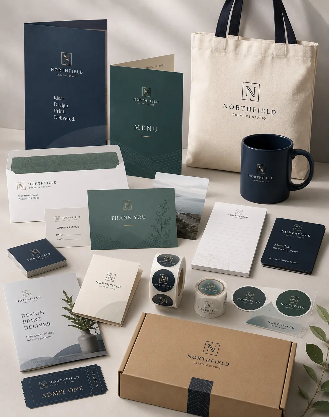


A card gets judged faster than most people admit. Someone takes it from your hand, bends it a little without meaning to, glances at the color, then decides whether it feels worth keeping. That moment is quiet, but it matters. Business cards do more than share a phone number. They give a tiny sample of how careful the business is.
After seeing many files come through print counters, the weak ones usually have the same problems. The stock feels thin, the logo came from a website, the text sits too close to the edge, or the finish does not match the service. Good business card design is not about making a loud piece. It is about making a small card feel settled, clear, and useful.
Business Card Materials That Influence First Impressions
Thin Stock Feels Forgettable
A thin card gives itself away as soon as it bends. Better paper stock for business cards gives the piece a steadier feel, especially when it is handed over after a quote, consultation, or first meeting. Weight is not everything, but it is the first thing people feel.
Weak Paper Gets Tired Fast
Cards live in wallets, drawers, reception bowls, and glove boxes. Poor paper quality for business cards starts to curl or pick up dents too quickly. A stronger sheet keeps the card looking decent after it has been carried around for a few days.
Flat Coating Can Kill Color
Some printed business cards look fine on screen and dull on paper. The coating may be too plain for the ink, or the paper may absorb more color than expected. Dark backgrounds, red logos, and photo areas usually show this problem first.
Finish Should Fit The Mood
Matte business cards suit brands that want a quiet, clean, and steady feel. They also reduce glare, which helps small names and numbers stay readable. Gloss can work beautifully for food, events, or photo heavy layouts, but it has to earn its place.
Texture Should Not Feel Random
Texture is useful only when it makes sense. Luxury business cards should feel intentional in the hand, not decorated just to look expensive. A soft surface, raised detail, or heavier stock works best when it feels connected to the service being offered.
Design Mistakes That Make Cards Look Cheap

Crowded Layouts Feel Rushed
A card should not carry the whole website on one side. Strong round card design gives the name, logo, and contact details room to sit properly. When every corner is full, the piece feels nervous. When there is space, it feels more confident.
Tiny Text Causes Friction
People read cards while standing at a counter, leaving an appointment, or walking away from a booth. Visiting cards need a type that can be read quickly. If the phone number, email, or address needs effort, the design is already making the customer work.
Weak Contrast Hides Details
Pale gray text on a soft background can look stylish in a mockup, then fade after print. need clear contrast for names, websites, QR codes, and phone numbers. A pretty layout fails if the basic details are hard to read.
Bad Logo Files Show Up
A logo pulled from a small web image almost always prints with soft edges. Premium business cards cannot hide a blurry brand mark. If the logo is clean, the entire piece feels sharper. If it is fuzzy, the card looks cheaper right away.
Empty Space Does Real Work
Good business card design often depends on restraint. The eye needs a clear path from the name to the service and then to the contact detail. Empty space is not wasted space. On a small card, it is what keeps the layout calm.
Business Card Printing Setup Mistakes That Ruin Quality
Bleed Keeps The Edge Clean
Tiny white lines near the edge usually mean the file was set up without enough bleed. Proper business card printing lets color and images extend past the trim area. That extra space helps the cut look clean, even when trimming moves a little.
Color Needs Print Thinking
Screens glow, paper does not. That is why printed business cards can look different from the laptop version. Good print setup helps protect brand colors, product photos, dark backgrounds, and skin tones from looking muddy once ink hits the sheet.
Tight Borders Make Errors Obvious
Thin border lines look neat until the cut shifts slightly. Custom business cards often look better when frames, text, and important details sit away from the edge. A safer margin makes the final piece feel steadier and less like a rushed batch.
Special Finishes Need Control
Foil, soft touch, raised gloss, and extra thick stock can all look strong. Premium business cards feel more refined when one finish leads and the rest of the layout stays simple. Too many effects can turn a nice card into a noisy one.
Proofing Saves The Order
Proofing is where small problems get caught before money is wasted. Luxury business cards need this step because small details decide the final feel. Margins, spelling, logo sharpness, QR placement, and color balance all deserve one last careful look.
Tips To Create Business Cards People Actually Keep

Match Stock To The Customer: A contractor, realtor, dentist, boutique, and salon do not need the same feel. Paper stock for business cards should match the setting where the card will be used. A sturdy card helps the service feel more reliable before a customer makes contact again.
Pick A Finish People Can Use: A shiny finish is not always the better option. Matte business cards are practical when people may write appointment times, quick notes, or names on the surface. The best finish looks good and still works in the real world.
Keep The Message Narrow: Visiting cards are not flyers. They should make the name, role, contact path, and one clear brand idea easy to catch. When the message is focused, the card feels cleaner and has a better chance of staying in someone’s wallet.
Check The Design At Actual Size: A screen can hide small print issues because everything looks larger while designing. Good business card design should be reviewed at final size. Tiny text, crowded corners, weak contrast, and awkward spacing become much easier to notice before printing.
Frequently Asked Questions
Why Do Some Cards Feel Cheap?
They usually feel cheap because the stock is too thin, the coating is weak, or the artwork was not prepared for print. Most weak cards are not ruined by one thing. Several small choices usually add up.
Is Thicker Stock Always Better?
Not always. Thickness helps, but the card still needs clean spacing, readable type, sharp artwork, and the right finish. A heavy card can still look poor if the design feels crowded.
What Finish Looks Most Professional?
A smooth matte or soft touch finish often works well for service brands and local companies. Gloss can work for photo based designs, but it may create glare on small types or fine details.
Why Does My Card Look Dull After Printing?
The file may use low quality images, weak color setup, or paper that absorbs too much ink. A proof can show those issues before the full order is printed.
How Can A Simple Card Feel More Expensive?
Use stronger stock, clean spacing, sharp logo files, and readable contrast. Simple cards feel expensive when the details are controlled instead of crowded.
Nutshell
A cheap looking card usually comes from thin stock, weak artwork, crowded spacing, dull color, or a finish that does not fit the business. Strong business cards feel clear, steady, and easy to keep because the details work together. If your card feels too light, too plain, or not polished enough.
However, Laguna Digital can help you choose better materials, review the file, and create cleaner results with business card printing that supports a stronger first impression.