

A business card still has one basic job: to help another person remember a business and know what to do next.
What has changed in 2026 is the way print supports that job. Instead of filling a small card with multiple design effects, businesses are paying more attention to material, typography, useful QR destinations, controlled color, and formats that suit the way customers interact with the brand.
That shift makes sense. A card is handled at close range. Poor spacing becomes obvious. Weak contrast becomes difficult to read. Cheap-looking stock can undermine an otherwise professional identity. On the other hand, a simple design on the right material can feel deliberate and memorable.
The most useful 2026 trends follow that idea. They improve recognition, usability, or follow-up rather than adding decoration for its own sake.
Business Card Trends: How The Card Will Be Used
The most important business card trends are not specific fonts, colors, or finishes. They are changes in how businesses think about the printed piece before designing it.
A photographer needs a different result from a plumber. A financial adviser may care about trust and material quality, while a restaurant may want customers to scan a code and make a reservation.
That context should shape every later decision.
Start With The Recipient
Before working on business card designs, decide what the recipient should understand within a few seconds.
The company name, person’s name, role, and most useful contact method usually need the clearest hierarchy. Secondary information can sit lower in the layout.
This keeps the design focused and prevents a small card from becoming a miniature brochure.
Define The Next Action
The card should also make the next step obvious.
That may mean calling, booking, visiting a portfolio, requesting an estimate, saving contact details, or visiting a location.
Once that action is clear, choices involving business card layout, stock, QR placement, and format become easier to justify.
Premium Stocks And Tactile Finishes Are Becoming More Intentional
Physical texture has become one of the clearest ways print can offer something digital contact sharing cannot.
Premium business cards often rely on paper feel, weight, and surface treatment before decorative artwork enters the discussion.
Stock Changes Perceived Quality
A heavier stock can make a simple card feel more substantial. Uncoated paper provides a softer, tactile surface and can be useful when someone needs to write notes or appointment details.
Smooth coated stocks work better when photography, deep color, or sharp graphics need a cleaner surface.
Businesses using a traditional format can compare standard business cards first, then decide whether an upgraded stock genuinely improves the presentation.
Finishes Need One Clear Job
Business card finishes such as foil, spot gloss, embossing, debossing, and soft-touch coating work best when they support one focal point.
A foil logo may already provide enough visual interest. Raised gloss can highlight a mark or pattern. Embossing can add texture without introducing another color.
Using several effects at once often reduces clarity rather than increasing perceived quality.
Typography And Layout Are Becoming Cleaner
Modern business cards increasingly rely on typography instead of decorative graphics.
That does not mean every card needs to look minimal. It means the information hierarchy should remain obvious even when the design has personality.
Hierarchy Improves Scan Speed
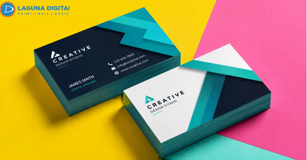
A good business card layout helps the eye move naturally from identity to contact information.
The name or company usually carries the most visual weight. Job title, phone number, email address, and supporting information should follow in a clear order.
Creative business cards can still use oversized typography, unconventional alignment, or strong contrast, but those choices should not make essential information harder to find.
Actual Size Reveals Design Problems
A design that looks comfortable on a large monitor may feel crowded once reduced to its final size.
Print a draft at 100 percent scale.
Small type, narrow line spacing, fine rules, and weak contrast become much easier to judge when the artwork is viewed at the size the customer will actually hold.
Designs using full-edge backgrounds should also account for trim and safe areas. The full bleed setup guide explains how those areas affect the finished piece.
QR Codes Are Becoming More Useful And Less Decorative
QR codes are now common enough that simply placing one on a card no longer makes the design modern.
Their value depends on where the scan leads.
Specific Destinations Convert Better
Printed business cards become more useful when the QR destination matches the customer’s next likely action.
A salon can link to appointments. A contractor can open an estimate request. A photographer can send prospects to a selected portfolio. A realtor can direct people to current listings.
This removes steps from the follow-up process.
Placement Affects Scanning
A QR code needs clean space around it and strong contrast against the background.
Avoid placing it over detailed photography, textured graphics, or reflective finishing.
The code should also be tested from the printed proof, not only from the screen.
That check becomes especially important before bulk business card printing. A broken or incorrect destination becomes expensive when repeated across a large order.
Unique Shapes Work Best When They Match The Brand
The standard U.S. business card size remains popular because it fits wallets, cardholders, and familiar networking habits.
Different shapes can work well, but only when the design naturally fits the format.
Square Cards Support Compact Visual Branding
A square business card works well with centered logos, photography, icons, and compact compositions.
Designers, photographers, beauty businesses, boutiques, galleries, and creative studios can often use the proportion effectively.
The format becomes harder to manage when too much contact information is forced into the available space.
Brands whose identity already works in balanced proportions can consider square business cards rather than adapting square artwork to a rectangular card.
Round Cards Favor Simple Information
A round business card requires a different composition because the corners no longer help organize the layout.
Circular logos, monograms, food brands, hospitality businesses, beauty services, and events can suit the shape particularly well.
Keep information concise and work from the center outward.
For brands built around circular visual elements, round business cards provide a format that supports the identity instead of treating the shape as a novelty.
Brand Color Systems Are Replacing Random Trend Palettes
Business card colors should strengthen recognition before they reflect fashion.
A color that appears frequently in annual trend reports is not automatically appropriate for an established brand.
Controlled Variation Keeps Cards Fresh
One useful approach is to build several cards from the same approved palette.
Different teams, services, or locations can use different brand colors while keeping typography, logo placement, and overall structure consistent.
This creates variety without making the cards look unrelated.
Print Contrast Matters More Than Screen Contrast
Colors behave differently in print than on bright displays.
Light text may lose strength on warm or textured stock. Tiny reversed text can become harder to read against dark backgrounds.
Reviewing a physical proof under ordinary indoor lighting gives a more realistic picture of how customers will see the piece.
Magnetic Cards Serve A Different Retention Goal
Some printed pieces are designed for the first meeting. Others are designed to remain visible afterward.
Business cards magnets fall into the second category.
Repeat-Service Businesses Benefit Most
Magnetic cards can work particularly well for businesses customers may need again, such as home repair, restaurants, clinics, maintenance providers, pet services, and local service companies.
The design should emphasize recognition and contact information rather than fine decorative detail.
A customer viewing the card on a refrigerator should be able to identify the business and find the phone number quickly.
For that type of long-term visibility, business card magnets can offer more practical value than an expensive specialty coating.
Print Preparation Determines The Final Quality
Even the strongest business card styles can fail when the production file has technical problems.
Bleed, image resolution, safe areas, borders, and text size deserve the same attention as the visual concept.
Bleed And Safe Areas Protect The Layout
Background colors and images intended to reach the edge should extend beyond the trim line.
Important text and logos should remain safely inside the cut area.
This prevents small trimming variations from creating unwanted white edges or making the layout appear uneven.
Preflight Prevents Expensive Errors
Before approving printed business cards, check the final exported file rather than only reviewing the editable design.
Names, titles, phone numbers, email addresses, URLs, QR destinations, image quality, and spelling all need a final review.
For larger quantities, the 500 business card preflight checklist provides a practical final check before production begins.
A five-minute review is much cheaper than reprinting hundreds of cards.
The Best 2026 Trend Depends On The Business
There is no single format or finish that works equally well for every company.
- High-volume networking usually benefits from a standard format, clear typography, and durable stock.
- Luxury services can justify premium business cards with heavier materials or restrained specialty finishing.
- Visual brands may benefit from a square business card or image-led composition.
- Businesses with circular logos or simple centered identities can consider a round business card.
- Repeat-service companies may gain more value from business card magnets than from expensive finishing.
- Teams ordering business card printing in volume should standardize fonts, spacing, logo placement, business card colors, and contact fields before creating individual versions.
The trend is useful only when it improves recognition, usability, or follow-up.
FAQs
What Business Card Trends Matter Most In 2026?
Tactile stocks, cleaner typography, purposeful QR codes, controlled color systems, specialty finishes, and carefully selected alternative shapes are among the most relevant directions. The right option depends on the brand and how the card will be used.
What Is The Standard Business Card Size In The United States?
The common U.S. business card size is 3.5 by 2 inches. It remains practical because it fits most wallets and cardholders while providing enough room for essential information.
Are QR Codes Still Useful On Business Cards?
Yes. They work best when they lead directly to something useful, such as a booking page, portfolio, estimate form, menu, digital contact profile, or current listings page.
Which Business Card Finishes Look Most Professional?
There is no universal best finish. Matte works well for restrained layouts, gloss can support photography and saturated color, uncoated stock provides texture and writability, while foil and spot treatments can support premium positioning.
Are Square And Round Business Cards Practical?
They can be. Square formats work best with compact visual layouts, while round formats suit simple centered compositions. Businesses with substantial contact information may find standard rectangular cards easier to organize.
Final Verdict
The best trends do not make a card more complicated. They make it more appropriate.
Start with the person receiving it. Decide what they need to notice first and what action should follow. Then select the stock, shape, typography, color, finish, and digital features that support those goals.
Before placing the final order, view the artwork at actual size, test every QR destination, proof every contact detail, and check the production file carefully.
When the design is ready to move from screen to print, Laguna Digital offers business card printing across standard and specialty formats, helping turn finished artwork into a physical piece that is clear, useful, and worth keeping.