


A design that looks clear on a laptop can become difficult to read once it is installed across a parking lot or above a storefront. Distance reduces fine detail, sunlight changes contrast, and people rarely stop long enough to study a crowded message.
That is why an effective banner should be planned around the place where people will actually see it. Viewing distance, traffic speed, mounting height, background color, and available reading time all affect what will work.
The goal is simple. A person should understand the main message before smaller details demand attention. The following process explains how to build that clarity into the artwork before it reaches production.
Banner Design Should Start With the Viewing Distance
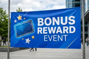
The most important decision is not the color or photograph. It is how far away the audience will be when the message first needs to make sense.
A storefront promotion may be read from the opposite side of a parking lane. A trade show display may be noticed from the end of an aisle. Roadside advertising has an even shorter window because the viewer is moving.
A common starting point is roughly one inch of visible letter height for every ten feet of comfortable viewing distance. It should be treated as a practical guide rather than a fixed rule because speed, lighting, angle, and typeface can change the result.
| Approximate Viewing Distance | Starting Letter Height | Common Setting |
| 20 feet | 2 inches | Lobby or sidewalk |
| 30 feet | 3 inches | Storefront |
| 50 feet | 5 inches | Parking lot or event entrance |
| 100 feet | 10 inches | Roadside or large venue |
When planning custom banner printing, establish this distance before deciding how much information the artwork can carry. Businesses compare signs and banners services while deciding how the finished piece will be installed.
Viewing Distance and Letter Height
A larger surface does not automatically improve readability. If too much copy is added, the designer often reduces the lettering simply to make everything fit.
That defeats the purpose of increasing the banner size.
Start with the headline at a scale that works from the intended distance. Add supporting information only after the main message remains comfortable to read.
Reading Time and Message Length
A person walking through an event may have several seconds to look. A driver may have only a moment.
That difference should change the amount of text.
Moving audiences need shorter headlines, fewer supporting details, and a simpler call to action. Stationary audiences can handle slightly more information because they have time to move closer.
Clear Message Hierarchy Improves Banner Readability
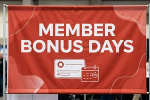
Once viewing distance is established, the next step is deciding what should be noticed first.
A useful layout normally has three levels. The headline communicates the main idea. A supporting line adds necessary context. The final element tells the reader what to do next.
Problems appear when the phone number, offer, logo, web address, date, and headline are all given equal visual weight. Nothing leads the eye.
Good banner readability comes from making the importance of each element obvious before the viewer begins reading.
Headline Priority
The headline should communicate one idea.
A grand opening display does not need to explain every service the business offers. An event entrance does not need to carry the complete schedule. A promotional display does not need several offers competing for attention.
Choose the message that matters most and let the remaining details support it.
This principle reflects Dieter Rams’ well-known design idea, “Less, but better.”
For long-distance graphics, removing unnecessary information can often improve communication more than adding another visual element.
Supporting Information
Secondary copy should answer the next obvious question.
That may be a date, discount, location, phone number, or short web address. If the information does not help the reader understand or act on the message, it probably does not deserve prominent space.
This is especially important in business banner printing because commercial designs often become crowded when every department wants one more detail added.
Banner Typography Should Stay Simple at a Distance

After the message hierarchy is settled, typography determines how quickly the words can be recognized.
Bold sans-serif typefaces are often dependable because their shapes remain clear at larger viewing distances. Very thin strokes can lose definition, while narrow decorative fonts may force the reader to spend longer identifying individual letters.
Banner typography should also have enough spacing to keep words from visually merging.
Letter Shape and Weight
Two fonts set at the same point size can look completely different when printed.
One may have tall capital letters and open counters. Another may have narrow forms and smaller visible letter height.
This is why banner font size should be judged using the actual typeface rather than relying only on the number shown in design software.
The weight matters as well. Heavy enough strokes remain visible from farther away, but extremely thick lettering can close the internal spaces of smaller characters.
Spacing and Line Length
Banner text size is only one part of readability.
Letters placed too tightly together become harder to separate. Long headlines also force the eye to travel farther across the surface.
Shorter lines generally give the designer more freedom to increase letter size and preserve white space.
For large format banners, that extra breathing room becomes particularly valuable because people often see the design from several different angles.
Strong Contrast Keeps the Message Visible
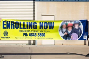
Once the type is readable, the next question is whether it separates clearly from the background.
Dark lettering on a light background and light lettering on a dark background are reliable starting points. Problems occur when text and background colors have similar brightness.
Two colors may look attractive next to each other on a monitor but lose separation outdoors.
Background and Environment
Outdoor banner design should consider what sits behind the finished display.
A pale layout can disappear against a bright concrete wall. Dark graphics may lose impact in a shaded area. A detailed photograph can interfere with lettering placed over it.
Before approval, convert the artwork to grayscale. If the headline becomes difficult to distinguish, the light and dark values are probably too similar.
Material also changes the final appearance. For storefronts, events, and general promotional installations, reviewing available vinyl banners before final artwork approval can help align the design with the intended surface and finishing.
Image Control
Photography should support the message rather than compete with it.
One strong image often performs better than several smaller pictures. When text is placed over photography, use an area with little visual detail or create enough separation between the image and the lettering.
Printed banners already compete with buildings, vehicles, signs, and people in the surrounding environment. The artwork does not need to add another layer of visual noise.
Banner Size and Material Should Match the Installation
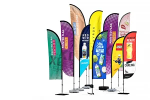
Design decisions should not be separated from production decisions.
A display attached to an indoor wall has different requirements from one stretched across an exposed fence. The second location may face wind, sunlight, rain, and movement that the first never encounters.
That changes both the material and the artwork.
Solid Vinyl Applications
Vinyl banner printing works well for many storefront promotions, indoor events, walls, temporary campaigns, and general business displays.
Solid material provides a continuous printing surface, which supports photographs, strong color fields, and detailed graphics.
The installation method should still be confirmed before export because grommets, hems, or pole pockets reduce some of the usable space near the edges.
Mesh for Exposed Locations
Outdoor banner printing on open fencing needs greater attention to wind.
Mesh material allows air to pass through small openings in the surface, making it useful for certain exposed installations. The perforation also means very fine detail can appear less defined than it would on solid material.
For locations where airflow is an important consideration, mesh banner printing can be evaluated before the final artwork is built.
That decision should happen early so the designer can use larger lettering, cleaner graphics, and stronger visual separation where necessary.
Production Details Should Be Planned Before Export
A strong layout can still fail when important information sits too close to finishing areas or when low-resolution artwork is enlarged beyond its limits.
Production checks should therefore be part of the design process rather than something left until the final minute.
Safe Area and Finishing
Banner dimensions should leave comfortable space around logos, headlines, and contact information.
Grommets occupy the perimeter. Pole pockets require additional material. Hems reinforce the edge.
None of these finishing methods should interfere with essential content.
For large banner printing, the effect becomes more noticeable because small alignment problems are magnified across a larger physical surface.
Artwork Quality
Vector logos and vector text can scale cleanly without becoming pixelated.
Photographs and other raster images need enough effective resolution at their final output size. Enlarging a small web image across several feet can produce visible softness or pixelation.
Banner printing files should also follow the printer’s current requirements for color setup, bleed, file format, and finishing.
Real World Testing Reveals Problems a Screen Can Hide
The final check should imitate the way people will actually see the finished piece.
A full design viewed from two feet away on a monitor does not reveal whether the headline will work from across a parking lot.
Reduce the artwork on screen until it occupies roughly the same portion of your field of view that the finished display will occupy at the installation site.
Then look away and glance back for only a few seconds.
If the main message is not immediately clear, something still needs improvement.
Distance Proofing
A printed scale proof offers another useful check.
Place it across a room and ask someone unfamiliar with the project what they notice first. Do not explain the design beforehand.
If the person struggles to identify the headline or call to action, adjust the hierarchy before production.
Retractable displays require a slightly different approach because viewers can usually come closer. A retractable banner display can support more supporting information, but the upper section should still communicate the primary message from across an aisle.
Final Layout Decisions Should Reflect the Location
A storefront, convention hall, school event, roadside fence, and sports venue should not use the same information density.
At a storefront, people may approach from several directions. At an event entrance, the name and directional information matter most. Near moving traffic, only information that can be understood quickly deserves prominent space.
That is why banner visibility should be evaluated at the installation site whenever possible.
Check the viewing angle, background, nearby signs, sunlight, mounting height, and distance before final production.
These practical observations usually provide better answers than designing around a standard template alone.
What Banner Font Size Works From 50 Feet?
About five inches of visible letter height is a useful starting point for comfortable stationary viewing at 50 feet. Increase the size when traffic is moving, lighting is weak, the viewing angle is difficult, or the background is visually busy.
Which Banner Dimensions Work Best for a Storefront?
The best banner dimensions depend on available mounting space, viewing distance, and message length. Choose dimensions that allow the main words to remain large rather than selecting a size first and shrinking the text to fit.
What Improves Outdoor Banner Design?
Effective outdoor banner design combines strong contrast, large lettering, short copy, controlled imagery, adequate spacing, and material suited to the installation. Sunlight, viewing angle, mounting height, and surrounding visual clutter should also be considered.
Are Large Format Banners Suitable for Events?
Large format banners work well for entrances, stage areas, directional displays, sponsor graphics, and promotional spaces. The amount of information should depend on how far away attendees will be and whether they are walking past or stopping to look.
How Should Banner Readability Be Tested Before Printing?
Use a distance test, scaled proof, and short viewing test. Ask someone unfamiliar with the design to identify the headline and call to action within a few seconds. If either is difficult to find, simplify the layout before production.
Bottom Lines
Good custom banner printing is not simply a matter of enlarging artwork. The strongest results come from planning the viewing distance first, controlling the amount of information, establishing a clear hierarchy, choosing the type that survives distance, building enough contrast, and matching the material to the installation.
Printed banners should communicate before the viewer has time to analyze the design. For business banner printing, large banner printing, event graphics, storefront promotions, or other display needs, finalize the message around the location where people will actually see it. Once the artwork, dimensions, and installation requirements are clear, Laguna Digital can help turn that planning into a production-ready display.