A label may look the right colour, have a great logo, the right typography etc and it just doesn’t feel right, there is something off. Sometimes a very thin line that surrounds the art work is the issue. It is a confining line that isn’t really necessary for the rest of the design.
This is especially prominent on small bottles, cosmetic bottles, candle jars, and food packaging. If there are multiple elements already vying for space in a limited area, an outline may make the space seem constricted. It’s removing it that makes the typography, background and product imagery more room for collaboration.
It doesn’t mean that borders are irrelevant or not appropriate for each brand. A framed design can look great even if there’s a clear purpose behind the framing. The choice of making the decision will rely on the packaging, the artwork, and the way that the information is thought to be read by the consumer.
When choosing a packaging update, it is important to know when to take that extra line out of the label to make a difference to the finished look.
Why Borders Sometimes Make Packaging Look Crowded
Border is a visual element, and is always a stroke, even if it’s a thin one. It grabs the attention and provides a distinct line around all of its contents. This can be helpful for when the design requires structure. However, with a logo, product name, and background all establishing a pre-existing visual order, a frame might just be redundant in conveying information that the artwork already does.
Think of a small bottle of skin care – cream colored background, dark typography, simple botanical drawing. The rectangular frame which surrounds all three elements, adds one more shape in a restricted area. Once it is off the screen, the illustration and the product’s name are the principal focus of attention.
This may not be as extreme as it sounds, but it can make a difference to the way that the whole package tastes.
Consider unframing when:Unframing can help in the following instances:
- Less visual competition. The product brand and information is given more emphasis.
- A more open layout. There is some space for background colours and pictures to bleed out.
- Efficient use of the limited space. The small packaging can’t carry another decoration.
- A regular look and feel. This design can be transferred from one size to another and different variations of the product.
Effective product packaging is not about the minimum amount of elements. It’s about retaining the elements that can be useful.
Which Products Benefit Most From a Borderless Look?
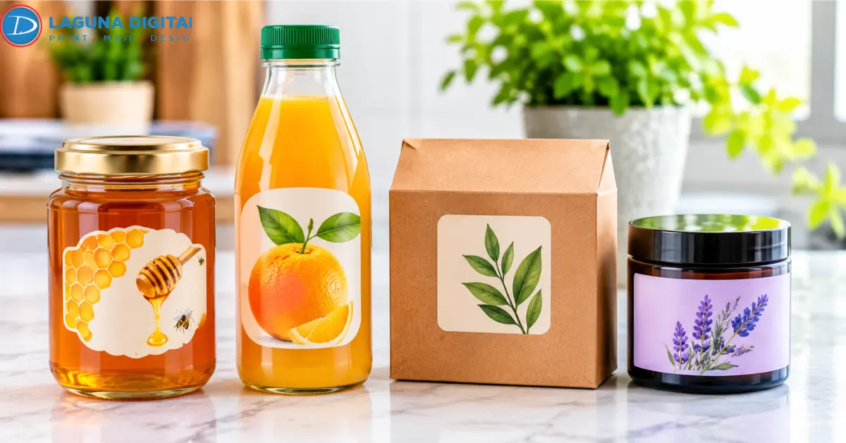
A borderless layout is effective only if it is a product and its container. The same piece of art can look completely different on a glass bottle as opposed to a flexible pouch or even a paper jar label.
Skincare and Beauty Products
Typography is carefully arranged, there are restricted colours and a short description used in skincare packaging. If the label offers ingredients, directions and product information, an unnecessary frame can make the small bottle feel cramped. A more basic design gives more emphasis to the brand name without fighting for attention with an elaborate border.
A face bottle, for instance, could have a light-toned background, a tiny logo and the product name placed more towards the center. It’s possible to have a surrounding frame but not the majority of the space.
Food and Beverage Packaging
Illustrations, photographs or changes in color are commonly used to convey the content of jars of food, sauces, specialty beverages, and bottled goods. An outline that is clearly visible can break up an illustration that otherwise would flow towards the edges. Its removal can create a sense of connection between the artwork and the packaging.
The bottle or jar may be visible without the use of a solid background (clear stickers). Planning is required when working with transparent material, however, as the light colour artwork needs to be underlined with a white ink to be visible against the product in the inside.
Candles & Home Fragrance
Glass and dark-coloured containers are often used to make candle jars, and the packaging colours are often muted. The large frame can also sometimes clash with the typography, or the design may seem too formal.
If the design is more restrained, the use of spacing, the right typeface and a small illustration can help to identify the product. It is the container itself that is important. What looks well balanced when displayed on a flat screen can be very different when displayed on a curved jar.
Borderless Design and Full-Bleed Printing Are Not the Same
One of the most significant differences to understand prior to submitting artwork for production. A borderless design is one in which there is no apparent frame around the picture. When an artwork goes beyond the final trim line, so that the printed background extends to the cut edge, it is printed using full-bleed printing. Full bleed is not required for a label to be considered borderless.
For example, a white label design with a black logo in the middle and a lot of white space. There is no enclosing line, but the artwork does not extend to the edges. It’s a no-border design.
Now think of a label that has a green background and is completely covered. The green color must be extended to the specified printer bleed if this color is to be printed to the finished edge.
| Design type | Main characteristic | Suitable application |
| Borderless layout | No visible enclosing outline | Simple logos and typography |
| White-space layout | Open areas remain around the artwork | Skincare and premium packaging |
| Full-bleed layout | Background artwork extends beyond the trim | Photographic and colored backgrounds |
| Framed layout | A visible outline surrounds the design | Structured, traditional packaging |
When preparing product labels printing files, use the actual production template rather than assuming that every printer follows the same bleed measurement.
Five Design Decisions That Make Borderless Labels Work

Just because an outline is removed doesn’t automatically make for a good design. The other elements must be carefully laid out, especially if the available printing space is limited.
Give the Product Name a Clear Position
Customers should not be forced to look for the product name, among decorative elements. Once you know which information is most important, you can sort the artwork.After determining which information should be emphasized, you can prioritize the artwork.
With a coffee package, it could be the brand name and roast type. It could be the name and purpose of a cosmetic product for a cosmetic bottle. Use secondary information in a supporting role. This helps to give a natural reading order without the need of a frame to organize the material.
Pay Attention to Typography and Spacing
With the borderless layout, the typography has to take over more of the load. Use fonts that will be legible at the printed size. If the lettering is very fine it will appear nice when viewed from a big monitor but it would be hard to read in a small bottle.
Provide sufficient space between the logo, product name and supporting information. Packing all these things into one small box is not what the elimination of the frame is all about! One tests it by printing it out at the size it will be used. The ability to view it only at a larger screen setting can mask any readability issues.
Let Background Colors Do Some of the Work
There’s more than one type of frame for separating design elements. Color contrast can set up clear divisions without adding an additional outline. Sometimes, a cream background with dark lettering may require no embellishments or trims.
If you have a product variant, use a small accent colour to distinguish it. Different colours can be used to differentiate a fragrance, flavour or product type and maintain the overall layout. The outcome should be cohesive throughout the product line and not seem disjointed.
Design Around the Actual Container
Not all problems that manifest after applying the artwork can be seen in the artwork preview. Bottles, tapered jars and narrow containers can warp the look of a design. A logo that is just right in the middle of a flat file might get a bit off-center when wrapped around a bottle.
Always check artwork to the actual size of the container before printing the product label. Be sure to carefully watch the seam, curved edges, and any overlapping label areas.
Keep Essential Details Away From the Trim Edge
This is where the preparation for the production of the artwork is important. Important information should be within the safe area; the background may extend to the bleed area. Avoid placing the brand name, barcode, product identity, and necessary labeling information near the cutting edge.
A thin frame set too close to the edge can also show up some cutting inconsistencies. If the design does not require this line, the removal of this line may avoid an uneven look of the outline.
Choosing the Right Label Material for the Design
The material affects how the finished artwork looks and performs. A beautiful design may not produce the intended result if the selected stock is unsuitable for the container or its storage conditions.
For example, a refrigerated beverage has different requirements from a candle displayed on a retail shelf.
Here are some considerations worth reviewing before ordering.
- Paper stock. A practical choice for many indoor applications where a traditional paper appearance is preferred.
- White film. Provides an opaque background for designs that need consistent color presentation.
- Clear BOPP. Allows the container or product underneath to remain visible. Laguna Digital offers clear material options for this type of presentation.
- Metallic material. Introduces a reflective appearance, although the artwork should account for the underlying finish.
Businesses considering sticker labels printing should also check adhesive compatibility, application conditions, moisture exposure, and the container surface.
The available options can be reviewed through custom stickers printing range, which includes different formats and material choices.
What to Check Before Sending Artwork for Printing
A design can look finished on screen and still encounter problems during production. A few checks before ordering can prevent unnecessary revisions.
Check the final dimensions. Confirm the width, height, and shape against the actual container. Do not estimate the size from a product photograph.
Review the bleed and safe area. Follow the printing provider’s template. Keep essential text and logos inside the recommended safe area.
Check image quality. Use suitable high-resolution artwork. Enlarging a small image can produce soft edges and visible pixelation.
Review transparency settings. Clear stock needs particular attention. Decide which areas should remain transparent and whether white ink is required beneath light-colored elements.
Request a physical proof when appropriate. A printed sample can reveal color, positioning, and readability issues that are difficult to judge on a monitor.
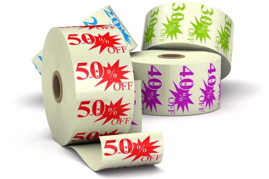
For businesses using roll formats, the application direction also matters. Roll sticker printing includes material and unwind-direction selections, making it important to consider how the labels will be applied during packaging.
Common Mistakes That Can Ruin a Borderless Label
Some problems have little to do with the design concept itself. They happen because the artwork and production requirements were not considered together.
Watch out for these mistakes.
- Extending text or logos into the bleed area.
- Using a transparent background without checking how white elements will appear.
- Selecting material without considering moisture or the container surface.
- Placing too much information on a small label.
- Assuming the design will look identical on a flat preview and a curved bottle.
- Approving a large print quantity without reviewing the final artwork.
These issues can affect both appearance and usability. A label should look good on the shelf, but it must also remain readable and suitable for its intended application.
Frequently Asked Questions
When is the last time you’ve seen a product label with borders?
When the artwork has a clear visual hierarchy, they can, especially. An excess of an outline can be removed so that there is more space for typography, colours and illustrations. Framed layouts still work well for products that would lend themselves more to a structured look, though.
Borderless and Full Bleed Labels: What is the difference?
Borderless refers to a design that doesn’t have a visible enclosing frame. Full bleed is when the background artwork goes beyond the last cut of the paper, it goes to the edge of the paper. A label doesn’t need to be full-bleed to be a borderless label.
Is it appropriate to use borderless labels for small bottles?
Yes. Small containers can be easier to read, as long as the brand name and necessary product information can be read. The art also needs to take the curvature and surface area of the bottle into consideration.
Is there a way to get rid of a white background on the printed labels?
Yes. Translucent materials can be applied over a translucent background, so that the container will show through. While this is the case in most instances, though, in some design elements white ink may be required under certain elements to ensure that they remain visible. Correct set-up would depend on the artwork and printing requirements.
When ordering custom product labels, what should I be looking for?
Verify dimensions, material, adhesive considerations, bleed, safe area, artwork resolution and finish. Check the following before approving a final production file: If the labels are intended to be printed on curved bottles or in moist conditions, you should review that before finalizing the production file.
Conclusion
finite labels don’t have their prior element completed by a border. Typography, background, spacing, material and container can impact the design’s balance.
A simple outline will help for some products. For others, eliminating it provides the artwork space to breathe, and maintains focus on the product. It is best to test both versions side by side as they will appear in print and only order a production run after this.
When designing a new packaging or updating an old product line, check out materials, shapes and finishes before ordering. If you are not sure how to proceed, Laguna Digital can assist you in determining appropriate printing choices, and in getting your next project ready.