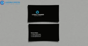
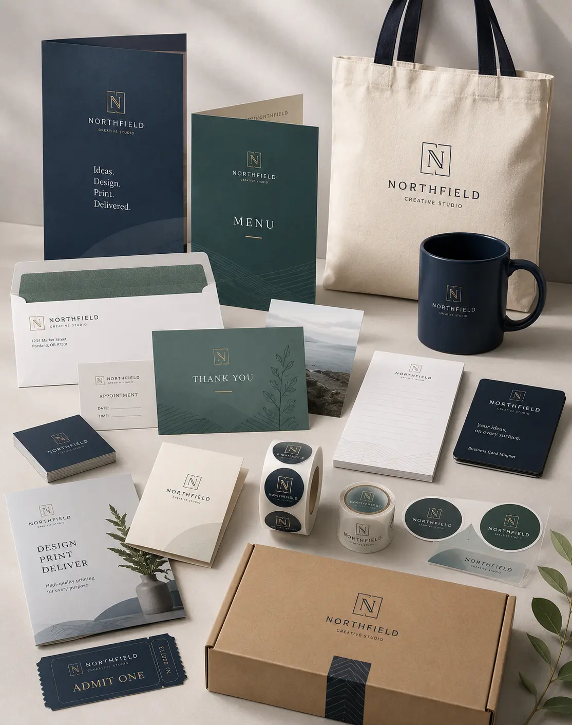

We often see business owners spend weeks refining a digital marketing strategy, only to hand out a flimsy, cluttered card at a local networking event. If your Business Cards end up in the bottom of a trash can or a forgotten desk drawer, you haven’t just lost a piece of paper; you have lost a potential lead. We believe a card should act as a handshake that stays in the room after you leave.
In our years of printing and design, we have noticed that the most effective cards don’t necessarily have the flashiest graphics. Instead, they provide a clear, tactile representation of a brand’s promise. We help our clients move beyond the idea of a card as a simple contact list. By treating this small piece of cardstock as a conversion tool, you ensure that every introduction carries actual weight.
Moving Beyond the Rolodex Mentality
Many business owners still design cards based on 1990s standards, trying to cram every service, phone number, and social media handle onto a tiny surface. This clutter overwhelms the eye and obscures your primary call to action. We suggest a more modern approach that focuses on a singular, clear objective. Ask yourself: what is the very next step you want a prospect to take?
We see much higher conversion rates when business owners leave “white space” on their cards. This breathing room allows the recipient to focus on your logo and name without distraction. It also provides a practical benefit: it gives the recipient a place to jot down a quick note about your conversation. Those handwritten notes often turn a cold contact into a warm, memorable lead.
Mastering the Balance of Visual Hierarchy
A successful design directs the viewer’s eye to the most important information first. We usually recommend placing your name or your brand logo as the focal point, followed by your primary contact method. Use font sizes strategically to create this hierarchy; your name should stand out clearly from your job title or email address.
We often warn clients against using more than two different fonts on a single card. Mixing too many styles creates a chaotic look that suggests a lack of professional focus. Stick to clean, legible typefaces that reflect your industry’s personality. A law firm might choose a classic serif font to convey tradition, while a tech startup might opt for a sleek, modern sans-serif.
Material Matters: The Psychology of Touch
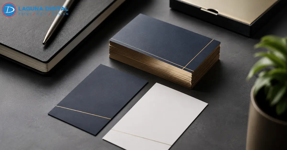
The physical feel of your card communicates as much as the printed words. When you hand a prospect a thin, easily creased card, you subconsciously communicate that your business might be temporary or low-budget. We always encourage clients to feel different paper weights—measured in “points” or “gsm”—before they commit to a large print run.
A 16pt cardstock feels substantial and signals stability and quality. We also guide clients through the world of finishes, such as matte, gloss, or “soft-touch” lamination. A matte finish offers a sophisticated, modern look that resists fingerprints, whereas a high-gloss finish makes vibrant colors pop. These tactile choices create a sensory experience that helps a prospect remember you long after the event ends.
Bridging the Gap Between Physical and Digital
In our digital-first world, your business card should serve as a portal to your online presence. We highly recommend incorporating a QR code into the design, but only if it serves a specific purpose. Don’t just link to your homepage; link to a custom landing page, a digital portfolio, or a direct “Add to Contacts” link.
We have found that putting a QR code on the back of the card keeps the front clean while providing a high-tech utility. This strategy respects the traditional aesthetic of networking while embracing modern convenience. When you make it easy for someone to find your work or book a consultation, your conversion rates naturally climb.
Strategic Ordering and Volume Management
We frequently see clients over-order cards with information that might change in six months, such as a specific promotion or a temporary office address. Much like we advise clients on ordering memorial items efficiently, we suggest starting with a manageable quantity. This approach allows you to test different designs or calls to action before investing in a massive bulk order.
High-volume orders save money per unit, but only if you actually use them. We help businesses determine the right “burn rate” for their cards based on their networking schedule. If you attend three trade shows a year, your needs differ greatly from a local service provider who hands out cards daily. Professional printing partners like us can help you find that sweet spot between cost-effectiveness and wasteful overproduction.
Common Printing Mistakes to Avoid
One of the most frequent issues we fix involves “bleed” and “safe zones.” If you place your text too close to the edge of the design, the cutting process might lop off the last letter of your email address. We always check files to ensure they include a proper bleed area, which prevents white edges from showing up after the cards are trimmed.
Additionally, avoid using low-resolution images pulled from the web. A logo that looks fine on a phone screen will often appear blurry or “pixelated” when printed at high resolution. We insist on vector files or high-DPI images to ensure your brand looks crisp and professional. Taking the time to prepare your files correctly saves you from the embarrassment of a low-quality final product.
FAQs
What is the standard size for a business card?
The standard size in the United States is 3.5 x 2 inches. While we can print custom shapes and sizes, staying with the standard ensures your card fits perfectly into wallets and cardholders. Custom sizes often get left behind because they don’t fit into the recipient’s existing organization system.
Should I print on both sides of the card?
We generally recommend using the back of the card. It provides valuable real estate for a tagline, a list of core services, or a QR code. Leaving the back entirely blank is a missed opportunity to reinforce your brand identity or provide extra value to the recipient.
What is the best font size for readability?
We suggest keeping your main body text between 8pt and 10pt. Anything smaller than 7pt becomes difficult for many people to read, especially in low-light networking environments. Your name should typically be larger, around 12pt or 14pt, to ensure it captures immediate attention.
Can I use a photo on my business card?
Photos work exceptionally well for industries based on personal trust, such as real estate or coaching. If you use a photo, ensure it is a professional headshot with a clean background. A high-quality image helps people put a face to the name when they look at the card weeks later.
Conclusion
A business card remains one of the most powerful tools in your marketing arsenal, provided you design it with intention. We have seen how a well-crafted card opens doors and starts conversations that digital ads simply cannot replicate. By focusing on clean design, quality materials, and a clear call to action, you transform a simple networking staple into a lead-generation machine.
Your brand deserves more than a generic template. We take pride in helping our clients navigate the technical details of print production to ensure their vision translates perfectly to paper. If you feel ready to upgrade your professional image and start handing out cards that actually drive results, reach out to us. The experts at Laguna Digital stand ready to help you design and print business cards that leave a lasting, professional impression.