


What makes a business easily recognizable when you see it on a billboard or a website or even a business card? How does a business stay strong? Memorable whether you see it on a computer or on paper? The answer is really simple, consistency is the key. These days people are looking at businesses on signs and on their phones and computers so it is really important that a business looks the same on paper and on a screen.
In this guide we will tell you everything, about making your business look the same everywhere. You will learn the basics of building a business presence and you will also learn some more advanced things that can help. We will give you steps you can follow to make your business consistent. You can start doing these things right now no matter if you have a small business or a big one.
What Is Brand Consistency?
Brand consistency is when your company looks the same every time people see it. This means everything you make whether it is something you can hold in your hand or something you see on a screen should look like it is from your company. When your brand looks the same people start to trust your company, think it is professional and remember it.
The Core Elements of Brand Identity

Before you can build consistency across any channel, you must define your brand identity clearly. The key elements include:
Logo
Your logo is the visual symbol that represents your brand everywhere. It should always appear in a clear and consistent way across print and digital platforms. Define proper size, spacing, and placement rules so it never looks distorted or crowded. Using the correct version on different backgrounds helps maintain a strong and professional brand image.
Color Palette
Your color palette plays a major role in how people recognize and remember your brand. Select a few key colors and use them consistently in all materials. Colors create emotions and influence perception, so choose shades that reflect your brand personality. Keeping colors uniform across print and digital builds familiarity and strengthens visual identity over time.
Typography
Typography gives your brand a unique voice through written content. Choose one or two main fonts and use them consistently in headings, body text, and designs. Fonts should be easy to read and match your brand personality. Using too many different fonts can confuse your audience and make your brand look unorganized and less professional.
Imagery Style
Your imagery style includes photos, graphics, and illustrations that represent your brand visually. Whether your brand feels modern, energetic, or calm, your images should reflect that tone. Consistent lighting, colors, and composition help create a unified look. Strong and clear visuals make your brand more appealing and easier for people to connect with.
Voice and Messaging
Your brand voice is how you communicate with your audience through words. It should remain consistent whether you are writing website content, social media posts, or printed materials. Decide if your tone is friendly, professional, or inspiring, and stick to it. A clear and steady voice builds trust and helps people feel connected to your brand.
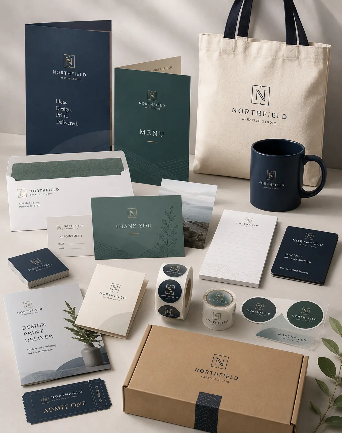
How to Ensure Consistency Across Print Media
Print marketing still plays an important role. Many customers appreciate the physical feel of paper and the lasting impression of printed materials. Print examples include business cards, brochures, posters, banners, and booklets. In fact, services like book printing still serve many industries like education, publishing, and corporate branding. To ensure consistency in print:
Create a Print Style Guide
A style guide for print should include:
- Logo usage rules
- Color values (Pantone, CMYK, RGB)
- Font specs and size rules
- Image quality and style rules
Choose High Quality Materials
Consistency is not just about visuals. It is also about how your brand feels. Using cheap paper may harm how people perceive your brand. Choose paper quality that aligns with your brand values, whether elegant, bold, or eco friendly.
Work with Trusted Printing Partners
When working with a digital printing solution or traditional printing house, make sure they understand your brand guidelines. Trusted partners help maintain quality and brand standards. Provide them with your style guide and be available to answer questions.
Common Mistakes and How to Avoid Them
Even experienced brands make mistakes. Here are common pitfalls and how to avoid them.
Inconsistent Use of Logo: Using different versions of your logo on printed and digital materials weakens your brand. Always refer to your style guide for the correct logo version and proportions.
Fonts That Do Not Match: Different fonts in print and digital can make your brand feel fragmented. Choose fonts that work in both formats and stick to them.
Ignoring Color Accuracy: Colors can look different when printed versus on a screen. Use color standards like CMYK for print and RGB for digital to ensure accuracy. Always test print samples before large print runs.
Poor Image Quality: Low resolution images in print look unprofessional. Avoid this by using high resolution files for print and optimized versions for digital.
Nutshell
In every printed item, from the smallest business card to complex brochures, and in every digital interaction, from your homepage to your social media posts, clarity and harmony matter. Whether you are choosing materials for service digital printing, preparing flyers for printing business promotions, arranging quality book printing services, or selecting a digital printing solution partner, always keep consistency at the heart of your decisions