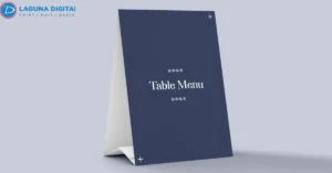


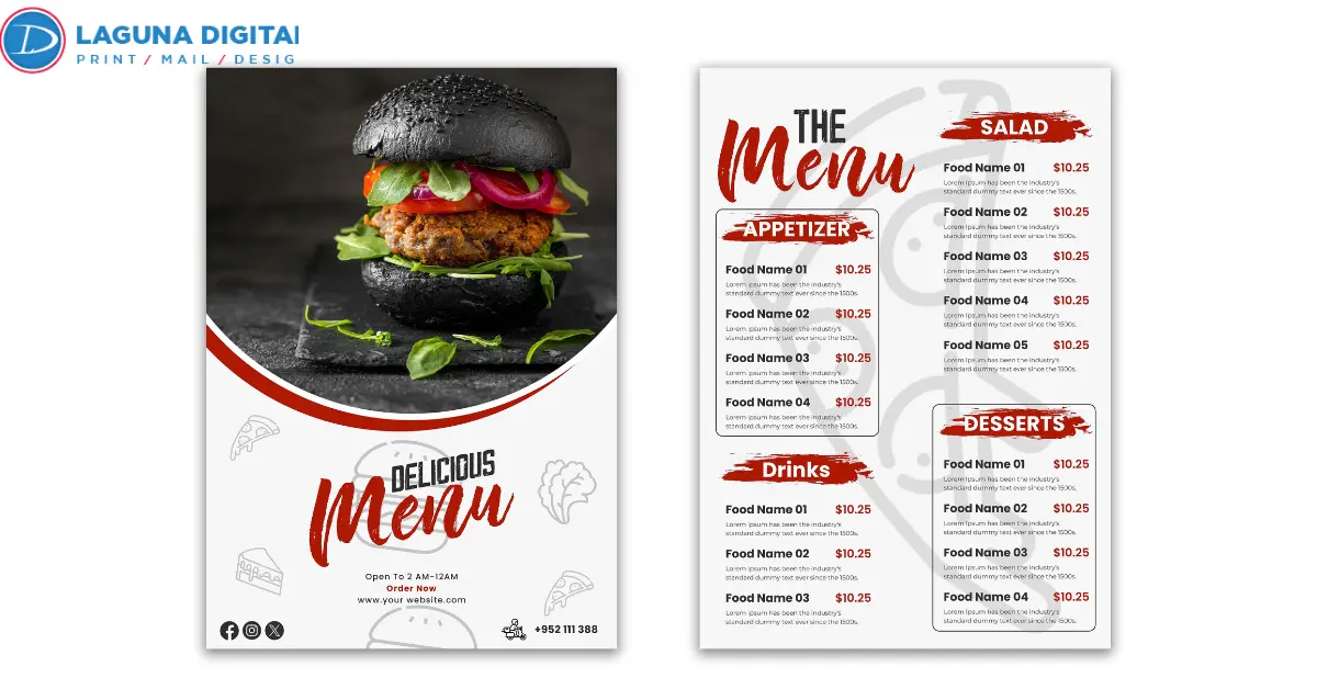
A printed menu can do more than list food and prices. When relevant add-ons sit beside the right dishes and their extra cost is clear, the menu becomes part of the ordering process. The goal is to make useful upgrades easier to notice and order.
A strong restaurant menu starts with real ordering behavior. Look at what guests already buy, which extras carry a healthy contribution margin, and what the kitchen can deliver consistently.
Build a Printed Menu Around Add-Ons That Earn Their Space
Start with sales data before choosing colors, boxes, or type styles. Pull several weeks of POS reports and identify high-volume entrées, then review the modifiers most often sold with them.
The add-on should fit the dish, contribute worthwhile margin, and avoid slowing service. This is where restaurant upselling becomes practical instead of decorative.
Proven Add-On Pairings
A burger may lead to bacon, avocado, or loaded fries. A salad may support grilled chicken, shrimp, or avocado. Breakfast items may pair with fruit, breakfast meat, or specialty coffee.
The printed menu should reflect those relationships instead of giving every entrée the same extras list.
Place Add-Ons Beside the Main Ordering Decision
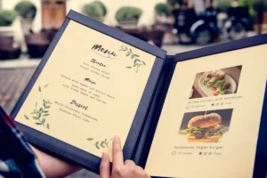
Guests should not have to scan another panel to find the upgrade that belongs with a dish. Put the strongest options directly beneath or beside the item they improve.
- Classic Burger $14
- Add Smoked Bacon +$2
- Add Avocado +$2.50
- Upgrade to Loaded Fries +$3
The guest can process the base item and upgrade together. Restaurant menu design should shorten the path between interest and action.
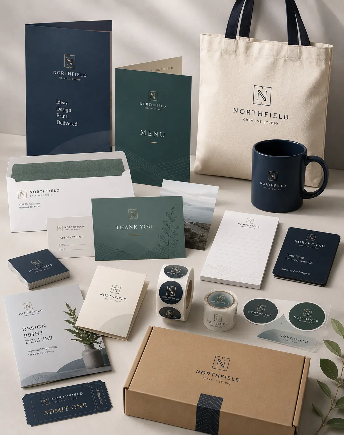
For operators preparing custom printed menus, the finished size should support this hierarchy. Menu printing options include dine-in and takeout formats, different paper stocks, coatings, and finished sizes. Choose the format after the content structure is settled, not before.
Write Add-On Copy That Answers the Guest Quickly
Weak add-on language creates hesitation. “Add toppings” forces the guest to ask what is available. “Add Roasted Mushrooms +$2” gives the answer immediately.
Good food menu design uses specific names, clear prices, and familiar language. If the kitchen calls an item “garlic parmesan fries,” the menu and POS should use the same wording.
Consistent Modifier Language
Before custom menu printing begins, compare the proof with the live modifier list in the POS. This catches problems before busy service.
If the page says “premium side” while the register lists several unrelated choices, staff must explain the difference repeatedly. A well-edited restaurant menu removes that friction before the order reaches the counter.
Group Add-Ons by the Way Guests Actually Order
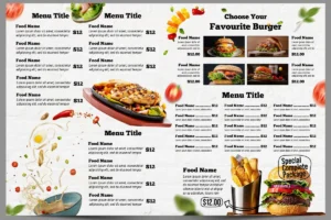
Add-ons make more sense when they follow the structure of the meal. Burgers may support cheese, bacon, avocado, or a premium side. Salads may support protein or a better dressing. Coffee orders may support an extra shot, alternative milk, or a pastry.
That grouping improves menu upselling because the suggestion feels connected to the meal.
Focused Menu Categories
Do not place six or seven upgrades under every entrée just because the POS allows them. Two or three high-value choices are easier to scan and easier for staff to execute.
The menu layout should make the main item dominant, the description secondary, and the upgrade easy to spot without competing for attention.
Use Visual Hierarchy Instead of Menu Sweet Spot Myths
A printed menu needs visual emphasis, but it does not need to be built around one supposed location where every diner looks first.
An eye-tracking study of restaurant menus published in the International Journal of Hospitality Management found that observed scan paths did not support the idea of one universal menu sweet spot. The study was small, but it still challenges a design rule often repeated without context.
Use hierarchy instead. Clear category names, readable prices, comfortable spacing, and selective emphasis are more dependable than forcing every profitable item into one corner.
Selective Visual Contrast
If every item has a border, icon, badge, color block, or oversized heading, nothing feels important. Use emphasis for a small number of items or upgrades that truly deserve attention.
This restaurant menu design approach also improves menu layout because the guest can understand the page before being asked to notice a promotion.
Create a Short Upgrade Path for Popular Items
Restaurant upselling works best when the next choice feels like a natural extension of the first.
- House Iced Coffee $4.50
- Make It Cold Brew +$1
- Add Vanilla Sweet Cream +$1
The upgrade stays attached to a decision already made. A printed menu should keep these paths short. Two or three options give enough choice without turning one order into a long customization process.
Use Bundles to Simplify the Order
Bundles work when they remove decisions. A burger with fries and a drink is easy to understand. A soup and half sandwich pairing also makes sense because the items belong together.
The bundle should state what is included and what substitutions cost. Good food menu design avoids burying the offer under several lines of conditions.
Clear Takeout Panel Flow
Folded pieces need discipline. A customer should not have to open several panels to understand one meal deal.
When using takeout menu printing, plan the panel sequence before finalizing the artwork. Keep connected information on panels that are viewed together so the reader does not need to jump across folds.
Match the Print Finish to Real Restaurant Use
Restaurant menu printing should account for how often the piece will be handled, where it will be read, and how long it needs to last.
A dine-in piece may need greater durability, while a takeout piece may need lighter stock and a compact fold. Gloss can look polished, while matte or uncoated stock may reduce glare.
Full-Size Proofing Before Production
Before custom menu printing moves to production, print the artwork at full size. Check the smallest type, fold positions, margins, price alignment, and whether important add-ons remain easy to find.
For custom printed menus exposed to repeated handling, moisture, or frequent wiping, lamination services can add protection to selected formats.
A restaurant menus printer can produce a durable piece, but the restaurant still needs to decide which information deserves attention.
Measure Add-On Performance After Launch
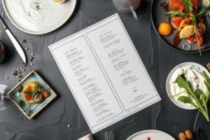
A printed menu should be treated as a testable sales tool. Record a baseline before launch. Track average check, add-on attachment rate, modifier sales, contribution margin, and recurring staff questions.
If loaded fries are moved beside the three best-selling burgers, compare how often those orders include the upgrade before and after the change. If attachment improves and service remains smooth, the placement has earned its space.
Performance-Based Menu Revisions
A highlighted add-on that still sells poorly may have the wrong price, weak wording, poor relevance, or an operational problem. Do not give it more visual space until the cause is clear.
This is the practical side of menu upselling. The page changes, the numbers are reviewed, and the next restaurant menu printing run reflects what actually worked. A restaurant menus printer handles production. Sales data should guide the next design decision.
Frequently Asked Questions
How Many Add-Ons Should Appear Under One Menu Item?
Two or three relevant choices are a strong starting point. They keep the decision easy to scan without limiting useful upgrades.
Should Add-On Prices Be Listed Separately?
Yes. Show the extra cost beside each option so guests can understand the impact of the upgrade without asking staff.
Which Add-Ons Should Be Promoted First?
Start with extras that pair naturally with popular items, contribute worthwhile margin, stay reliably available, and are easy for the kitchen to execute.
Do Boxes and Highlighted Areas Increase Add-On Orders?
They can improve visibility when used selectively. Too much emphasis creates clutter, so use boxes or contrast only for items that deserve extra attention.
How Often Should a Restaurant Review Its Menu?
Review the menu whenever food costs, pricing, availability, or customer buying patterns change. A regular menu engineering review also helps prevent weak add-ons from occupying valuable space.
Bottom Lines
The strongest printed menu makes the next choice easy. It connects the main dish to a relevant upgrade, keeps prices clear, and gives profitable extras enough visibility without overwhelming the page.
Start with one high-volume category. Identify the dishes that drive the most orders, choose one or two sensible upgrades for each, and record the current attachment rate. After the revised menu has been in use, compare the same numbers and keep the changes that improve both sales and service.
When the layout is ready for production, Laguna Digital can turn the plan into a polished piece using paper, coating, size, fold, and finishing choices suited to the way your restaurant serves customers.