
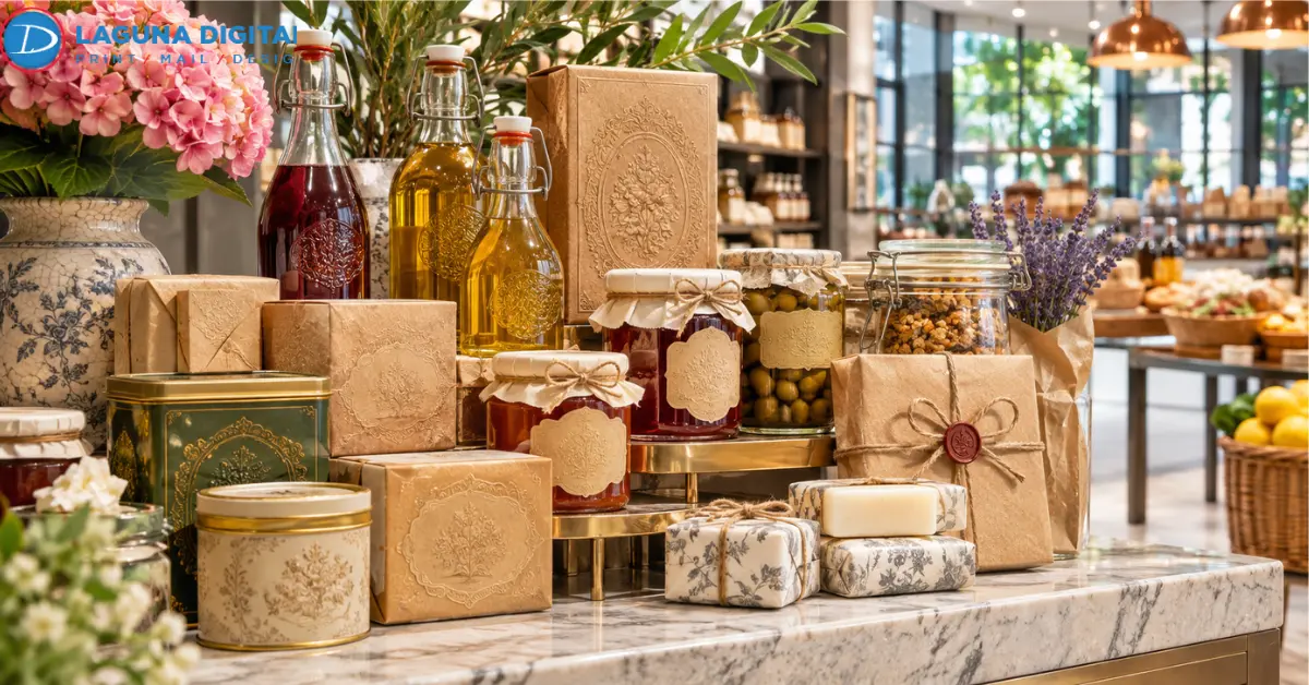
Heritage packaging is having a moment again, and we notice it most in the files customers send over. A few years back, most requests were about stripping a logo down to two flat colors and a thin sans serif.
These days a typical project starts with a shoebox of old labels and one question. Can that look come back on our custom printed retail boxes?
Usually it can. The trick is knowing which parts of the old design earned their keep and which parts were just the printing limits of the day.
Heritage Packaging Brings Brand History Back To The Shelf
Heritage packaging is a pack built from pieces of a brand’s own past. Sometimes that’s the first logo. Sometimes it’s nothing more than the red that used to be painted on the delivery van, or the year the doors opened. Nothing gets invented. Shoppers are quick to smell a fake “Est.” date on a company they’ve never heard of.
The payoff of this kind of brand packaging is plain recognition. Somebody pushing a cart should spot the product from halfway down the aisle without reading a word.
Heritage Versus Vintage Design
Customers mix these two up constantly. Vintage packaging borrows a decade’s look. A soda brand that launched last spring can put a 1950s diner script on its cans tomorrow and nobody can stop it.
Heritage only works with what the company itself actually did. That’s why it lands harder on product packaging, and it’s also why every date or origin claim needs paperwork. The FTC, for example, expects an unqualified Made in USA claim to meet its all or virtually all standard.
Shopper Trust Is Driving The Return Of Classic Designs
Some of this is plain fatigue. After years of white boxes with lowercase logos, shelves started to blur together, and a mark people remember from their parents’ pantry jumped out of that blur fast. We think that’s the main reason heritage cues keep turning up in current packaging trends; they read as proof that a product has lasted.
We can print a label in minutes. Nobody can print the years of Saturday grocery runs that made someone trust it, and that’s the part heritage packaging borrows.
Standing Out In A Crowded Aisle
There’s a practical side, too. Store brands and online startups have made a lot of retail packaging look alike, and an old mark with real character breaks up that wall.
Mountain Dew’s answer, in 2025, was to retire “MTN DEW” after 14 years and spell itself out again, founding year included. Smaller companies can test the same idea with custom packaging for far less. We usually suggest a few hundred labels on digital printing first, and packaging boxes wholesale only once the numbers say yes.
Classic Design Elements That Make Heritage Packaging Work
Two details carry most of the look, and both should come straight from the archive.
Color And Logo Marks
Color travels farther than type, so in packaging design it’s the first thing we protect. There’s a catch that surprises almost everyone. The red from an old glossy carton won’t look the same on uncoated board; it sinks in and turns a little brick-colored. So we match it against the uncoated Pantone book and show a physical proof before anyone signs off.
Logos are trickier. The so-called original is often a fourth-generation photocopy that’s been reused since the nineties. Our graphic design team rebuilds it as vector art by hand, so it holds up on a billboard or a two-inch jar lid.
Paper Stocks And Finishes
Then there’s the paper. Uncoated stock and kraft drink up ink, so colors land a shade softer, which does half the vintage work for free. Kraft has one gotcha, though. A barcode printed straight onto a brown board may not scan at checkout, so we lay white ink under it and under the fine print.
One foil seal or one blind-embossed crest is plenty. Metallic stickers on the closure fake the effect cheaply while the budget catches up to printed packaging boxes with full foil work.
Seven Steps To Plan And Print Heritage Packaging
Loyal buyers spot every change on a pack they’ve bought for years, so a heritage redesign carries more risk than a routine refresh. We take it in this order.
Planning The Story
- Raid the archive. Old labels, ads, photos, even a price sticker stuck to the bottom of a tin. We scan the good pieces at high resolution, because paper from the seventies doesn’t get any less yellow. Then listen for what loyal customers bring up unprompted; that’s where the real brand equity is hiding.
- Pick one story and commit. A founding year works. So does an original recipe. Cramming three stories onto one box is how a pack ends up cluttered, and it’s the moment plenty of companies bring in packaging design services, because an outsider has no trouble cutting the material the founder’s family loves most.
- Borrow two or three cues and stop there. That’s usually all heritage packaging needs, and the rest of the layout can be fully modern.
- Check the claims. A box that says “Est. 1952” had better match the company records.
Production And Testing
- Keep the back panel boring. That’s where the barcode, the net quantity statement, and the ingredients live on labels and custom printed retail boxes alike, and none of it should fight a decorative border.
- Test it where it’ll be sold. We’d print a small batch of labels, or header cards if the product hangs in bags, and let it sit under store lighting for four to six weeks. If the new version outsells the old one, that’s usually enough proof to order custom packaging at full volume.
- Write everything down before scaling. A one-page spec with the Pantone numbers sounds dull, but once a brand moves to bigger branded packaging solutions or buys packaging boxes wholesale, it’s the only thing standing between the archive red and a slightly wrong orange.
Common Mistakes That Make Heritage Packaging Look Dated
Most heritage redesigns that flop go wrong in the same few ways, usually through a packaging design call that should have been caught at proof.
- A crowded front panel. Badges and borders bury the product name, while good product packaging gives the eye one obvious place to land.
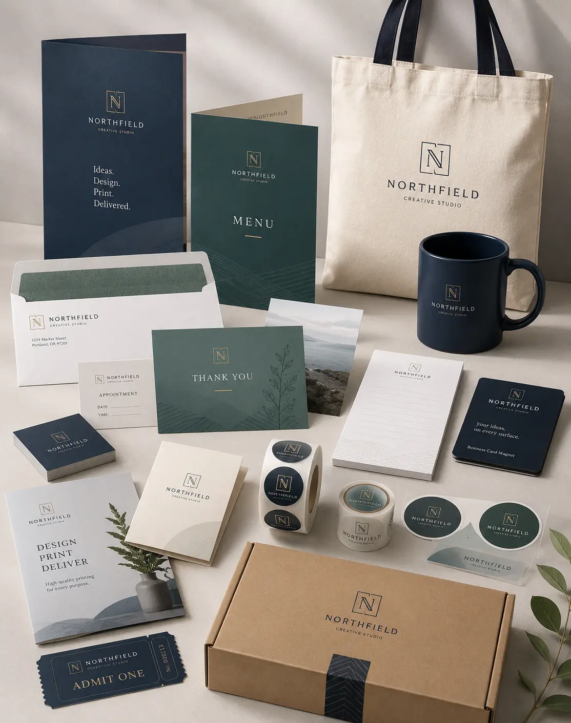
- Changing the box and nothing else. Fresh packaging next to old business cards and signs sends mixed signals, so a business materials refresh belongs in the same launch plan.
- Forgetting the online shelf. Retail packaging gets judged on a phone now too, at roughly postage-stamp size, where a pretty hairline script turns into a gray smudge.
Frequently Asked Questions
What Is Heritage Packaging?
We’d describe it as packaging that only uses history a company can prove. The first logo, the old house color, the year painted on the original storefront sign. If someone has to make it up, it’s just a vintage costume.
What Is The Difference Between Vintage And Retro Packaging?
Vintage packaging, in the strict sense, means the real design from back then or a near-exact copy. Retro only grabs the feeling, like burnt orange and a chunky 1970s typeface dropped onto a layout nobody back then would have drawn.
Is Nostalgic Packaging Still A Trend In 2026?
Yes, and it has outlasted most design fads, probably because digging into what a brand already owns costs so little. Mountain Dew spelling out its full name again in 2025 kept heritage among the steadier packaging trends.
Can A New Brand Use A Heritage Look?
It can. Picture a hot sauce maker in Santa Ana that started two years ago. Its neighborhood and its small batches are fair game, but a “since 1920” stamp is not, because honest brand packaging ages better than borrowed history.
Which Printing Finishes Make Packaging Look Vintage?
Mostly the paper. Uncoated stock and kraft board do the heavy lifting, and on printed packaging boxes we’d add a matte coating and keep to two or three spot colors. High-gloss UV makes an old design look brand new, so we skip it.
Wrapping It Up
Nobody has to reprint the whole product line on a Monday. At Laguna Digital, most heritage jobs begin with a short run of labels or header cards, plus a design pass that turns a cracked old logo into something a press can actually use.
Got a shoebox of old artwork? Send it over and request a quote, because comparing packaging design services or branded packaging solution