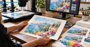



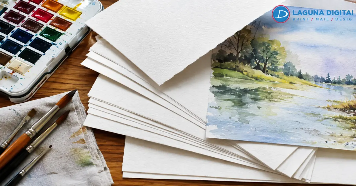
Watercolor depends heavily on the surface beneath the paint. Untouched paper becomes part of the highlights, pale washes rely on small tonal shifts, and dry-brush marks often get their character from the sheet itself. That makes paper choice critical when producing watercolor prints.
For most reproductions, cotton rag around 290 to 340 gsm is the safest premium starting point. Smooth or lightly textured stock favors detailed work. A stronger tooth suits loose landscapes, florals, and pieces where visible grain is part of the original look. The final choice should come from a physical proof.
Textured or Smooth Paper?
Texture changes how clearly an image reads.
A textured watercolor paper surface works well with broad washes, granulation, and loose brushwork. That texture suits traditional watercolor painting, but deep tooth can break fine ink lines, architectural edges, and delicate pencil marks.
For detailed watercolor prints, smoother cotton rag usually holds fine edges better without creating photographic shine. Light texture sits between the two and works for many mixed-style originals.
Proof a small crop containing a pale wash, a dark area, one fine edge, and untouched white before committing to an edition.
If the original still needs digitizing, professional art reproduction services can preserve subtle color and surface information before paper selection begins.
Is 300 GSM Enough?
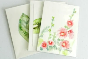
Around 300 gsm gives premium fine art prints the substantial feel many artists expect. It works well for signed editions, portfolios, and gallery presentations. Lighter stock can still suit proofs or open editions.
Weight alone does not prove quality. When comparing fine art print services, ask for the paper name, fiber content, finish, white point, and recommended profile. A qualified giclée printing company should explain those specifications clearly.
The same rule applies to archival paper. Thickness does not prove permanence, which depends on material composition and storage conditions.
Bright White or Natural White?
White point changes every color printed above it.
Bright white stock tends to sharpen cool colors and high-key images. Natural white often suits portraits, earth pigments, and soft landscapes.
Place the proof beside the original under consistent neutral light. If warm areas suddenly look cold, or soft highlights become harsh white gaps, the base tone is fighting the artwork.
A profile built for a specific fine art paper helps the printer reproduce the file within the color range of that ink and sheet.
For useful background before choosing papers and finishes, read how giclée works for artists.
Cotton Rag or Alpha-Cellulose?
Cotton rag is a strong choice for premium watercolor prints because it combines a refined surface with substantial hand feel and good material stability. It is commonly selected for signed work, collector editions, and museum quality art prints.
High-grade alpha-cellulose, made from highly purified wood pulp, can be a practical lower-cost option for open editions.
The Library of Congress notes that “archival” is not a legally defined term and points instead to measurable characteristics such as pH, alkaline reserve, lignin content, and tear resistance.
Ask for specifications when a stock is described as archival paper, conservation grade, or permanent. Marketing language alone says little about long-term behavior.
Why Matte Usually Works Better?

Traditional watercolor rarely benefits from strong surface glare. Matte paper keeps attention on transparent washes, broken edges, and the soft character associated with watercolor painting.
Photo paper serves a different purpose. Glossy or semi-gloss stock can deepen contrast, but it is less natural when the goal is to retain the quieter surface of a painted original.
If both looks seem plausible, compare a matte proof with a photographic proof at final size. A professional photo printing service provides a useful comparison point.
Proof the Hardest Part of the Painting
A difficult crop often tells you more than a reduced version of the whole image.
Choose an area containing the palest visible wash, the darkest shadow, a neutral color, and the finest line. Print that section on two candidate papers and compare both directly with the original.
If a light wash disappears on one stock but survives on the other, compare papers before editing the master file.
That matters in custom art printing because corrections made for one substrate may not transfer well to another. With giclée prints, paper, pigment ink, coating, profile, and viewing light act as one system.
For more background, the science behind high-quality art reproduction prints explains why capture and output materials need to be evaluated together.
Capture Quality Comes Before Paper Choice
Paper cannot restore detail that a weak scan or photograph failed to capture. Pale washes disappear through overexposure, glare flattens texture, and fine pencil marks can vanish through poor resolution.
For oversized originals, large-format fine art scanning provides a controlled capture route for reproduction work. Keep the approved master file with the paper name, profile, finished size, and proof date so that later watercolor prints can match the first approved edition.
Longevity Depends on the Whole Print System
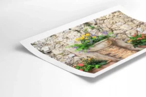
Long-lasting watercolor prints depend on more than premium paper. The same is true of museum quality art prints.
The Library of Congress recommends a cool, stable environment for works on paper, about 35 percent relative humidity, and minimal exposure to direct or intense light.
ISO 9706:2025 also makes clear that permanent paper is not immune to excessive humidity, heat, light, pollutants, or water.
Good paper, pigment ink, appropriate framing, controlled light, and sensible storage belong to the same preservation plan for watercolor prints.
Best Paper by Artwork Style
| Artwork | Recommended starting point | Check first |
| Loose landscapes | Lightly textured cotton rag | Washes and granulation |
| Botanical or architectural work | Smooth cotton rag | Fine edges and pencil detail |
| Bright contemporary pieces | Neutral or bright white fine art paper | Highlights and clean color |
| Warm portraits or earth tones | Natural white cotton rag | Ochres and warm neutrals |
| Open editions | Premium alpha-cellulose matte stock | Cost and consistency |
| Signed editions | Heavy cotton rag | Surface feel and repeatability |
Two papers with the same weight can still print differently because texture, white point, and coating change the result.
Paper Selection Checklist
Before approving watercolor prints for sale or exhibition, use the same checks whether you order locally or compare fine art print services online:
- Texture matches the detail in the original.
- White point supports the artwork’s color temperature.
- Weight fits the selling price and presentation.
- Fiber content and permanence information are documented.
- The correct ICC profile is used.
- A physical proof has been compared with the original.
- The paper can be reordered for future editions.
- Framing and storage recommendations are clear.
For custom art printing, keep one approved proof as a benchmark for future runs.
What paper is best for watercolor prints?
Cotton rag around 290 to 340 gsm is a strong starting point for most watercolor prints. Use a smooth surface for detailed botanical, architectural, or pen-and-wash work. Choose a lightly textured watercolor paper when visible grain and broad washes are central to the artwork.
Is 300 gsm paper good for art reproduction?
Yes. Around 300 gsm gives fine art prints a substantial feel, but fiber content, coating, white point, and printer compatibility still matter.
Is giclée suitable for watercolor reproduction?
Yes. The giclée process suits watercolor reproduction because pigment ink systems and quality papers can preserve delicate gradients and fine detail. A reliable giclée printing company should also offer proofing before full production.
Should watercolor reproductions use matte paper or photo paper?
A matte surface usually fits traditional watercolor because it reduces glare and keeps a paper-like appearance. Photographic stock suits work that intentionally needs stronger contrast.
What should artists check before ordering collector editions?
Review the paper specification, print a physical proof, confirm the master file, and record the approved settings. For giclée prints positioned as collector pieces, consistency across future runs matters as much as the first print.
Conclusion
The best paper for watercolor prints is the one that preserves the character of the original instead of imposing a different surface or color temperature. Cotton rag remains the strongest premium starting point, but texture, white point, weight, capture quality, and proofing determine whether the finished reproduction truly works.
Before ordering a full edition, print the most demanding crop on at least two suitable papers, compare both under consistent light, and record the winning stock and profile. When the artwork is ready for production, Laguna Digital can help turn an accurate master into finished prints with paper and proofing choices matched to the artwork.