We understand the frustration of planning a world-class event only to see a half-empty dance floor on opening night. Many promoters mistakenly believe that any piece of paper with a date and a DJ name will suffice, but the reality is much more competitive. A high-impact Club Flyer serves as a tangible invitation that must cut through the noise of a busy street or a cluttered bar counter within seconds.
We have spent years working with venue owners to transform their promotional materials from simple announcements into powerful conversion tools. Designing for the nightlife industry requires a deep understanding of psychology, lighting, and tactile experience. We focus on strategic design choices that don’t just look pretty, but actually compel someone to clear their schedule and show up at your door.
Mastering Visual Hierarchy to Capture Attention
We always advise our clients to think about the “order of operations” when someone looks at their marketing materials. In the fast-paced environment of a club or lounge, your audience rarely gives you more than a few seconds of their time. We recommend placing the most exciting element—whether that is a headline artist or a specific theme—at the very top of the visual hierarchy.
Prioritizing the Main Attraction
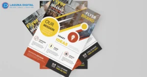
The focal point of your design should act as a magnet for the eyes. We often use oversized typography or a central high-resolution image to anchor the entire layout. If you bury your headliner in small text at the bottom, you lose the primary reason people would attend your event. We find that a “less is more” approach with one dominant element works far better than trying to make every piece of text equally large.
Balancing Information with White Space
Many business owners try to cram every drink special and sponsor logo onto a single 4×6 card. We strongly discourage this because a cluttered design creates visual fatigue and makes important details hard to find. We use intentional white space, or “negative space,” to allow the eye to rest and focus on the essential details like the date and location. A clean layout suggests a high-end, well-organized event that people actually want to attend.
Selecting Color Schemes That Set the Right Mood
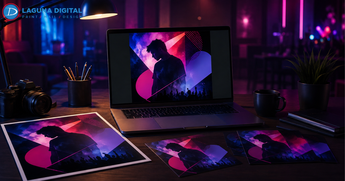
Color psychology plays a massive role in how potential guests perceive your brand before they even read a single word. We help our clients choose palettes that align with the specific energy of their venue. For instance, neon pinks and electric blues signal a high-energy dance atmosphere, while deep burgundies and golds suggest a sophisticated cocktail lounge or VIP experience.
Using Contrast for Low-Light Readability
We must consider where people will actually see these flyers—often in dimly lit bars or under streetlights at night. We recommend high-contrast color combinations, such as bright white or neon text on a dark background, to ensure maximum legibility. If the colors blend too closely together, your message disappears the moment the sun goes down. We always test designs in various lighting conditions to ensure the text remains crisp and readable.
Evoking Emotion Through Visual Themes
Every design choice should contribute to the “vibe” you want to project. We suggest using textures like metallic gradients for luxury events or gritty, distressed overlays for underground techno nights. When the visual style matches the music and the crowd, you build instant trust with your target audience. People are much more likely to attend an event when the marketing feels like a preview of the actual experience.
Integrating Call-to-Actions for Better Tracking
A beautiful design without a clear instruction is just art, not marketing. We emphasize the importance of a direct Call-to-Action (CTA) that tells the viewer exactly what to do next. Whether you want them to “Book a VIP Table” or “Get Early Bird Tickets,” the instruction must be impossible to miss. We find that placing the CTA in a high-contrast box near the bottom of the flyer significantly increases engagement rates.
Bridging the Gap with Digital Integration
We live in a digital world, but physical flyers remain one of the most effective ways to reach local crowds. We recommend adding a custom QR code that links directly to your ticket portal or social media page. This allows you to track exactly how many people scanned your promotional items to make a purchase. Providing this shortcut removes friction and makes it easy for a guest to commit to your event on the spot.
Selecting Professional Materials for Lasting Impact
The physical quality of your flyer speaks volumes about the quality of your event. We have seen promoters lose credibility by printing on thin, flimsy paper that feels cheap and disposable. We always steer our clients toward premium cardstock that feels substantial in the hand. A thicker flyer stays in a pocket or on a fridge much longer than a thin piece of paper that easily crumples.
Choosing the Right Finish for the Environment
The finish you choose can change the entire personality of the print. We often recommend a high-gloss UV coating for club events because it makes colors look more vibrant and protects the flyer from liquid spills at a bar. For more exclusive or “boutique” events, a soft-touch matte finish offers a velvet-like texture that feels incredibly high-end. These tactile details create a sensory connection with your brand that digital ads simply cannot replicate.
FAQs
What is the most effective size for a club flyer?
We generally recommend the standard 4″ x 6″ size. It is large enough to hold all necessary information but small enough to fit easily into a pocket or purse. This size also offers the best balance between printing costs and visual impact for street-team distribution.
How much text is too much for a flyer?
We suggest keeping your word count as low as possible. Stick to the event name, date, time, location, and a clear call to action. If a guest has to read for more than five seconds to understand the “point” of the flyer, the design is likely too crowded.
Should I include my sponsors on the front of the flyer?
We advise placing smaller sponsor logos at the bottom or on the back of the flyer. While sponsors are important, their branding should never overshadow your main event details. Keeping the front focused on your headline act ensures a higher conversion rate.
Do QR codes actually work on physical flyers?
Yes, we see significantly higher engagement when flyers include a QR code. It eliminates the need for the user to type in a long URL. We recommend placing the code in a clean area with plenty of contrast so phone cameras can easily scan it in low light.
Conclusion
We believe that a successful club flyer is the result of careful planning and a deep understanding of your audience. By focusing on a clear visual hierarchy, choosing colors that set the right mood, and insisting on high-quality print materials, you turn a simple piece of paper into a powerful guest-list driver. Your marketing should always be as professional and exciting as the event itself to ensure the best possible results.
At Laguna Digital, we take pride in helping our clients navigate the complexities of design and production. We combine our industry experience with high-end printing technology to ensure your brand stands out in a crowded market. If you want to elevate your next event and see a real return on your marketing investment, we are ready to help you bring your vision to life.