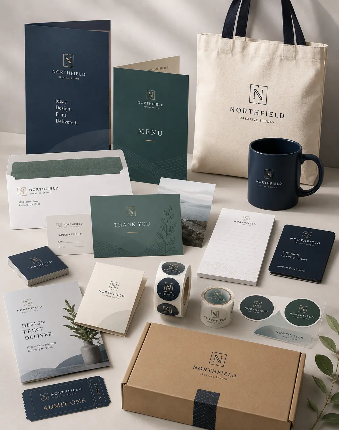


Scaling a business brings many challenges, and we often see owners struggle with the transition from small-batch production to high-volume shipping. When you manually peel individual stickers from a sheet for the five-hundredth time, you realize you need a more efficient system. Our professional Roll Stickers provide the perfect bridge between a growing startup and a streamlined industrial operation. We believe that packaging should save you time, not create a bottleneck in your fulfillment process.
In our experience, the move to rolls represents a significant milestone for any brand. It signals that your volume has outgrown hobbyist methods and requires a professional touch. We help our clients navigate the technical nuances of adhesives and materials so their labels stay put, even in tough environments. By choosing the right roll format, you ensure that your team—or your labeling machine—works at peak efficiency every single day.
Why Businesses Prefer Roll Stickers Over Sheet Stickers
We frequently hear from clients who feel overwhelmed by the costs and slow pace of sheet-fed labels. While sheets work beautifully for small tests or hand-distribution at events, they fail during high-speed production. Roll stickers allow for rapid application because they fit perfectly into handheld dispensers or fully automated labeling machines. We help you choose rolls when your goal involves labeling hundreds or thousands of products without wasting a single movement.
The unit price of a sticker also drops significantly as you move to rolls. We see business owners save a substantial portion of their marketing budget by ordering in bulk quantities that rolls facilitate. This cost-efficiency allows you to reinvest those funds into other areas of your business, like product development or customer service. When you look at the bottom line, the efficiency of a roll format simply beats the alternative for any serious brand.
The Efficiency Factor for High-Volume Packaging
Speed serves as the primary driver for our high-volume clients. If your staff spends three hours a day labeling jars or boxes by hand, you lose valuable labor time. We recommend roll stickers because they minimize the “peel and stick” struggle that slows down your packing line. With a roll, the backing paper remains in one continuous piece, making cleanup easier and faster for your warehouse team.
Better Cost-Efficiency for Growing Brands
We understand the need to balance quality with a strict budget. We find that roll stickers offer the most competitive pricing for businesses that order more than 500 units at a time. Because the manufacturing process for rolls is highly automated, we pass those savings directly to you. This makes it affordable to maintain a professional look across all your product lines without sacrificing your profit margins.
Choosing the Right Material for Your Environment
A common mistake we see involves choosing the wrong material for a specific product environment. We once worked with a client whose labels peeled off in a refrigerator because they used standard paper stickers for a beverage brand. We now guide every customer through a selection process based on where their product lives. If your items face moisture, oils, or cold temperatures, you need a synthetic material like BOPP (Biaxially Oriented Polypropylene).
BOPP is the “gold standard” for the food, beverage, and cosmetic industries because it resists water and chemicals. For products that stay in dry, indoor environments, a high-quality paper sticker might suffice and save you a bit of money. We analyze your specific use case to ensure the adhesive and face-stock match the surface of your packaging, whether it’s glass, plastic, or cardboard.
Synthetic Materials for Moisture Resistance
We strongly recommend synthetic stickers for any product that might encounter a bathroom or a kitchen. These materials do not tear or yellow over time, ensuring your branding stays crisp and legible. We provide various options, including clear BOPP for that “no-label” look on clear containers. This choice allows your product’s natural color to shine through while keeping your logo front and center.
Texture and Finish: Gloss vs. Matte
The finish of your sticker influences how customers perceive your brand’s personality. We often suggest a high-gloss finish for brands that want to appear vibrant, energetic, and modern. Conversely, a matte finish provides a sophisticated, “artisan” feel that works perfectly for premium candles or organic skincare. We help you choose a finish that not only looks great but also provides an extra layer of protection against scratches and scuffs.
Technical Specs: Understanding Wind Direction and Core Size
One of the most technical aspects of ordering roll stickers involves “wind direction.” If you use an automated labeling machine, the machine expects the stickers to face a specific way as the roll unwinds. We have seen businesses order thousands of labels only to find they face the wrong direction for their equipment. We prevent this by asking about your specific applicator requirements before we ever start the printing press.
Core size is another critical detail that often escapes the notice of new business owners. Most industrial machines require a 3-inch core, while smaller handheld dispensers might use a 1-inch core. We ensure your rolls fit your hardware perfectly so you don’t experience any downtime or equipment frustration. Understanding these specs differentiates a professional printer from a generic online shop.
Why Your Applicator Machine Needs the Correct Wind
Machine applicators move at high speeds and require precision to place a label perfectly centered. If the wind direction is incorrect, your labels will appear upside down or sideways on your bottles. We provide clear charts and guidance to help you identify if you need “top off,” “bottom off,” “right off,” or “left off” winding. This small technical detail ensures a smooth production day for your entire team.
Design and Testing: Avoiding Common Labeling Mistakes
We believe that a great sticker starts with a great file, but it ends with a successful test. We often see designers forget about the “bleed” area—the extra space around the design that ensures no white edges show up after cutting. We review your artwork to make sure your text stays within the “safe zone” and your colors extend all the way to the edge. This professional oversight prevents the most common visual errors in the sticker world.
Before you commit to a massive run of 10,000 labels, we always suggest verifying the adhesive strength on your specific packaging material. You should test a product label to confirm it bonds correctly to your containers. Different plastics and coatings react differently to adhesives, and we want to ensure your label stays exactly where you put it for the life of the product.
Frequently Asked Questions
What is the difference between a 1-inch core and a 3-inch core?
The core refers to the cardboard tube in the center of the roll. We use 1-inch cores for small, manual dispensers or hand-application projects. We reserve 3-inch cores for large industrial labeling machines that require a sturdier base to handle the tension of high-speed application.
How do I determine the right “wind direction” for my labels?
You should consult the manual for your labeling machine or ask your co-packer for their requirements. They will specify which way the label should face as it leaves the roll. We offer all eight standard wind directions to ensure compatibility with every machine on the market.
Are roll stickers waterproof?
If we print your stickers on BOPP or vinyl with a protective laminate, they become highly water-resistant. These materials won’t soak up moisture or fall apart when wet. While “waterproof” is a strong term, our synthetic roll stickers survive ice buckets, refrigerators, and showers without any issues.
Can I get a custom shape for my roll stickers?
Yes, we use digital die-cutting or custom dies to create almost any shape you can imagine. Whether you want a standard circle, a sharp-edged rectangle, or a custom “kiss-cut” that follows the outline of your logo, we can accommodate your design. Custom shapes help your packaging stand out on crowded retail shelves.
Conclusion: Streamline Your Branding with Confidence
Roll stickers offer an unbeatable combination of efficiency, cost-savings, and professional durability. We have spent years helping businesses transition from basic labels to sophisticated, machine-ready packaging solutions. By focusing on the technical details like material choice and wind direction, we ensure that your branding efforts support your growth rather than slowing it down. We take pride in being more than just a printer; we act as a partner in your brand’s physical presentation.
Choosing the right partner for your labeling needs eliminates the guesswork and protects your investment. We use high-grade materials and precision equipment to deliver results that make your products look their absolute best. If you feel ready to take your packaging to the next level and save time in your fulfillment process, reach out to us. The experts at Laguna Digital are here to help you design, print, and implement the perfect roll sticker strategy for your unique business.