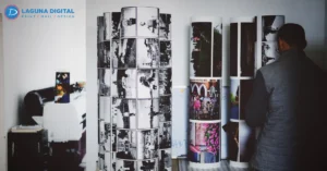


Print buyers are paying closer attention to how a piece feels, reflects light, and survives real handling. A carton, folder, brochure, menu, or retail insert can look polished on screen, yet still feel ordinary when it reaches the customer. That is why finish selection matters more in 2026.
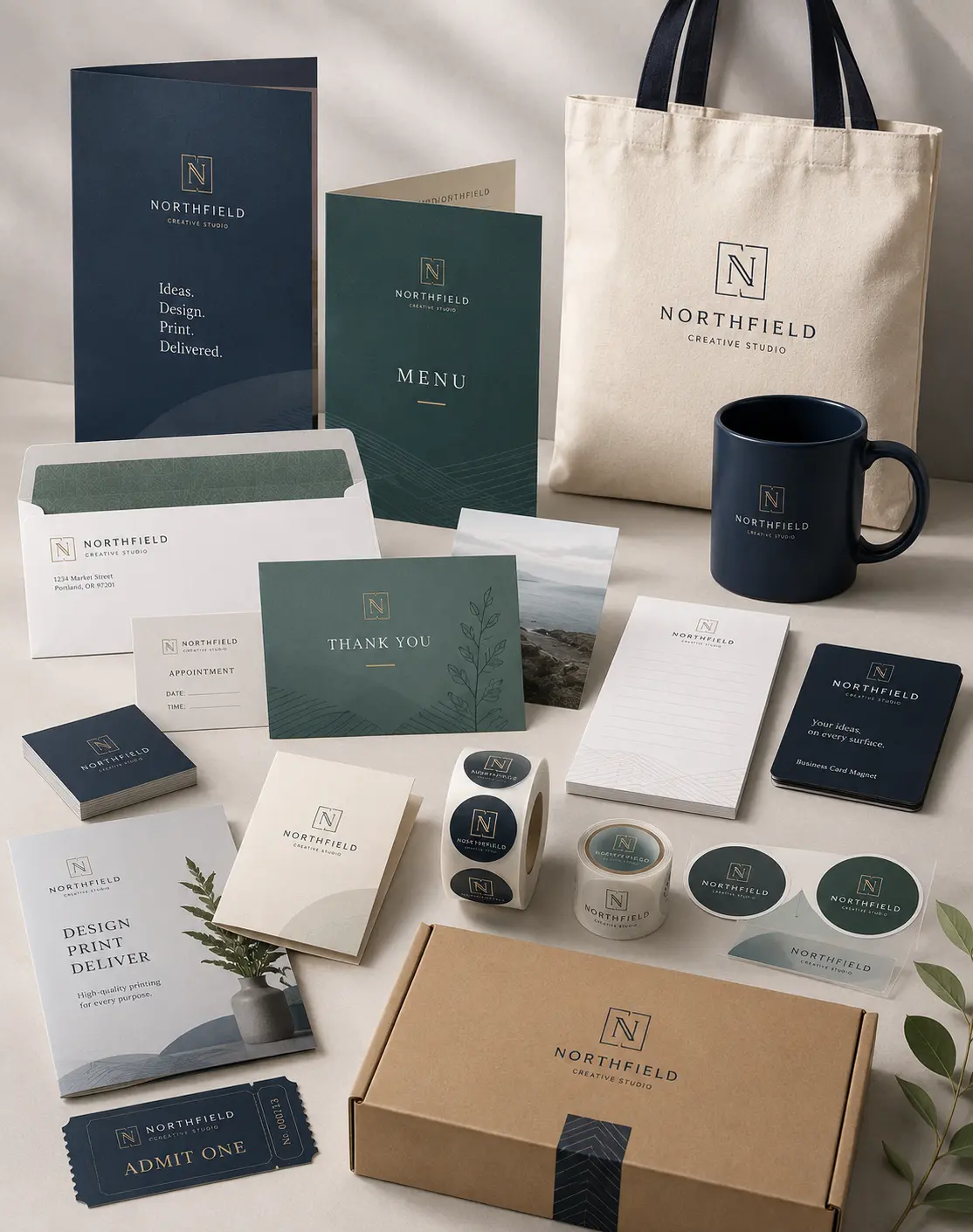
Brands want surfaces that create memory without making the design feel loud. They also want practical choices that match budget, durability, color, and sustainability goals.
The strongest work is not always the shiniest or the most expensive. It is the finish that supports the message, the product, and the way people will actually use the piece.
The Shift Toward Feel, Light, and Brand Memory
Surface That Speaks Before the Copy
A printed piece creates a first impression before anyone reads a line of text. Smooth, rich, or reflective lamination finishes can make a simple design feel more considered. The best results come when the surface matches the product category, not just the designer’s personal taste.
Quiet Premium Signals
Many brands are moving toward calmer surfaces, softer textures, and cleaner layouts. This is especially visible in luxury packaging, where the goal is no longer only to look expensive. The package must feel controlled, intentional, and pleasant to hold without needing excessive decoration.
Shine That Still Sells
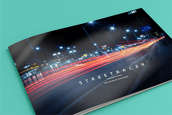
Gloss is not disappearing. It remains useful for bright color, sharp product photography, and retail pieces that need instant shelf attention. The challenge is using shine with restraint so it supports contrast and clarity instead of making the design look cheap or overly busy.
Touch as a Design Choice
Modern print finishing is about more than protection. It helps decide whether a brand feels bold, calm, playful, clinical, premium, or practical. A finish can guide emotion in a subtle way, which is why it should be discussed before the final artwork is approved.
Clean Design With More Intention
Minimal layouts need surface detail to avoid looking flat. This is where packaging finishes can add depth without adding clutter. A smooth film, a reflective highlight, or a soft surface can make simple typography and color blocks feel complete.
Soft and Glossy Surfaces in Real Print Projects
Visual Personality
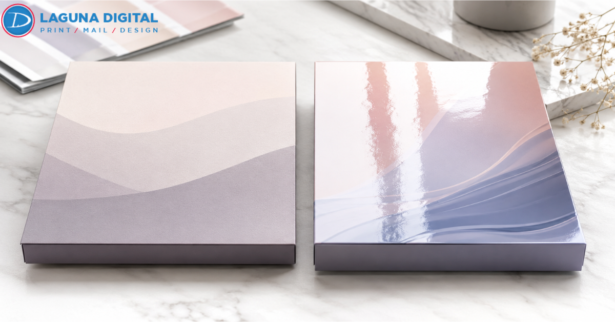
Soft surfaces reduce glare and give designs a calm appearance. Glossy surfaces push brightness and color strength. When comparing print lamination types, the right answer depends on whether the piece needs to feel refined, energetic, protective, or instantly noticeable.
Customer Handling
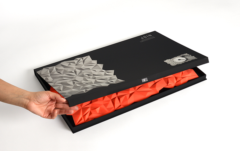
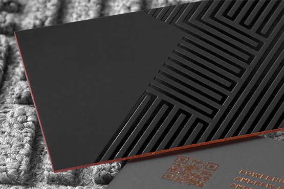
A retail box, sales folder, or menu may pass through many hands before the final user keeps it. Soft touch lamination gives a smooth, velvet like feel that works well for premium items. It is often chosen when the hand feel is part of the brand experience.
Color Behavior
Gloss lamination can make photography, solid color, and product imagery appear more vivid. This makes it useful for cosmetics, food items, event materials, and promotional pieces where strong color matters. It can also help dark ink look deeper under bright lighting.
Practical Durability
Lamination adds a protective layer over print, helping reduce surface wear from handling and transport. Exact performance depends on film, paper stock, ink coverage, and finishing method. For pieces that will be stacked, mailed, or reused, testing a sample is worth the time.
Trends Shaping Finish Decisions in 2026
Tactile Design With Purpose
Texture is becoming a stronger part of brand identity. Designers are pairing soft surfaces with embossing, foil, and spot effects to create depth. The point is not to add every option, but to make one or two details feel deliberate and easy to remember.
Lighter Luxury Thinking
Premium design is becoming less heavy and less wasteful. Brands still want polish, but they are more careful about material use, recyclability, and transport weight. This shift is changing how buyers view luxury packaging in both retail and ecommerce.
Sustainability in the Finish Conversation
Buyers now ask about recyclability, film choice, paper stock, and whether a finish complicates recovery. The right answer depends on the full structure, not the surface alone. Strong planning helps avoid a finish that looks good but creates issues later. That is why lamination finishes should be reviewed with stock choice and recovery needs.
Category Specific Choices
Beauty, wellness, food, real estate, hospitality, and corporate print each need a different surface language. The same finish that feels premium on a skincare carton may feel too muted for a seasonal promotion. Good direction starts with audience and use case. The strongest packaging finishes feel natural to that buying moment.
Sampling Before Production
A screen proof cannot show touch, glare, or real light reflection. Physical samples reveal how inks, paper, and film work together. They also help teams compare cost, texture, color, and handling before committing to a full production run. For print finishing, this step prevents expensive guesswork.
How Brands Should Choose the Right Finish?
Start With the Buying Moment
Think about where the piece will be seen first. A retail shelf, trade show table, hotel counter, mail piece, and ecommerce box all have different needs. Finish choice should match the moment when the customer forms an opinion.
Match Finish to Artwork
Not every design benefits from the same surface. Heavy photography often looks stronger with shine, while simple typography and deep colors may look better with a softer feel. Smart design teams choose the surface after reviewing ink coverage and contrast.
Consider Budget and Quantity
Costs change based on film type, sheet size, stock, run length, and finishing steps. Professional lamination services can explain where the finish adds value and where a simpler option may perform just as well. This prevents overbuilding the piece.
Protect the Brand Experience
Packaging is handled, opened, stacked, shipped, and sometimes saved. A beautiful finish that scratches easily or shows marks too quickly can weaken the impression. Durability should be judged against real handling, not only against how the sample looks under studio light.
Keep the Decision Simple
There are many print lamination types, but most projects do not need a complicated finish plan. Pick the surface that supports the brand promise, then make sure the paper, ink, and finishing process all work together. Simple choices often look more confident.
Common Asking Questions
A soft, low glare surface usually feels more premium for high end boxes, covers, folders, and gift packaging. A shiny surface can still look premium when the design uses rich photography, bold color, and clean spacing.
Which finish is better for colorful artwork?
A shiny film usually gives stronger color depth and more visual punch. It is a good fit for product photos, bright graphics, and retail materials that need quick attention from a distance.
Does a soft finish protect printed pieces?
Yes, it can add protection, but performance depends on the film, paper, ink, and handling conditions. For packaging that ships, stacks, or gets frequent use, always review samples before final production.
Are these finishes suitable for small business packaging?
Yes. Small brands often use premium surfaces on short runs to improve presentation without changing the full structure. The key is choosing a finish that supports the product price and customer expectation.
Should every packaging project use lamination?
No. Some projects work better with coatings, textured paper, or uncoated stocks. Lamination is useful when the piece needs stronger surface protection, a specific feel, or a more polished presentation.
Conclusion
The best finish is not simply the one that looks most dramatic. It is the one that fits the brand, the artwork, the product, and the way the customer will handle the piece. In 2026, the strongest print projects balance beauty with practical choices. They use touch, shine, and protection with purpose. Before choosing a final surface, review samples, compare options, and consider how the printed piece should feel in real life.
For a project that needs a polished and reliable result, working with experienced lamination services can help you make the right call. When you are ready to move from idea to production, contact us to review the best finishing direction for your next print project.