

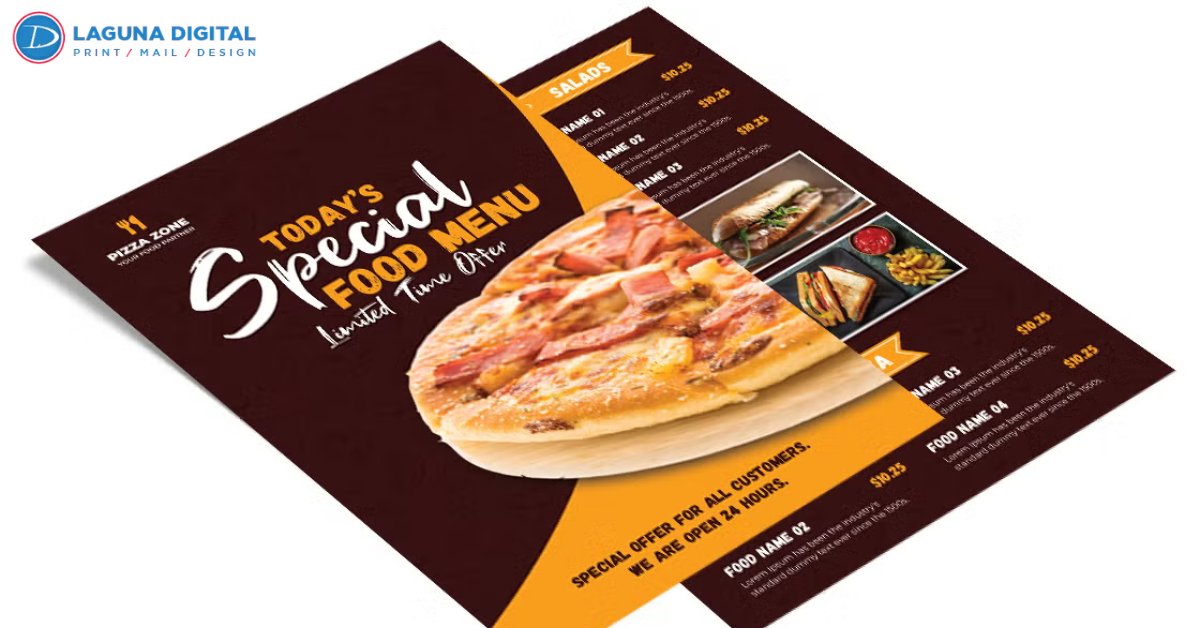
We see it happen every single week in the printing industry. A local restaurant owner walks in with a brilliant culinary concept but a menu design that looks like a cluttered spreadsheet. They wonder why their phone isn’t ringing on a Friday night or why customers seem confused when placing orders. Over years of assisting food service professionals, we have learned that a Take Out Menu serves as your silent salesperson, and its design dictates your profit margins before the food ever hits the plate.
When someone pulls your menu from a kitchen drawer, you have roughly ten seconds to grab their attention. If they struggle to find your phone number or can’t decipher your pricing, they will move on to the next option in the stack. We focus on creating physical marketing tools that bridge the gap between a customer’s hunger and your kitchen’s efficiency. Through our hands-on experience, we have identified the specific elements that separate high-performing menus from those that end up in the recycling bin.
Designing for Hunger: How Visual Hierarchy Drives Sales
The human eye follows a very specific path when scanning a menu, a pattern we call the “Sweet Spot.” Most customers look at the top-right corner first, followed by the top-left. We advise our clients to place their highest-margin items or signature dishes in these prime locations. By strategically placing your “star” dishes where people look first, you naturally steer the customer toward choices that benefit your bottom line.
White space serves a critical purpose in professional menu design. Many business owners feel tempted to fill every square inch with text to save on printing costs, but this creates visual exhaustion. We find that clean, spacious layouts allow your food descriptions to breathe and make your offerings more appetizing. When you provide enough room around your categories, you make the decision-making process easier for your hungry guests.
The Font and Layout Balance
Legibility remains the most overlooked factor in menu success. We often see beautiful, script-heavy fonts that look elegant but remain impossible to read under dim kitchen lights or for older patrons. We recommend high-contrast sans-serif fonts for descriptions and bold, clear headers for categories. This ensures that a customer can find “Appetizers” or “Desserts” without squinting or losing patience.
Strategic Use of Food Photography
While a picture can say a thousand words, a bad picture can ruin a thousand appetites. We suggest using professional photography only if the images truly represent the quality of your kitchen. If a high-end photoshoot doesn’t fit the budget, we recommend using high-quality illustrations or simply focusing on compelling, sensory-rich descriptions. A well-written description of “slow-roasted, herb-crusted chicken” often works better than a blurry smartphone photo.
Selecting the Perfect Menu Format for Your Brand
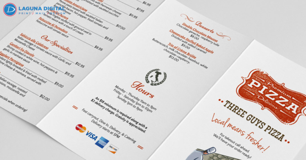
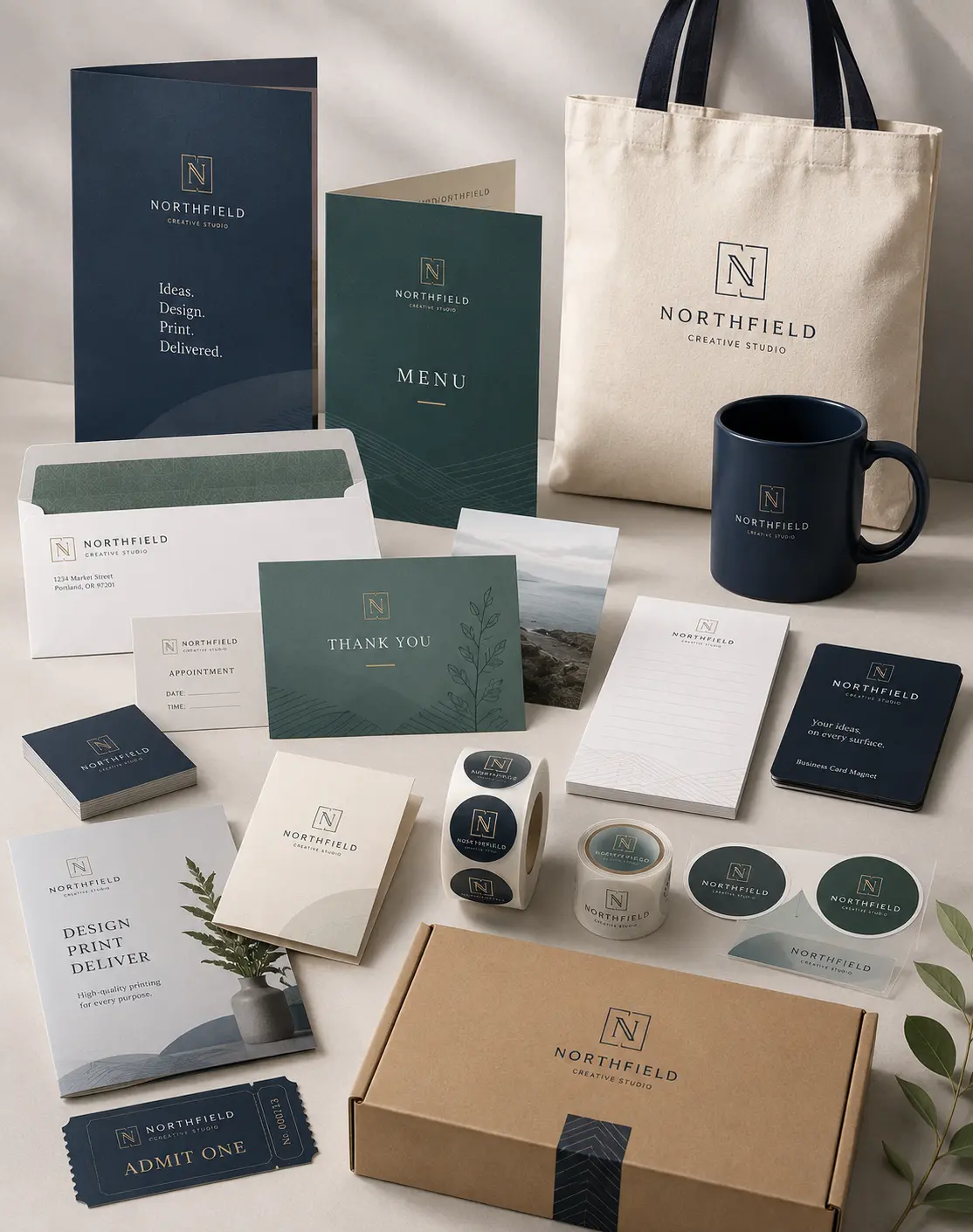
Every cuisine requires a different structural approach to present its story effectively. A high-end Italian bistro needs a different tactile experience than a fast-paced neighborhood deli. We help our clients choose between various folding options and paper weights to match their brand’s personality. The physical feel of the paper tells the customer about the quality of the ingredients before they even take a bite.
Tri-fold menus remain the industry standard for a reason: they are incredibly portable and easy to organize. This format allows us to create distinct sections for different meal types, such as lunch specials and dinner entrees. For businesses with smaller selections, like coffee shops or bakeries, a single-page flat menu often provides a modern and minimalist aesthetic that resonates with younger demographics.
Choosing the Right Paper Stock and Coating
Durability matters just as much as design when it comes to take out materials. We have seen thin, uncoated papers soak up grease and tear easily, which reflects poorly on the restaurant’s standards. We suggest a sturdy 100lb gloss text or a light cardstock with a protective aqueous coating. This finish resists moisture and fingerprints, ensuring your menu looks fresh even after weeks of sitting on a customer’s refrigerator.
In addition to the menu itself, your packaging plays a vital role in the customer’s perception of your brand. We often recommend using durable sticker printing to seal bags and containers. These small details show customers that you care about the security and presentation of their meal during transit. When your branding remains consistent across the menu and the packaging, you build a much stronger sense of trust.
Common Mistakes Restaurant Owners Make
The biggest mistake we witness involves missing or hidden contact information. We emphasize placing your phone number, physical address, and online ordering URL on every single panel of the menu. You should never force a customer to hunt for the way to pay you. If they can’t find the “order now” details instantly, you are essentially handing your business to the competitor down the street.
Another frequent error involves neglecting the “Add-On” section. We encourage our clients to create a dedicated space for sides, drinks, and desserts. These high-margin items significantly increase the average order value with very little extra effort from the kitchen. By grouping these items near the end of the menu or in a highlighted box, you remind the customer to complete their meal with a beverage or a sweet treat.
Forgetting the Mobile Audience
Even with a physical menu in hand, many customers will still check your social media or website. We recommend including a QR code that links directly to your online ordering platform or your latest Instagram specials. This bridges the gap between the physical and digital worlds. We find that menus featuring a clear digital call-to-action see a much higher engagement rate than those that rely solely on phone calls.
Finalizing Your Menu Strategy for Long-Term Success
We believe that a great take out menu acts as an extension of your dining room’s atmosphere. It conveys your brand’s voice, showcases your culinary expertise, and simplifies the ordering process for your community. By focusing on high-quality materials, strategic layouts, and clear communication, you turn a simple piece of paper into a powerful revenue generator. We take pride in helping business owners navigate these choices to find the perfect fit for their specific needs.
When you invest in professional printing and thoughtful design, you demonstrate a commitment to excellence that customers notice. We have watched many small eateries transform into local staples simply by refining how they present their food to the world. Your menu serves as your first impression; we ensure it is a lasting and profitable one.
Whether you need a complete redesign or a simple refresh of your current look, our team at Laguna Digital stands ready to assist you. We bring years of practical experience and technical knowledge to every project, ensuring your restaurant stands out in a crowded market. Reach out to us today to discuss how we can help your business grow through effective print marketing.