

A printed report still says a lot before anyone reads the first page. The cover, paper, finish, and spine all shape how the reader feels about the material. In many offices, the way pages are bound has moved away from heavy, flashy formats and toward cleaner choices that feel polished without looking overdone.
That shift fits modern report design, where clarity matters more than decoration. Teams want materials that are easy to open, simple to review, and professional enough for boardrooms, client meetings, investor updates, and internal planning sessions.
Minimalism does not mean plain or cheap. It means every detail has a reason. For company reports, the right finish can make dense information feel organized and credible. It also helps the report sit neatly on a desk, travel well in a bag, and leave a better impression after a meeting ends.
Clean Binding Choices That Support Modern Business Needs
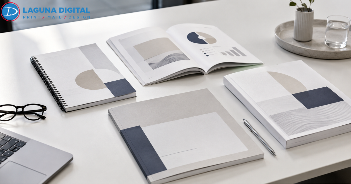
Soft Touch Covers: Soft touch covers give a report a smooth, premium feel without adding visual noise. The finish works well when the design uses calm colors, clear titles, and simple branding. It feels modern in the hand and helps business documentation look more thoughtful.
Wire Binding With Structure: Wire binding remains popular because it opens flat and handles frequent page turns. For financial packets, training guides, and proposal books, it offers functions with a neat profile. It also suits presentation styles that rely on quick review during meetings.
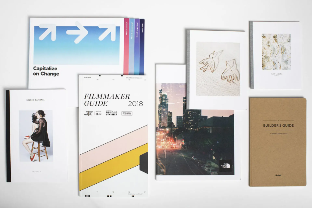
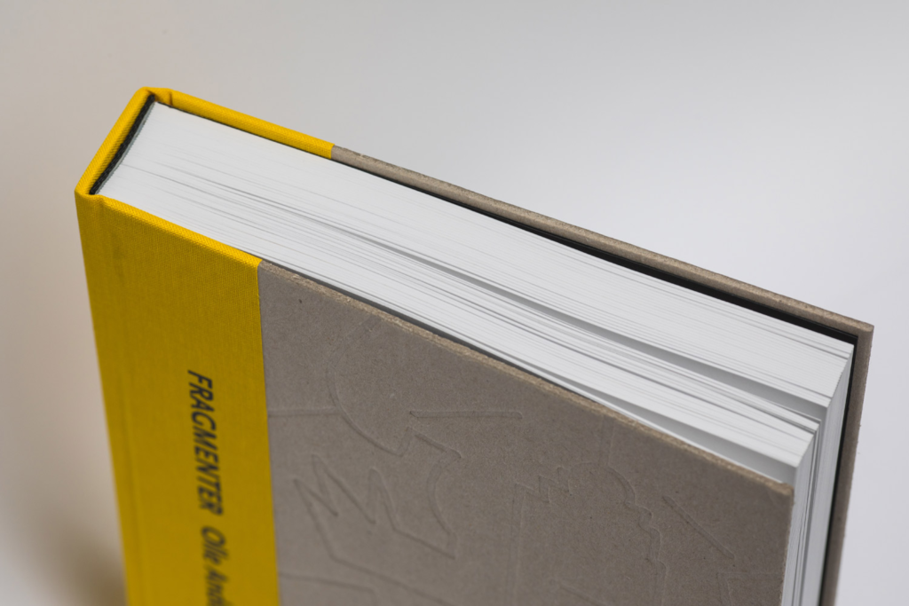
Perfect Binding For Polished Reports: Perfect binding gives longer reports a clean book-like edge. It works best when the content is final and does not need page swaps. Many teams use it for annual summaries, research documents, and client facing materials that need a refined finish.
Clear Front Covers: A clear front cover protects the first page while keeping the design visible. It is useful when the title page already carries strong branding. This option keeps the report simple, practical, and easy to identify in a stack of materials.
Matte Lamination: Matte lamination reduces glare and gives covers a calm, professional surface. It is a strong match for minimalist layouts because it avoids shine while adding durability. The result feels understated, clean, and appropriate for serious business settings.
Design Details That Make Minimal Binding Work
Balanced White Space
White space gives the page room to breathe. It helps charts, headings, and summaries stand out without forcing the reader to work harder. In minimalist report design, open space often does more for readability than extra graphics.
Restrained Color Palettes
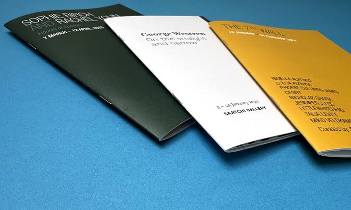
Simple color palettes keep attention on the information. Many teams now choose one main brand color with neutral support tones. This approach makes corporate reports feel consistent and helps covers, tabs, and dividers look unified.
Strong Typography
Typography should guide the reader through the report without calling too much attention to itself. Clean fonts, steady spacing, and clear heading levels make a document feel organized. Good type choices can lift even a simple layout.
Quality Paper Selection
Paper weight changes how a report feels. A slightly heavier sheet can make charts look sharper and pages easier to turn. It also helps the finished piece feel more substantial without needing extra decoration or bulky covers.
Simple Brand Placement
Minimal branding often looks more confident than oversized logos. A small logo, clean title, and careful color use can create a stronger impression than a crowded cover. It tells the reader the company values clarity and control.
Practical Trends Shaping Corporate Presentation Work
Flat Opening Formats
Reports that open flat are easier to review during meetings. This matters when several people are comparing charts, signing off on plans, or taking notes. The best document binding choice is often the one that makes the conversation smoother.
Short Run Customization
Companies no longer need to print every report in large quantities. Short runs allow teams to update covers, sections, and recipient details. That flexibility helps business documentation stay accurate while still looking professionally produced.
Cleaner Tabs And Dividers
Tabs are becoming more subtle. Instead of bright blocks and heavy labels, many reports now use muted dividers and clean section names. This keeps navigation easy while preserving a refined look across the whole piece.
Premium Minimal Covers
Minimal covers can still feel high end when the materials are right. Thick stock, soft finishes, and careful trimming can make a simple report feel important. This is where experienced binding companies can make a real difference.
Eco Conscious Material Choices
Many offices now ask about recycled paper, lower waste production, and practical quantities. Minimalist reports naturally support this mindset because they avoid unnecessary inserts and oversized packaging while still keeping the final product professional.
Production Choices That Improve Final Presentation
Accurate Page Planning
Before printing, the page count should match the selected binding method. A short report may feel awkward in a thick spine, while a long one may need stronger support. Good planning prevents a report from looking unfinished or hard to handle.
Consistent Margins
Binding affects how close text can sit to the inside edge. Wider inner margins keep content readable after finishing. This small detail is easy to miss, but it has a major impact on how comfortable the report feels to use.
Sharp Image Output
Charts, photos, and diagrams should print clearly on the chosen paper. Soft images can make even a well bound report feel less credible. Reliable report printing services check files, resolution, and color before production begins.
Durable Spine Selection
The spine must match the use case. A report that will be opened often needs a stronger, flexible format. A final executive summary may need a sleeker edge. Matching used to finish is a key part of professional presentation styles.
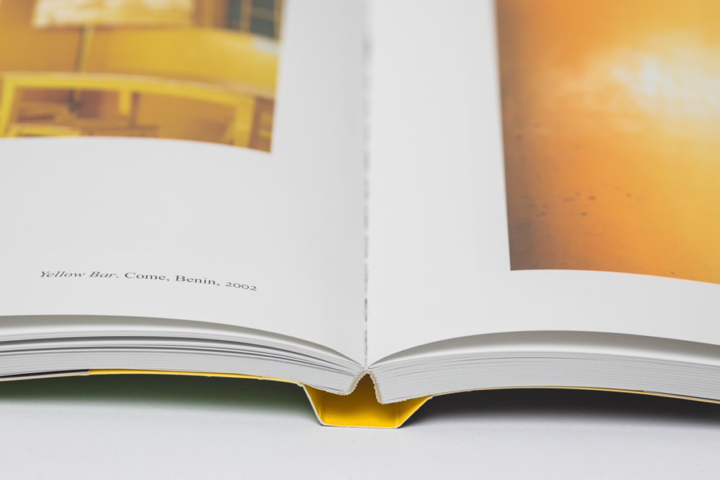
Clean Final Trimming
Final trimming gives the report its finished shape. Uneven edges or shifting pages can weaken the overall impression. Careful trimming, square corners, and aligned covers help minimalist work look intentional rather than basic.
Choose The Right Partner For Minimalist Reports
Production Experience: A print partner should understand how binding, paper, color, and finishing work together. The best document binding results usually come from teams that ask about the purpose of the report before suggesting options.
File Review Support: Small file issues can become visible after printing. Page bleed, low quality images, and margin problems should be caught early. Skilled binding companies help spot these problems before they affect the finished piece.
Business Ready Turnaround: Corporate deadlines are often tight. A reliable partner gives clear timing, reviews the files carefully, and communicates before production starts. This matters most when reports are needed for meetings, pitches, or quarterly reviews.
Scalable Print Options: Some projects need ten copies while others need hundreds. Flexible report printing services allow teams to order the right amount without wasting budget. This keeps presentation work practical and easier to manage.
Complete Print Support: Companies often need more than one item for a meeting. Reports, folders, inserts, and leave behind pieces should feel connected. Strong corporate printing solutions help keep all materials consistent from the first page to the final handout.
Frequently Asked Questions
What binding style works best for a professional report?
The right style depends on page count and use. Wire binding is good for reports that need to open flat. Perfect binding is better for polished final documents. Simple covers work well when the layout already has strong branding.
Are minimalist reports too plain for client meetings?
No. A minimalist report can look premium when the paper, cover, typography, and finishing are chosen well. The goal is not to remove personality. The goal is to keep attention on the message and make the document easier to read.
How can a report look more expensive without a busy design?
Use better paper, clean margins, matte finishes, and a strong cover layout. Small upgrades often have more impact than extra graphics. A well planned report feels valuable because it is easy to handle and visually controlled.
Should every department use the same report format?
A shared format helps create consistency, especially for leadership updates and client facing documents. Departments can still adjust sections, colors, and page counts while keeping the overall structure familiar and professional.
What should be checked before sending files to print?
Check page order, margins, image quality, spelling, page numbers, and cover details. Also confirm the binding edge so important text does not sit too close to the spine. A final file review saves time and prevents costly reprints.
Conclusion
Minimalist binding works because it respects the reader. It makes complex information easier to follow, gives printed materials a cleaner presence, and helps teams present their work with more confidence.
For companies that want practical, polished, and meeting ready documents, modern corporate printing solutions offer more choices than ever. Laguna Digital can be part of that process when a report needs to feel clear, professional, and carefully finished.