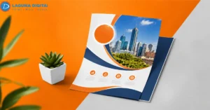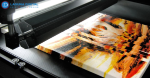
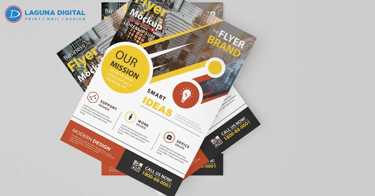
A flyer may look great on screen and look even worse when printed. Often a store owner doesn’t realize this until the piece is received, the product images are cloudy, the coupon text is thin and the entire piece has a poorly finished appearance.
For retail campaigns, sharp printing matters because customers judge the offer quickly. A blurry handout can make a sale, grand opening, menu, or service promotion feel rushed. Clean retail flyers printing help the business look prepared, credible, and worth visiting.
Many of the troubles are well underway before the printing ever begins. Images that are too low resolution, stretched-out logos, incorrect file exports, absent bleed, and poor paper selection can all cause print quality issues. Most quality print shops will catch quite a bit of these early on, but files should be created correctly in the first place.
Common File Issues That Make Printed Flyers Look Blurry
Low Quality Images
Images saved from websites, social posts, or screenshots are usually too small for clean print. They may look fine on a phone, but paper exposes missing detail. Use original product photos, clear staff images, and large image files whenever the offer depends on visual impact.
Weak Logo Files
A logo copied from an email signature or old web banner can look rough when enlarged. Vector artwork is the better choice because it keeps letters, icons, and lines smooth. This matters most when the logo sits near the headline or main offer.
Design Choices That Lower Flyer Response
Crowded Layouts
Best retail marketing ideas include offering clearly visible. People do not want to search through a cluttered ad to find the price, the date, or the location of the deal or coupon rules. Keep the primary marketing message up front and don’t be afraid of whitespace around elements that prompt customer action.
A quick review should confirm:
- The main offer is readable from arm’s length
- The phone number or web address is easy to find
- The sale date is visible
- The coupon code is not buried
Weak Contrast
Light gray text, thin fonts, and pale backgrounds can look stylish online but weak in print. Strong marketing flyers use clear contrast so the headline, offer, and call to action stand out. This helps customers scan the piece without effort.
Print Setup Details That Protect Sharpness
Final Size
Artwork should be built at the final print size instead of being stretched later. Resizing a small layout can soften photos, icons, and text. For reliable flyer printing, the file should match the exact finished size before it is exported.
Bleed And Safe Area
Bleed gives the printer room to trim clean edges, while the safe area keeps important text away from the blade. Without these settings, a file may need adjustment before production. That adjustment can hurt custom flyers printing when borders, coupons, or small details are already tight.
Paper And Finish Choices That Change The Final Look
Gloss Paper
Gloss paper can make colors feel brighter, and photos look more lively. It is a good match for food specials, boutique sales, beauty offers, product launches, and event flyers printing where first glance appeal matters.
Matte Paper
Matte paper reduces glare and gives the design a calmer feel. It works well for service lists, appointment offers, menus, clinic promotions, and information-heavy layouts. A matte finish can support print quality when the customer needs to read more than one line.
Retail Planning That Makes Flyers Sell Better
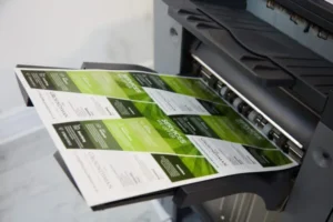
The Offer Is Clear: The flyer can serve as a bulletin board for every announcement, service, and product. Effective promotional flyers focus on a single, convincing reason to buy now, a discount, a new product release, a seasonal special, or a temporary discount. Single-focus designs are more effective.
The Call to Action: A clear message telling customers exactly what you want them to do motivates action. ‘Visit us today’, ‘scan the code for details’, ‘present this flyer, or ‘call now for a free quote’ are more likely to inspire the target customer.
Professional Checks That Prevent Costly Reprints
Prepress Check
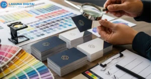
A proper prepress check looks at image strength, logo quality, color setup, trim safety, and font clarity before production. This is where many blurry file issues are caught. It also helps avoid delays when a promotion has a tight launch date.
A careful file check should include:
- Image resolution
- Logo format
- Final size
- Bleed setup
- Safe area
- Color mode
- Small text readability
Material Choice
Not every promotion needs the same stock. Custom flyer printing for a luxury service may need thicker paper, while event flyers printing may need a brighter finish and faster turnaround. Good material advice helps the final piece match the campaign instead of looking generic.
Sales Focused Print Choices For Local Campaigns
Product Photos
If the flyer sells a product, the photo must look clean, bright, and real. Strong retail flyers should make the item easy to understand before the customer reads every detail. Sharp promotional flyers make the item feel more desirable and help the price or discount feel easier to believe. A clean flyer design also makes the photo, price, and next step feel connected.
Brand Consistency
Colors, contact details, logo, and tone should be similar to the other elements of the business. By maintaining this, the design of your flyers is instantly recognisable, professional, and familiar. This applies to the printing of business flyers, as your flyer may be the first contact that a customer has with your business.
Frequently Asked Questions
Why Do Flyers Look Clear On Screen But Blurry After Printing?
Screens can hide weak image detail because they use light. Print shows the real quality of the file. If an image is compressed, stretched, or too small, it will usually look soft on paper.
What File Type Is Best For A Sharp Flyer?
A press-ready PDF is usually the safest option. It keeps the layout, fonts, image placement, and spacing more stable, which helps the print team review the artwork before production.
Can A Blurry Image Be Fixed Before Printing?
You can make minor enhancements, but an image of poor quality can’t be made crisp with filters. Often it’s best to replace it with an original high-resolution version.
Does Paper Stock Affect The Final Look?
Yes. Gloss can make color stronger, while matte can make reading easier. Paper weight also matters because thin stock can make the flyer feel less valuable even when the design is clean.
What Should I Send Before Placing An Order?
Send the final size, quantity, paper preference, finish, deadline, and press-ready artwork. Also include brand files if available, especially the logo, product photos, and any approved color notes.
Final Thoughts
Customers notice clean printing even when they do not think about it. Sharp photos, readable text, accurate trimming, and the right paper make the offer feel more professional. Better flyer printing can support walk-ins, calls, scans, and repeat local recognition.
Laguna Digital helps businesses prepare sharper print campaigns with file review, practical material guidance, and reliable printing services. Whether a flyer job is for a retail coupon, service deal, grand opening, or business flyer printing, the purpose of a flyer is easy. That flyer should look clean, sharp, and be ready to motivate that prospect.