
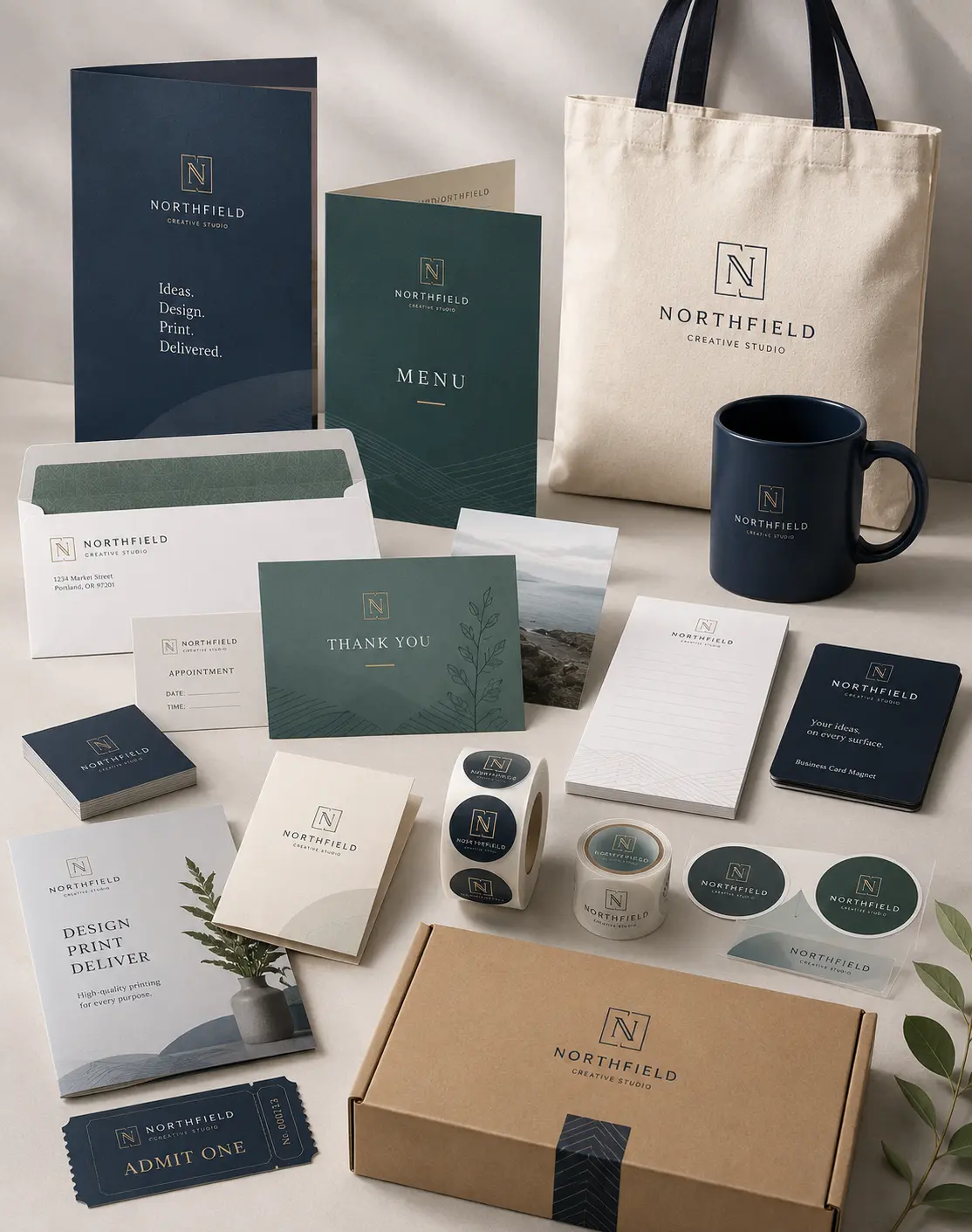


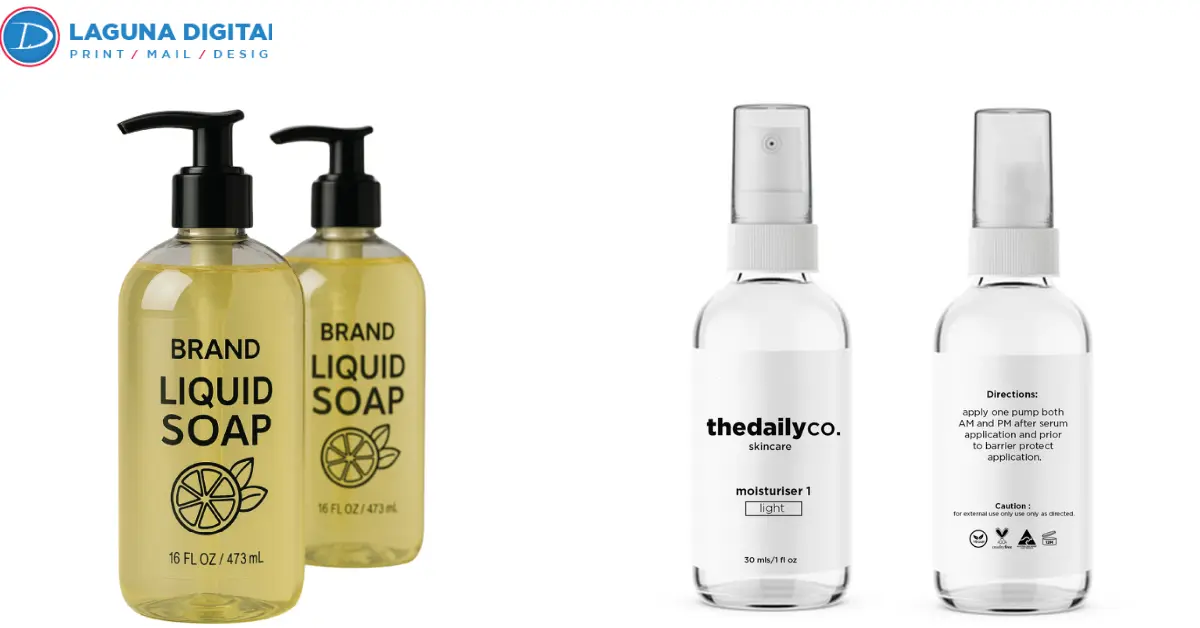
Place the same red logo on a white bottle, clear glass, and amber glass, and it will not look identical three times. The artwork has not changed. The surface underneath it has.
That is the practical difference between a clear sticker and a white sticker. Clear material allows the package to remain part of the finished design. White material creates an opaque base, giving printed colors a more controlled starting point.
The choice affects more than appearance. It can change color strength, small-text readability, white areas in the artwork, QR-code contrast, and how much of the product or package remains visible.
Clear Sticker and White Sticker Results Start With the Surface
Transparent material never works independently of its background. The surface beneath it remains visible through open areas and can influence how printed colors appear. On a white container, colors may look bright and crisp. Move the same artwork onto amber glass or dark plastic, and lighter colors can lose strength.
A white sticker removes much of that uncertainty. Its opaque face creates a stable background, which is useful when photographs, small text, or brand colors need to remain consistent across several package colors.
Material selection should therefore happen before the artwork is finalized. Once the surface is known, the design can be prepared for the conditions it will actually face.
Clear Film Works With the Package
Clear vinyl stickers work well on beverage bottles, candle jars, cosmetic containers, storefront glass, and packaging where hiding the surface would take something away from the design.
Good transparency looks intentional. Open areas should have a purpose, whether they reveal the product inside, preserve the appearance of glass, or create space around the artwork.
A clear sticker design should also establish where color prints, where the material stays transparent, and where white ink may be needed.
For projects built specifically around transparent material, clear sticker printing offers relevant production choices including clear BOPP, white-ink settings, and matte or gloss lamination.
White Material Gives the Artwork a Stable Base
White vinyl stickers make more sense on kraft packaging, dark bottles, equipment, patterned surfaces, and applications where the background should not interfere with the design.
A white sticker design can support pale colors, photographs, gradients, and smaller lettering without relying on the color underneath. Opaque white stickers are also useful when one label must maintain a similar appearance across several product variations.
Neither material is inherently better. The better choice is the one that gives the artwork the amount of background control it actually needs.
White Ink Determines What Stays Visible
Once transparent material has been selected, white ink becomes the next production decision.
Clear stock has no white background of its own. White lettering, pale graphics, or lighter brand colors may therefore need a white underbase to remain visible on the finished product.
That underbase does not have to cover the entire sticker. It can sit behind selected artwork while the surrounding film stays transparent. This is how printed clear stickers can preserve a clean, no-label appearance without allowing important details to disappear.
The distinction matters in transparent sticker printing because a white shape on a computer screen does not automatically mean white ink will appear on the finished piece.
A useful proof should show where white ink prints and where the material remains clear. It should also be reviewed against a background similar to the real package, particularly when the container is dark, colored, or reflective.
With the ink treatment settled, the artwork itself can be judged more accurately.
Artwork Needs Different Treatment on Clear and White Stock
The same source file can begin both versions, but that does not mean both versions should go to production with identical settings.
Clear material may need stronger contrast, heavier small type, or an underbase behind selected colors. A white sticker already provides opacity beneath the design, which gives lighter artwork more support.
Small reverse type, thin rules, gray lettering, QR codes, and barcodes deserve particular attention. A code that scans easily against a white artboard can become unreliable when dark or reflective packaging shows through the transparent film.
When a project requires flexibility in stock, shape, coating, or format, custom sticker printing fits naturally into the production process rather than forcing one sticker construction to handle every application.
Protect Fine Details at Final Size
Artwork should be checked at the size it will actually print. Enlarging a design on screen can make fine lines and small lettering appear safer than they are.
Important information needs enough contrast to remain readable at normal viewing distance. Scannable elements need even more care because an unpredictable background can interfere with their performance.
Make Transparency Part of the Composition
The strongest clear sticker design works with the surface instead of fighting it. Glass, product color, and open space should contribute something useful to the finished piece.
White material takes the opposite approach. It separates the artwork from its surroundings, which can be valuable when brand colors need to stay stable, or the package itself is visually busy.
This is why clear vinyl stickers and white vinyl stickers can carry identical artwork yet create noticeably different results.
Match the Material to the Real Application
Material decisions become easier when they are tied to a specific use rather than appearance alone.
| Application | Better Starting Point | Main Reason |
| Clear glass bottle | Clear material | Keeps the container visible |
| Amber bottle | Clear with white ink or white material | Protects key colors |
| Kraft box | White material | Blocks the brown background |
| Storefront window | Clear material | Preserves visibility through glass |
| Promotional handout | White material | Works across unknown surfaces |
| Cosmetic jar | Clear material | Supports a minimal label look |
| Photo-heavy artwork | White material | Gives images a stable base |
These are practical starting points rather than fixed rules.
Transparent stickers can work on darker containers when white ink is planned correctly. Opaque white stickers can still produce a weak result if the typography is too small, the finish does not suit the product, or the application surface has not been prepared properly.
Clear sticker labels also reveal more of what sits underneath them. Dust, fingerprints, trapped air, and uneven surfaces are harder to hide once the material is transparent.
That brings the decision naturally to finishing and format.
Finish and Format Shape the Final Result
Gloss and matte finishes influence both appearance and use.
Gloss can strengthen color and complement polished bottles or glossy packaging. Matte reduces reflections and can create a quieter finish for cosmetic, food, or retail packaging.
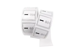
Format should follow the way the stickers will be applied. Individually cut pieces make sense for handouts, inserts, and promotional packs. Roll formats are more practical when labels are applied repeatedly to bottles, jars, boxes, or other packaged products.
For larger packaging runs where handling and application speed matter, roll sticker printing follows the production workflow naturally.
Sticker construction should also account for moisture, refrigeration, sunlight, rubbing, and frequent handling. Vinyl sticker printing for promotional use may have different requirements from labels that spend their working life inside a refrigerator or on a frequently handled container.
Prepress Checks Prevent Avoidable Reprints
A final proof should answer production questions, not simply show that the artwork looks attractive on screen.
Before approving clear sticker printing or white vinyl sticker printing, check the following details.
- Confirm the final size and shape
- Identify the exact application surface
- Check the color of the bottle, box, or container
- Mark areas that must remain transparent
- Confirm where white ink should print
- Review small type and thin rules at actual size
- Test QR codes and barcodes for sufficient contrast
- Verify bleed, safe area, and cut path
- Choose matte or gloss for the intended use
- Account for moisture, refrigeration, sunlight, or frequent handling
These checks matter more with transparent material because the package remains visible through the film. White material provides more background control, but it still relies on suitable artwork, finishing, adhesive, and surface preparation.
Common Production Mistakes Lead to Different Results

One of the easiest mistakes is approving transparent artwork against a white computer background and never checking the actual package. The screen can make pale colors and fine details appear stronger than they will on amber glass, dark plastic, or a colored bottle.
Another mistake is assuming every white element in the artwork will automatically print with white ink. That decision needs to be part of the production setup.
Material terminology can create confusion as well. Buyers often use vinyl stickers as a broad term, even though the final stock may be white vinyl, clear BOPP, or another film chosen for a specific application.
A search for clear vinyl stickers, for example, does not necessarily establish the exact material needed for a refrigerated bottle or transparent product label. The stock should be confirmed according to the job.
The same principle applies to white material. A white sticker still needs the correct finish and adhesive for the environment where it will be used.
When durable white stock is the actual requirement, vinyl sticker printing is a more relevant choice than adding transparency simply because the effect looks modern.
Frequently Asked Questions
Are Clear Stickers Better Than White Stickers
Neither material is better for every project. Transparent stickers make sense when the surface or product should remain visible. White material gives the artwork more control when opacity, readable text, and consistent color matter more.
Do Clear Stickers Need White Ink
Not every design needs white ink. Dark artwork can work well without it. Pale colors, white graphics, and fine lettering often benefit from a white underbase that keeps them visible against the application surface.
Can Transparent Stickers Work on Dark Bottles
Yes, provided the artwork is prepared for the darker background. Printed clear stickers may need white ink behind important colors, logos, or text so those elements do not lose contrast.
Which Material Works Better for Product Labels
Clear sticker labels work well when visibility of the bottle, jar, or product contributes to the presentation. White material is easier to control when photographs, fine text, pale colors, or consistent branding are more important.
What Should Be Checked Before Ordering Custom Stickers
Check the application surface, material, final size, white-ink requirements, finish, cut path, exposure conditions, and artwork at actual print size. Those decisions make custom sticker printing more predictable and reduce problems between the digital proof and finished product.
To Sum Up
The difference between a clear sticker and a white sticker goes well beyond whether the background can be seen. Material changes how colors behave, how white artwork is produced, how much influence the package has, and how consistently the same design can move between different applications.
Start with the real surface rather than the computer screen. Review the artwork at actual size and decide whether transparency adds anything useful to the design. From there, confirm white ink where necessary and choose the finish and format according to how the sticker will actually be used.
For artwork that is ready for production, Laguna Digital can turn those decisions into a finished sticker built around the material, application, and visual result the project requires.