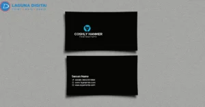
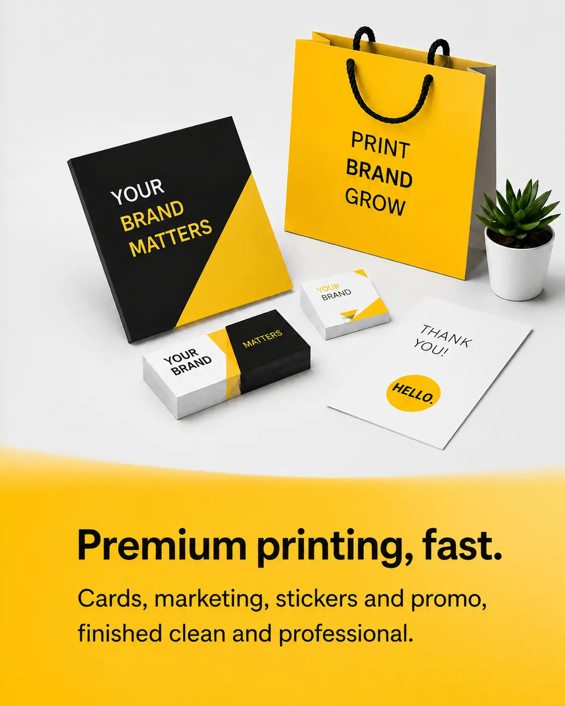

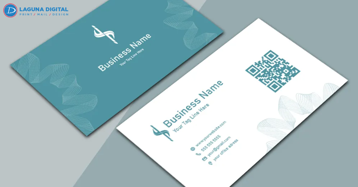
We see it at almost every networking event in California. An entrepreneur hands over a card that looks like it belongs in 1995 cluttered, flimsy, and immediately forgettable. You work tirelessly to build a modern, high-value brand, yet a poor first impression can derail a potential partnership before the conversation even ends. Professional Business Cards remain the most effective way to leave a physical piece of your brand in a client’s hand.
We observe that the most successful professionals no longer treat their cards as simple contact repositories. Instead, they view them as high-impact marketing tools that bridge the gap between a physical handshake and a digital follow-up. In a world of automated outreach, a well-designed card signals that you value quality and attention to detail. We see a significant shift toward designs that prioritize tactile experiences and clean, functional aesthetics.
Emphasizing Minimalist Sophistication
We find that the “less is more” philosophy currently dominates the design landscape for high-end service providers. A cluttered card creates visual noise that confuses the recipient and obscures your most important information. Modern trends favor plenty of white space, which allows your logo and name to breathe and command attention. We advise our clients to strip away unnecessary details like secondary fax numbers or physical addresses that people can easily find online.
Bold Typography Over Complex Imagery
A successful card guides the eye naturally from the most important element to the secondary details. We suggest using bold, sans-serif typography for your name or brand while keeping contact details in a lighter weight. This contrast ensures that the recipient remembers who you are first and how to reach you second. When we design for our clients, we focus on creating a path for the viewer’s gaze that reinforces brand recognition instantly.
The Power of Intentional White Space
Many business owners feel the urge to fill every square inch of the card with information. We consistently see that cards with more white space feel more premium and organized. White space doesn’t mean “empty” space; it represents an intentional design choice that highlights your most critical data points. This approach makes your card easier to read and much more likely to stay on a client’s desk rather than in the bin.
The Rise of High-Tactile Finishes
Texture communicates authority before the recipient even reads a single word on the page. We see a massive trend toward “extra-thick” cardstocks, such as 18pt or even 32pt painted-edge cards. These heavy-duty materials feel substantial and permanent, suggesting that your business possesses those same qualities. We find that people rarely throw away a card that feels like a premium object, increasing your chances of a future callback.
Soft-Touch Lamination and Raised Foil
Tactile finishes like spot UV, raised foil stamping, and embossing create a sensory “hook” that stays with a person. We often recommend a soft-touch lamination for luxury brands because it provides a velvety feel that people find difficult to put down. These finishes don’t just look better; they encourage the recipient to physically engage with the card for several extra seconds. This increased “hold time” translates directly into better brand recall and a higher perceived value.
Painted Edges for a Modern Pop
We observe more clients requesting painted or “sandwich” edges to add a subtle pop of color. When a card sits in a stack of others, a vibrant edge color helps your brand stand out instantly. This trend works particularly well for creative agencies or modern tech firms that want to showcase personality without sacrificing a professional layout. A subtle edge tint provides that extra bit of flair that makes your brand feel modern and approachable.
Integrating Smart Technology for Seamless Follow-ups
We believe that a business card should serve as a gateway rather than a final destination. The most effective cards today integrate technology to make the follow-up process seamless for the client. We no longer see QR codes as an eyesore; instead, we treat them as a design element that adds immediate functionality. By scanning a well-placed code, your prospect can instantly save your contact info or view your latest portfolio.
Strategic Placement of QR Codes
We suggest placing QR codes on the back of the card to keep the front design clean and professional. A custom-branded QR code can lead a prospect to a personalized landing page, a video introduction, or a direct booking link. This creates a frictionless transition from a physical handshake to a digital relationship. We observe much higher engagement rates when businesses make it easy for clients to take the next step without typing in a URL manually.
Maintaining Professional Consistency Across Brand Assets
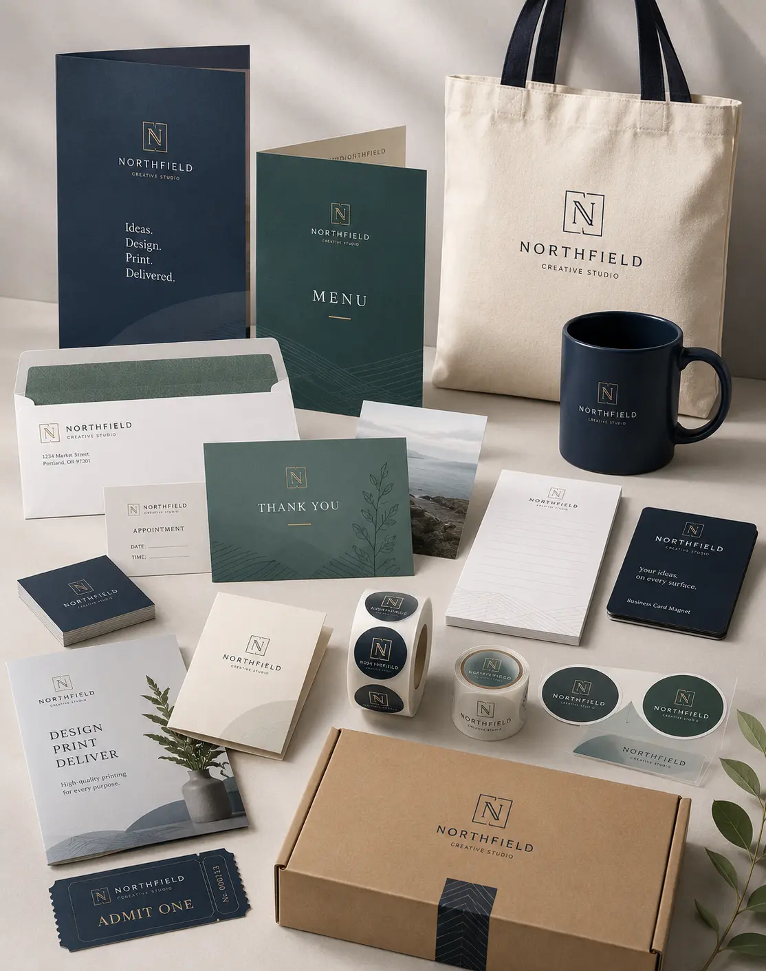
We find that consistency across all your professional gear builds trust faster than any single marketing campaign. Your card should reflect the same quality and aesthetic as your office signage or your employee apparel. For instance, professional name tag design helps you align your personal branding with your printed materials. When your name tag matches the sophistication of your business card, you present a bulletproof image of competence to every person you meet.
Frequently Asked Questions
Which paper weight makes the best impression?
We generally recommend starting with at least a 16pt cardstock. While standard 12pt or 14pt cards feel flimsy, a 16pt or 18pt card provides the rigidity and “heft” that people associate with established, professional brands.
Should I include my physical address on my card?
Unless you run a retail storefront where walk-in traffic is essential, we suggest omitting the physical address. Most people use GPS to find you, and removing the address frees up valuable space for a cleaner design or a QR code.
What is the benefit of a matte finish over a glossy one?
Matte finishes offer a more modern, sophisticated look and prevent fingerprint smudges. Glossy finishes work well for photography-heavy cards, but matte or soft-touch finishes generally feel more professional for service-based businesses.
How do I choose the right font size for my contact info?
We advise keeping your name and title between 10pt and 12pt, while contact details should stay around 7pt or 8pt. Anything smaller than 7pt becomes difficult to read for many people, which creates a barrier to communication.
Are double-sided cards worth the extra cost?
We always recommend double-sided printing. The back of the card offers prime real estate for a logo, a tagline, or a QR code. Using both sides makes the card feel more complete and allows for a less cluttered front side.
Conclusion
We believe that your business card should represent the absolute best version of your professional self. In an era where everyone has a digital profile, the physical card remains the most personal way to make a lasting impression. By following these design trends and focusing on high-quality production, you turn every handshake into a potential opportunity for growth. We take pride in helping our clients navigate these choices to produce cards that drive real business results.
We invite you to look at your current card and ask if it accurately reflects the level of service you provide. If your card feels like an afterthought, your prospects will likely treat your business with that same level of indifference. Let Laguna Digital help you design a card that commands respect and starts meaningful conversations. Contact us today to explore how professional design and premium printing can transform your networking outcomes and help your business grow.