

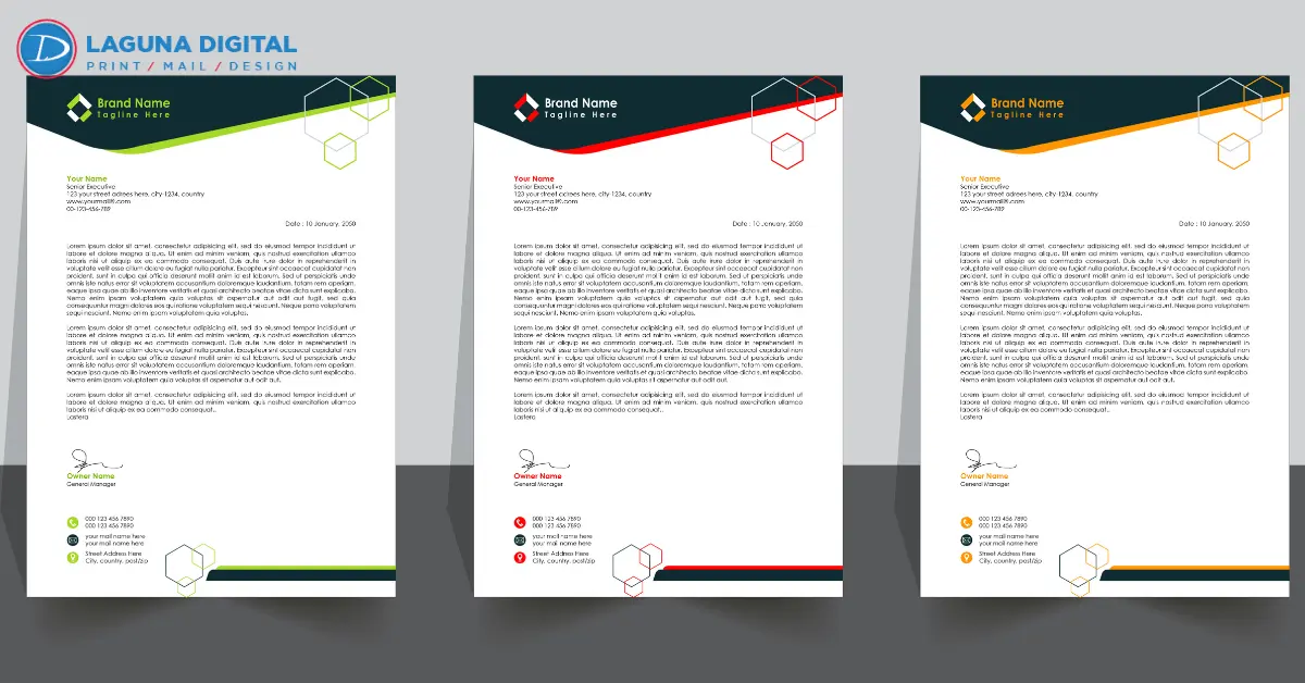
A logo can look precise on a monitor and different on paper. File profiles, ink or toner, paper shade, calibration, and office-printer settings all affect the final sheet.
In a controlled colors printing workflow, the file, paper, proof, and production method stay connected. Change one element and a blue may appear warmer or a gray may develop a color cast.
Why Letterhead Color Change in Printing?
Letterhead colors shift because RGB screens create color with light, while commercial printing usually uses CMYK inks or toners. Some bright screen colors cannot be reproduced exactly. Paper, equipment settings, and profiles further affect the result. Adobe notes that RGB-to-CMYK conversion can remap out-of-gamut colors to the closest printable values.
A Common Production Scenario
A company approves a vivid blue logo on a laptop. The first order uses bright-white paper. A reorder uses recycled stock and another press. The values remain unchanged, yet the blue looks softer and greener.
That does not prove the logo file is wrong. A business letterhead must be approved as a complete production specification, not as artwork alone.
| What looks wrong | Likely cause | Best next step |
| Brand color looks dull | RGB converted to CMYK | Review a CMYK proof |
| Color looks warmer | Cream or natural-white paper | Approve the exact stock |
| Reorder looks different | Press or method changed | Match the original job record |
| Gray looks tinted | Calibration or profile issue | Request a measured check |
| Preprinted sheet changes | Office-printer heat or setting | Test the actual device |
1. Screen and Print Color Use Different Systems
RGB is designed for screens; CMYK is designed for process printing. Electric blue, intense green, and saturated orange may sit outside a standard CMYK press range.
Before custom letterhead printing, supply a vector logo and a guide listing RGB, HEX, CMYK, and Pantone references. A reliable letterhead printing service should flag mixed color spaces during preflight. Adobe recommends CMYK for documents intended for process-ink printing and explains that color management settings affect the conversion.
An automatic conversion may be technically valid while still missing the expected visual target.
2. Paper Changes Perceived Color
Paper is not neutral. Bright-white, natural-white, cream, recycled, coated, and uncoated sheets reflect light differently. Xerox guidance also notes that paper type and color can affect print quality and color output.
Uncoated fibers absorb ink differently from coated surfaces. A glossy proof cannot represent a company letterhead printed on uncoated writing stock.
For consistent colors printing, record the paper manufacturer, product name, weight, finish, brightness, and shade. “White paper” is not a repeatable specification. A professional letterhead should also be tested for opacity, folding, writing quality, and office-printer compatibility.
3. Pantone, CMYK, and Digital Output Need Separate Approval
A Pantone spot color is a designated ink standard. CMYK builds color from four process inks, while a digital press may simulate the target through color management.
These methods can look closely related without producing an identical physical result. Pantone provides CMYK values for applicable color libraries, reinforcing the need to identify which specification is being used.
A branded letterhead within a business stationery program may change when a later order moves from spot ink to a digital press. Before selecting a color printing service, confirm whether the quote is based on spot color, process CMYK, or digital simulation. Keep the same method for reorders unless a new proof is approved.
4. The PDF May Contain Conflicting Instructions
A print-ready PDF can contain hidden conflicts: a CMYK logo, an RGB photograph, or a profile intended for another output condition.
Preflight should check:
- RGB or Lab objects that require conversion
- Missing or conflicting color profiles
- Low-resolution images and substituted fonts
- Incorrect bleed, trim, overprint, or transparency settings
For custom stationery printing, archive one approved master PDF rather than rebuilding the file from email attachments. The same rule applies to corporate stationery that must match across letterhead, envelopes, folders, and note cards.
A clean file improves colors printing, but it does not replace a physical proof. The profile predicts an output condition; the sheet shows what the selected paper and device produce.
5. Calibration Controls Repeatability
Commercial presses require measurement and maintenance. Digital output can drift with components, environment, and consumables; offset output can vary with ink density, paper, and press conditions.
G7 systems calibrate printing devices toward defined grayscale and visual targets. Idealliance describes G7 as a method used to improve consistency across print processes, not as a promise that every device and paper will look identical.
A dependable letterhead printing service should explain how the press is calibrated, how critical colors are checked, and what is saved for reorders. For recurring colors printing, the job record should include the approved PDF, stock, proof, production method, and any measured target.
“Exact Match” Needs a Defined Reference
An exact match cannot be judged against a bright phone screen. The reference must be a signed hard proof, a Pantone swatch viewed under suitable lighting, or a previously approved production sample.
6. The Office Printer Can Change the Result
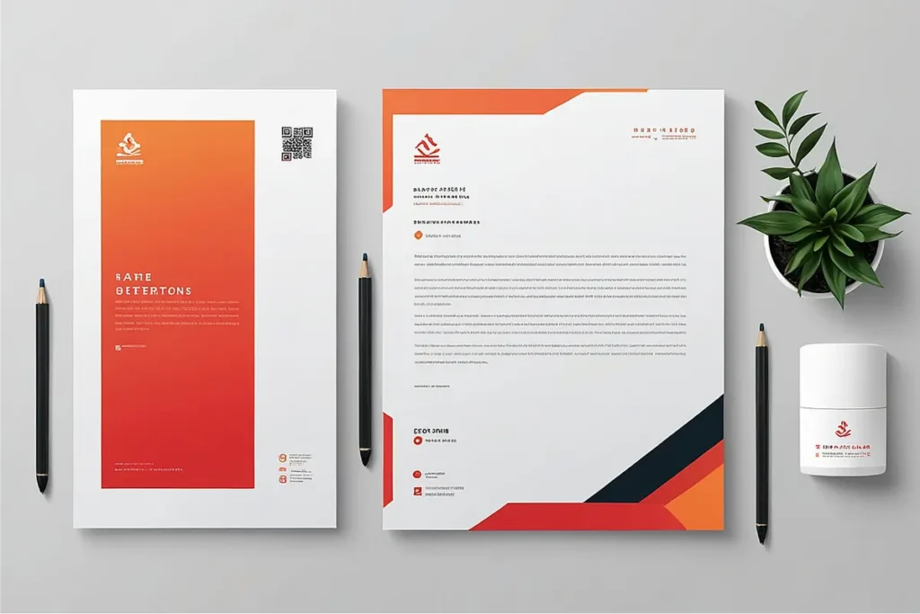
Preprinted sheets often pass through office laser printers. Heat, toner coverage, driver settings, and paper selection can affect the finished document. Xerox troubleshooting guidance recommends checking paper and color settings when output appears too light or dark.
Test the preprinted sheets in every device that will use them. Inspect feeding, curl, toner adhesion, and show-through. A professional letterhead also needs enough clear space for variable text and signatures.
This test is often missed during branded stationery purchasing, even though an attractive press sheet may perform poorly in daily use.
An Eight-Step Approval System
Use this process to make color printing repeatable:
- Collect approved logo files and print color values.
- Confirm CMYK, spot color, or digital simulation.
- Select the exact paper, including shade and finish.
- Request a preflight report for the final PDF.
- Approve a physical proof on the intended stock.
- Test the sheet through the office printer.
- Sign and date the approved proof.
- Save the file, stock, method, and sample together.
This record helps when business stationery is ordered for several locations and prevents approved specifications from being replaced with visibly different options.
Questions to Ask Before Ordering
A qualified provider should answer these questions clearly:
- Which profile should be used for the final PDF?
- Will the file receive a documented preflight review?
- Can a hard proof be produced on the selected paper?
- How will critical brand colors be evaluated?
- Will the same stock and method be available for reorders?
- Is the paper suitable for office equipment?
These questions compare process quality, not price alone. They apply to custom letterhead printing and programs involving business letterhead, envelopes, forms, and other branded stationery.
Frequently Asked Questions
Why does a printed logo look darker than it does on screen?
A monitor produces light, while print reflects it. Screen brightness, conversion, paper shade, absorption, and calibration can make a logo appear darker. Compare the result with an approved proof, not an uncalibrated display.
Should letterheads use CMYK or Pantone?
CMYK suits multicolor artwork and many short or medium runs. Pantone spot color may provide a clearer target when one shade is critical. The right choice depends on artwork, quantity, paper, budget, and tolerance.
Does uncoated paper make brand colors look dull?
It can. Uncoated paper absorbs ink and reflects light differently from coated stock, so color may appear softer. Approve the branded letterhead on the final writing stock rather than relying on a coated sample.
Can an office printer match commercially printed letterhead?
Not automatically. Office printers use different inks or toners, profiles, drivers, and maintenance conditions. For dependable colors printing, use commercially preprinted sheets for external documents and test them in the equipment that will add variable text.
How can a company keep future letterhead orders consistent?
Keep the signed proof, final PDF, paper specification, color references, method, and approved sample. Send the record with every reorder. A color printing service should retain job details, but the buyer should keep an independent copy.
Conclusion
Stable color depends on more than a correct logo. Files, paper, print method, calibration, proofing, and office use must support the same target. That is the foundation of reliable color printing and consistent corporate stationery.
Before approving a company letterhead order, request a file review, confirm the exact paper, identify the color method, and inspect a hard proof on the intended stock. Keep the approved sample and specifications for every reorder.
Send the logo files and color references for a production review, request a paper recommendation, and approve a physical proof before authorizing the full run. This process protects brand identity, reduces avoidable reprints, and gives custom stationery printing a repeatable quality standard.