
In the fast-paced world of networking, your business card is often the only physical reminder a potential client retains of your meeting. While digital contacts are convenient, they lack the psychological weight of a tangible asset. Just as industry leaders like mailprosusa.com understand the enduring power of physical direct mail in a digital world, savvy professionals know that a high-quality business card creates a lasting first impression.
To ensure that impression is positive, staying updated on design aesthetics is crucial. Whether you are a creative freelancer or a corporate executive, partnering with a premium service like Laguna Digital ensures that your cards are not just printed, but crafted to perfection. Below, we explore the essential design trends that are reshaping how professionals network today.
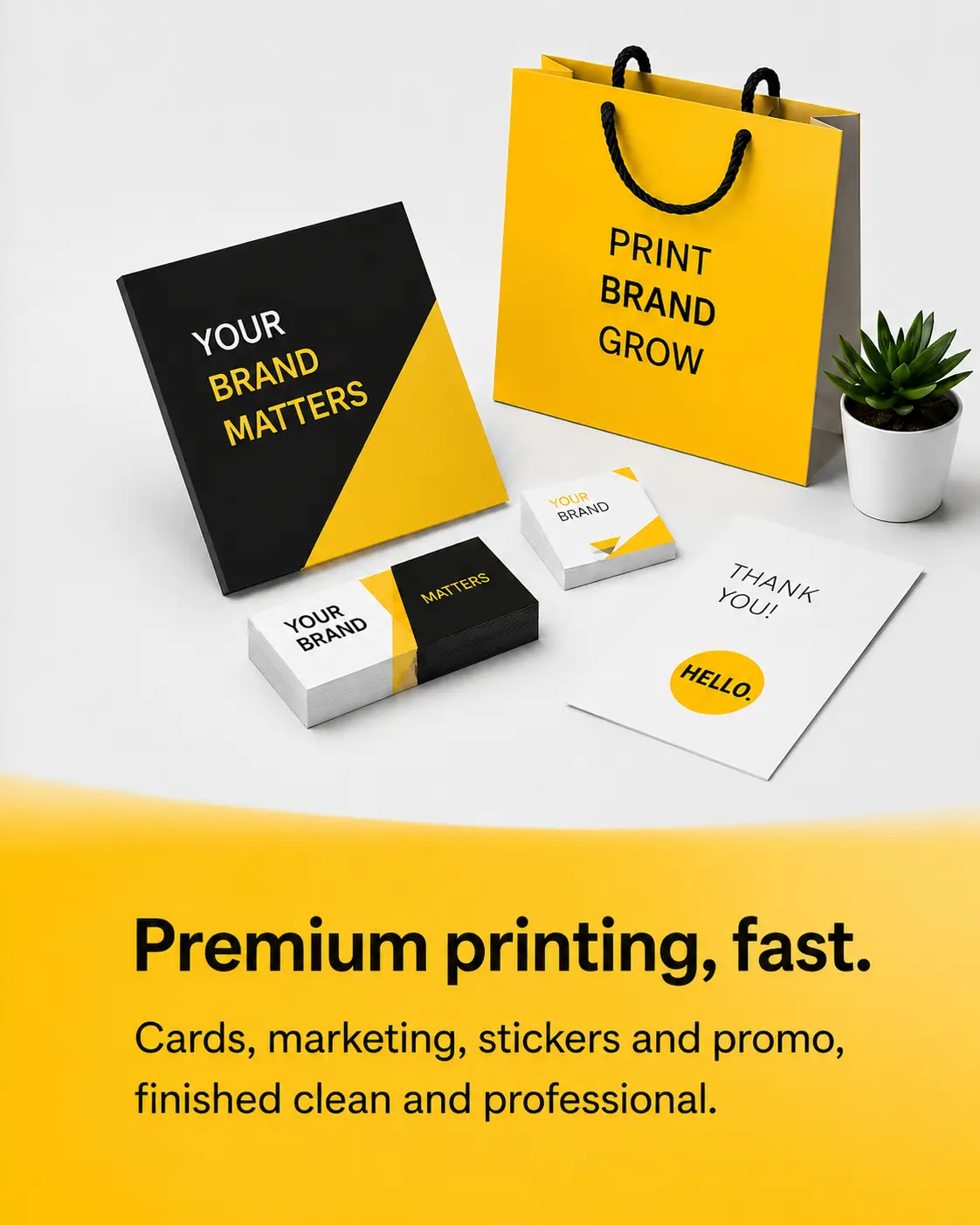
Why Professional Business Printing Defines Your Brand Identity
Before diving into specific artistic trends, it is vital to understand the medium itself. The most significant trend in recent years is the shift away from DIY, home-printed cards toward high-end, commercial-grade production.
Clients today associate the quality of your card with the quality of your service. A flimsy card suggests a flimsy business operation. By utilizing professional business printing services, companies can access paper stocks, color calibration, and cutting precision that standard office equipment simply cannot replicate. This foundation of quality allows the design trends discussed below to truly shine, ensuring sharp text and vibrant colors that command attention.
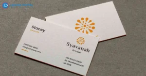
Timeless Elegance: The Resurgence of Minimalist Standard Business Cards
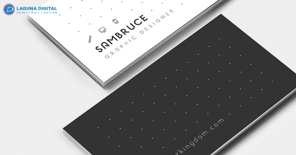
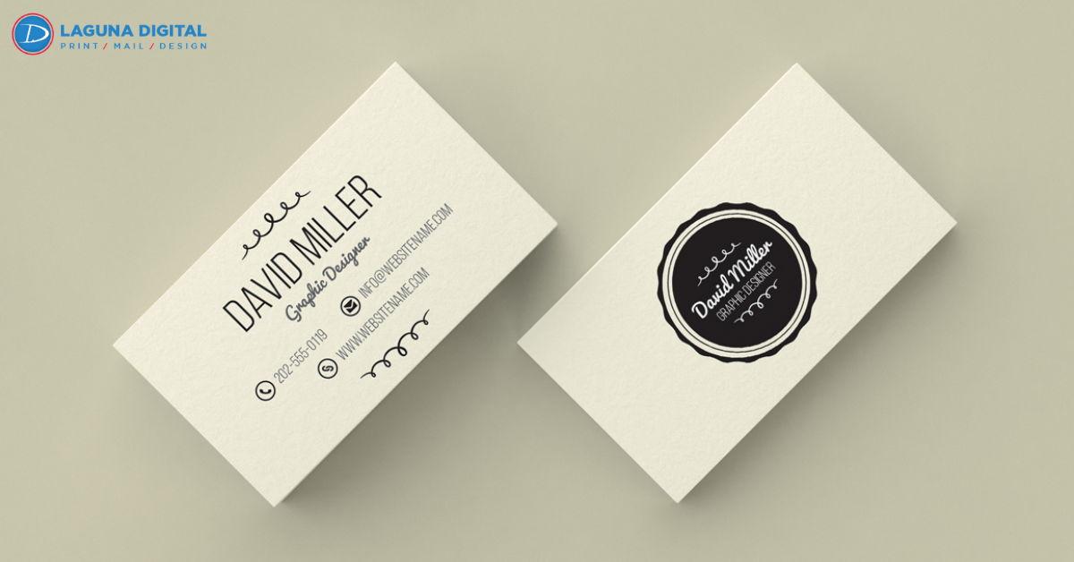
One of the most enduring trends is the move toward minimalism. The “less is more” philosophy has taken over, with designs favoring clean lines, ample white space, and bold typography over cluttered graphics.
This trend relies heavily on the quality of the paper stock. When the design is simple, the texture of the card becomes the star. High-quality Standard Business Cards that utilize heavy matte or uncoated stocks convey a sense of sophistication and confidence. A minimalist card does not scream for attention; it commands respect through understated elegance. This approach ensures that your contact information is legible and that your brand logo serves as the focal point, free from unnecessary distractions.
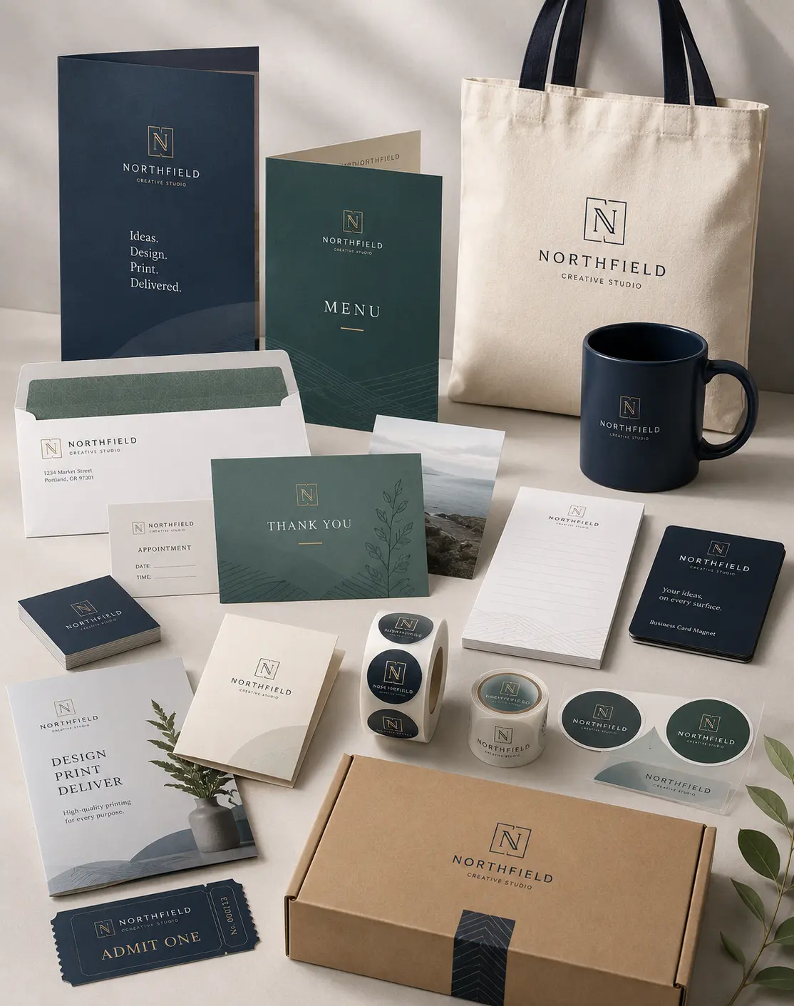
Cohesive Branding: Integrating Cards with Business Flyers
Modern branding is about consistency across all channels. A major design trend is ensuring that your business card is not a standalone artifact but part of a larger visual ecosystem. Your business card design should mirror the aesthetic of your brochures, banners, and Business Flyers.
When a potential client receives a flyer at a trade show and later looks at your business card, the visual language—fonts, color palettes, and paper finishes—should be identical. This cohesive approach builds trust and brand recognition. Many professionals are now designing their flyers and cards simultaneously to ensure that the color profiles (CMYK) and paper textures match perfectly, creating a unified and professional brand experience.
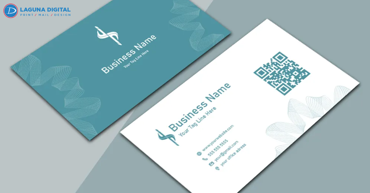
The Rise of Smart Business Cards and QR Codes
Bridging the gap between the physical and digital worlds is a trend that is here to stay. Adding a QR code to your printed card allows you to direct clients instantly to your portfolio, LinkedIn profile, or appointment booking page. This hybrid approach keeps the card clean while offering unlimited digital depth.
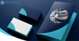
Textural Elements and Luxury Finishes
Beyond the visual design, the “feel” of a card is trending. Soft-touch laminations, spot UV (glossy coating on specific areas), and foil stamping add a tactile dimension to the card. These elements engage the sense of touch, making the card harder to discard and more memorable.
FAQs
What is the most popular font style for modern business cards?
San-serif fonts (like Helvetica, Arial, or custom geometric fonts) are currently the most popular due to their clean, modern look and high readability at small sizes.
Should I use both sides of the business card?
Yes. Using both sides maximizes the real estate of the card. One side is typically used for contact details, while the back is perfect for a logo, a QR code, or a tagline.
What is the standard size for a US business card?
The standard size is 3.5 inches by 2 inches. However, vertical orientations of this same size are becoming a trendy alternative to the traditional horizontal layout.
How does paper weight impact the perception of my business card?
Heavier paper (14pt or 16pt stock) feels more expensive and durable. It subconsciously signals to the recipient that your business is established and high-quality.
Are glossy or matte finishes better for business cards?
Matte is generally preferred for a modern, sophisticated look and is easier to write on. Glossy is better for cards that feature high-resolution photographs as it makes colors pop.
Can I include a photo of myself on my business card?
Yes, especially for real estate agents, sales professionals, and consultants. It helps put a face to the name and builds personal trust.
How much “bleed” should I leave on my design?
Standard bleed is usually 0.125 inches (1/8th inch) around each edge. This ensures that when the cards are cut, the design extends to the very edge without white borders.
Conclusion
Your business card is a handshake that you leave behind. By embracing trends like minimalism, smart technology integration, and cohesive cross-channel branding, you ensure that your first impression is an impactful one. However, great design must be supported by exceptional execution.
To guarantee that your materials reflect the high standards of your company, trust Laguna Digital for all your printing needs. From selecting the perfect paper stock to ensuring precise color matching, professional execution is the key to standing out. Ready to revitalize your networking strategy? Visit our shop today to order your premium Business Cards.